



Free Funnel Audit
Convert more customers today!
SEO
10 mins read

SEO
10 mins read
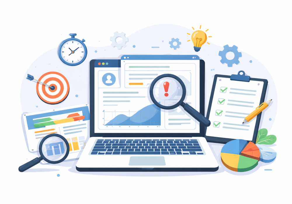
A UX audit is a structured way to find what’s broken in your product experience and fix it to improve conversions, usability, and user satisfaction.
You land on a site. It looks nice. But something feels off. You can’t find the button. The form is long. You leave. That’s exactly what a UX audit is built to catch.
Let’s break it down step by step.
A UX audit is a detailed review of how people use your website or app.
It looks at:
Ever opened a site and thought,
“Why is this so hard to use?”
That’s what an audit answers.
Businesses don’t run audits for fun they do it for results.
Here’s why:
Sometimes traffic is high, but sales are low. That’s a classic signal.
You might ask yourself:
“People are visiting. Why aren’t they buying?”
That question usually leads to an audit.
| UX Audit | Usability Testing |
| Reviews existing product | Tests with real users |
| Uses data + expert review | Observes live behavior |
| Faster to run | Takes more setup |
| Finds broad issues | Finds deep behavioral insights |
Both are useful. But an audit is often the first step.
Common red flags include:
Picture this. A user adds a product to cart. Then they disappear. No checkout. No payment.
What happened there?
Ask yourself:
If even two of these feel true, it may be time for a UX audit. A deeper review can reveal where users struggle, what slows them down, and which design issues affect conversions. It can also help you prioritize fixes based on actual user behavior rather than guesswork.
A good UX audit gives clarity. Not fluff.
It’s not about “making things pretty.”
It’s about making things work.
You also get direction.
Instead of guessing, you know:
Choosing the wrong type of audit can waste time. Let’s break each type down in a simple way.
This is the fastest way to spot obvious usability issues.
An experienced UX designer reviews your product using standard usability rules, like Nielsen’s heuristics. No users are involved at this stage. It’s an expert-led review based on patterns and experience.
When to use it:
What it gives you:
Who should run it:
It’s quick and practical. But it’s still based on expert judgment, not real user behavior.
This type focuses on real data. Not opinions.
It uses tools like Google Analytics or Mixpanel to understand how users behave. You look at metrics like bounce rate, conversion rate, and drop-offs.
When to use it:
What it gives you:
Who should run it:
This tells you where things go wrong. But it doesn’t always explain why. That’s where qualitative methods, such as usability testing and user interviews, can help uncover the reasons behind those issues.
This is where you watch real users interact with your product.
Users are given tasks like signing up or completing a purchase. Their actions, struggles, and feedback are recorded and analyzed.
When to use it:
What it gives you:
Who should run it:
This is one of the most valuable methods. Because it shows what users actually do, not what they say.
This checks if your product works for everyone, including users with disabilities.
It looks at things like color contrast, keyboard navigation, and screen reader support. Many issues here are not visible unless you test for them.
When to use it:
What it gives you:
Who should run it:
Accessibility is often ignored. But it directly impacts usability and legal compliance. Because accessibility issues can prevent users from completing basic tasks, such as navigating pages, reading content, or submitting forms. They can also create compliance risks when a digital product fails to meet applicable accessibility standards.
| Type | Best For | Output | Limitation |
| Heuristic Evaluation | Quick expert review | List of usability issues | No real user input |
| Analytics Audit | Data-driven insights | Drop-offs, behavior trends | Doesn’t explain why |
| Usability Testing | Real user behavior | Pain points, feedback | Takes time to run |
| Accessibility Audit | Inclusive design | Compliance issues | Needs specialized checks |
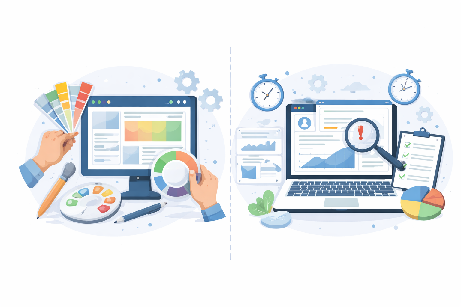
Both UI and UX look at your product and try to improve it. But they focus on very different things.
A simple way to think about it:
A UI audit focuses on the visual layer of your product.
It looks at:
The goal is to make the interface clean, consistent, and easy on the eyes.
When you need a UI audit:
What it gives you:
But here’s the catch. A beautiful UI does not guarantee a good website experience
A UX audit goes deeper. It looks at the full user journey.
It focuses on:
The goal is to make tasks simple and smooth.
When you need a UX audit:
What it gives you:
A UX audit can also help you spot small issues before they become bigger conversion problems. It gives your team a clearer view of what users experience and where improvements can have the most impact.
Aspect | UI Audit | UX Audit |
Focus | Visual design | User experience |
Looks at | Colors, layout, typography | Flows, usability, behavior |
Goal | Make it look clean and consistent | Make it easy to use |
Output | Design fixes | Usability improvements |
Impact | Aesthetic improvement | Conversion and engagement improvement |
Imagine an ecommerce checkout page.
Both are useful. But they solve different problems.
Ask yourself a simple question:
“Do users struggle to use the product, or does it just look outdated?”
In many cases, you’ll need both. But UX usually comes first. Because fixing how something works matters more than how it looks.
The right tools make patterns easier to spot and remove guesswork.
These tools give you numbers. They answer questions like:
When using these tools, don’t just skim dashboards. Look for patterns:
For example, if 70% of users leave at checkout, that’s not random. That’s a signal.
Use analytics early in your UX audit process. It helps you decide where to focus before digging deeper with user interviews, usability testing, session recordings, or heatmaps. These methods help explain why users behave a certain way and what may be causing the problem.
If analytics tells you where, these tools show you why. You can actually watch how users interact with your product.
Watch for:
Use these after analytics. First find the problem area. Then observe behavior inside it.
These tools help ensure your product works for users with different abilities.
Focus on basics first:
Run accessibility checks alongside your heuristic review. It fits naturally when you’re already evaluating usability.
Purpose | Tool |
Analytics | Google Analytics |
Behavior tracking | Microsoft Clarity |
Accessibility | Lighthouse |
This setup is enough to run a solid UX audit without spending money.
Start with a simple question:
“What needs improvement?”
Examples:
Then define scope:
Don’t audit everything at once. That’s a mistake.
Without clear KPIs, an audit turns into guesswork. You may find issues, but you won’t know if fixing them made any real impact.
KPIs keep your audit focused.
They help you:
For example, saying “improve UX” is vague. But saying “increase checkout completion rate from 45% to 60%” is clear.
You don’t need dozens of metrics. Start with a few that directly tie to user behavior.
This is the most important one for most businesses. It shows how many users complete a key action:
Formula:
Conversion Rate = (Conversions ÷ Total Visitors) × 100
If traffic is high but conversions are low, something is broken in the experience.
This tells you how users move through key steps.
For example:
You can track how many users complete each step.
What to watch:
This is where most UX issues hide.
Bounce rate shows how many users leave without taking action. A high bounce rate often means:
But context matters. A blog page may have a higher bounce rate than a product page.
This shows how long users stay on your site. Short sessions may mean:
But again, context matters. Quick answers can also lead to short sessions.
So always combine this with other metrics.
This is simple but powerful. It measures how many users can complete a specific task.
For example:
You usually get this from usability testing.
This shows how often users make mistakes.
Examples:
A high error rate usually points to poor design or unclear instructions.
Goal | KPI to Track |
Increase sales | Conversion rate |
Fix drop-offs | Funnel completion rate |
Improve engagement | Session duration |
Reduce confusion | Error rate |
Improve usability | Task success rate |
Instead of tracking everything, do this:
For example:
Now your audit has direction.
Look at:
Find problem areas.
Ask:
“Where are users leaving?”
That’s your starting point.
Focus on important paths:
Walk through them like a user.
Pause and think:
“Would I complete this?”
A heuristic review means checking your product against proven usability principles. These are well-tested rules created by usability expert Jakob Nielsen.
If Step 2 showed where users struggle, this step explains why.
You’re not just asking: “Is this page working?”
You’re asking: “Does this follow basic human behavior?”
Below are Nielsen’s 10 heuristics. Each one helps uncover different types of issues.
Users should always know what’s happening.
Common issues:
You click “Pay Now”… and nothing happens.
Did it work? Did it fail? That uncertainty creates stress.
Use simple, familiar language.
Common issues:
Users should feel in control at all times.
Common issues:
Things should work the same across the product. Users should not have to learn different patterns on different pages.
Common issues:
Inconsistency slows users down. They start thinking too much.
Good design stops errors before they happen.
Common issues:
It’s better to prevent mistakes than fix them later.
Users shouldn’t have to remember things.
Common issues:
The less users need to remember, the smoother the experience feels.
Make things faster for frequent users.
Common issues:
Think of it like this. A first-time user explores. A repeat user wants speed.
Keep it clean and focused.
Common issues:
When everything screams for attention, nothing gets noticed.
Errors should be clear and helpful.
Common issues:
A good error message feels like help, not blame.
Support should be easy to find.
Common issues:
Sometimes users just need a quick answer. Make it easy.
Some issues hurt conversions while others are minor. That’s why a severity rating system is used.
Severity | Meaning | Example |
0 | No issue | Everything works fine |
1 | Cosmetic | Minor spacing or color issue |
2 | Minor usability issue | Slight confusion, but task still doable |
3 | Major issue | Users struggle or slow down |
4 | Critical issue | Task cannot be completed |
Ask three simple questions:
For example:
This helps you focus on what truly matters.
Use:
Watch real sessions.
You’ll notice patterns:
Ask:
Accessibility is not optional. It impacts real users.
Not all problems are equal.
Use:
Example:
Include:
Keep it simple. If no one understands the report, it won’t be used.
Use this as a quick guide.
Let’s look at a case that shows how small UX changes can shift real numbers.
Users were adding products to the cart. That part worked well.
But then something strange happened. They reached checkout… and left.
Naturally, the first thought was:
“Is the price too high?”
That’s a fair question. But when behavior data was checked, the story looked different.
A closer look at the checkout flow revealed a few clear issues:
Now imagine being a user here.
You’re ready to buy. Then suddenly, you see a long form. Multiple steps. No idea how long it will take.
You pause. Maybe you think:
“Do I really need to fill all this right now?”
That hesitation is where drop-offs begin. Session recordings confirmed it. Users slowed down, clicked back, or simply exited.
Instead of a full redesign, the focus stayed on reducing friction.
Here’s what changed:
The impact was immediate and measurable:
Metric | Before | After |
Checkout completion rate | 42% | 56% |
Form completion time | ~2.5 min | ~1.4 min |
Drop-off rate | High | Reduced significantly |
That’s roughly a 34% increase in completed checkouts.
And the interesting part? The price never changed.
Now let’s look at a different kind of product. A SaaS tool.
Traffic to the signup page was strong. But conversions were low. Very low.
This raised a common question:
“Are users not interested, or is something blocking them?”
The signup flow had hidden friction points:
Think about this as a new user. You land on a tool you’ve never used. And right away, you’re asked for payment details. That creates doubt.
You might ask yourself:
“Do I trust this enough already?” For many users, the answer was no.
The team made a few focused improvements:
These were small changes. But they directly addressed user hesitation.
Here’s how things improved:
Metric | Before | After |
Signup conversion rate | 18% | 31% |
Bounce rate | High | Noticeably lower |
Trial starts | Moderate | Increased sharply |
That’s a 72% increase in signups. All without increasing traffic.
Use this table:
Issue | Impact | Effort | Priority |
Hidden CTA | High | Low | High |
Slow page load | High | Medium | High |
Minor design tweak | Low | Low | Low |
Full redesign | High | High | Medium |
A beautiful UI means nothing if users still struggle.
It depends on size.
Rushing it leads to shallow insights.
Sometimes an outside perspective helps.
Ask yourself:
“Are we too close to see the problem?”
A good report drives action.
Keep it clear and actionable. A long report that no one reads is useless.
A UX audit is a careful review of how people use a website or app. It helps find where users feel confused, stuck, or frustrated, so those issues can be fixed.
It’s best to run a UX audit every 6 to 12 months. You should also do one after major updates, redesigns, or when performance drops.
You need a mix of tools to see both data and behavior. This usually includes analytics tools, heatmaps or session recordings, and accessibility checkers.
The cost depends on the scope and who runs it. A DIY audit can be free or low cost, while a professional audit can range from $2,000 to $15,000 or more.
Start using our A/B test platform now and unlock the hidden potential of your website traffic. Your success begins with giving users the personalized experiences they want.
Start Your Free Trial

Empowering businesses to optimize their conversion funnels with AI-driven insights and automation. Turn traffic into sales with our advanced attribution platform.
Trusted by Customers


©CausalFunnel Inc. All rights reserved.