
")


Free Funnel Audit
Convert more customers today!
SEO
10 mins read

SEO
10 mins read
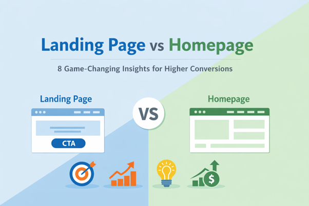
A lot of businesses still don’t know the difference between a landing page and a homepage. This confusion often means fewer conversions and wasted traffic. At first glance, both pages look the same. But their goals and structure are very different.
It’s important to know the difference between a landing page and a homepage in order to grow. Every page in your marketing funnel has a different job. One helps people trust and know about you. The other makes people take action and see results.
This guide does more than just compare a homepage to a landing page. You will find out how each page helps with design that focuses on conversions. We will look at structure, user intent, CTAs, and psychology. You will also learn how small changes can make conversions work better.
A landing page is designed to minimize distractions and maintain focus on a single conversion goal. Unlike standard website pages, it often removes full-site navigation and limits unnecessary outbound links. This reduces cognitive load and prevents visitors from diverting attention away from the intended action.
Rather than encouraging browsing, the page follows a structured, linear persuasion flow: a clear headline presenting the core promise, supporting proof to establish credibility, benefit-driven messaging, objection-handling elements, and a strong call to action. This guided structure moves users step-by-step toward conversion.
When the messaging closely matches the original ad or campaign source, it strengthens message alignment improving conversion rates and boosting ad relevance metrics such as Quality Score in PPC campaigns. Every element, from visuals to testimonials and form fields, is intentionally aligned around one measurable objective: converting focused traffic into leads, sales, registrations, or downloads.
The principles of conversion psychology that work best for landing pages are clarity over complexity, relevance over breadth, and focus over exploration. Every part, from the pictures to the testimonials to the form fields, works toward the same goal. The page is there to turn focused traffic into leads, sales, registrations, or downloads, no matter what the goal is.
The homepage is the main part of a website. It is meant to serve many different types of visitors with different levels of intent. It serves as the brand’s digital front door, welcoming visitors who come from organic search, direct traffic, referrals, or branded campaigns. The homepage should be broad, informative, and easy to navigate instead of being too persuasive because users’ intentions are different and hard to predict.
From an architectural point of view, a homepage is like a hub-and-spoke system. It links visitors to important internal pages like products, services, prices, blog resources, contact information, and company information. Its main job is not to get people to buy right away, but to help them find their way and build trust. It talks about brand positioning, gives high-level value propositions, and lets users choose their own path based on their interests and readiness.
The homepage is also very important for SEO from a strategic point of view. It usually goes after broad brand and industry keywords, spreads internal link authority, and helps organic traffic grow over time. Instead of telling visitors to do one thing, it gives them several options that help with awareness, exploration, and early-stage consideration. Instead of looking at single-offer conversion rates, it looks at engagement depth, navigation flow, and brand perception to see how well it works.
The eight insights below will help you design better and get more conversions.
The biggest difference in a landing page vs homepage starts with purpose. Each page supports different marketing funnel stages. A homepage serves visitors at many entry points. A landing page serves visitors from a specific campaign.
User intent is unpredictable on a homepage. Some visitors want pricing details quickly. Others want to explore features and reviews. Many are still in the awareness vs decision stage. Because intent varies widely, the homepage must stay broad. It cannot focus on one narrow offer.
A landing page works very differently. Visitor intent is usually clear and predictable. Users click from an ad or email campaign. They already expect a specific offer. This clarity allows stronger conversion psychology. The message can be focused and persuasive. There are fewer distractions and fewer choices. The page guides users toward one clear action.
Understanding this landing page vs homepage difference improves strategy. You align each page with the right funnel moment. This alignment increases conversion performance and reduces confusion.
Quick Comparison:
Structure shapes behavior more than most marketers realize.The real shift in a landing page vs homepage appears in navigation and links. A homepage includes menus, footers, and many exit paths. A landing page removes most of those distractions. This design choice protects CTA focus and improves clarity. It also supports a stronger conversion ratio.
In a homepage vs landing page comparison, link volume tells a clear story. Homepages often contain dozens of outbound links. Landing pages aim for a 1:1 conversion ratio. This means one clear goal and one main action. Fewer links reduce link dilution and confusion. Visitors face fewer decisions inside this distraction economy.
Consider a typical SaaS brand example. The homepage may include pricing, blog, careers, and resources. A campaign landing page removes that navigation completely. The only visible action is “Start Free Trial.” This structure protects attention and increases conversions.
Structural Breakdown:
Quick Comparison Table:
Element | Homepage | Landing Page |
Navigation | Visible and expandable | Usually removed |
Link Count | High volume | Very limited |
CTA Count | Multiple actions | One primary action |
Focus Level | Broad exploration | Focused conversion |
This structure adds actionable clarity for marketers. It proves that fewer links often increase measurable conversions.
The hero section shapes the first impression instantly. In a landing page vs homepage comparison, this area works differently. Above the fold design controls early attention and direction. Visitors decide within seconds whether to stay or leave.
A homepage hero often highlights brand identity and trust. It may include a broad value proposition. The message speaks to many audience segments at once. This keeps the tone informative and welcoming. Users can explore navigation after scanning the headline.
A landing page hero is sharper and more focused. The headline is benefit-driven and action-oriented. It connects directly to the offer promised in the ad. The value proposition is specific and measurable. Many landing pages place a form immediately beside the headline. This supports quick decisions during F-pattern scanning behavior. Users see the headline first, then move left and downward. A clear CTA within that visual path increases conversions.
Hero Element | Homepage Approach | Landing Page Approach | Conversion Impact |
Core Messaging Focus | Brand-focused messaging introducing company identity, mission, or overall solution category. | Offer-focused messaging centered around one specific campaign or value proposition. | Clear offer focus accelerates decision-making and improves message match. |
Primary Objective | Encourages exploration and deeper navigation into the site. | Encourages immediate action tied to a defined goal (signup, download, purchase). | Direct calls to action reduce hesitation and increase engagement. |
Value Proposition Style | Broad value proposition serving multiple audience segments. | Specific benefit statement addressing one targeted pain point. | Specificity increases perceived relevance and urgency. |
Navigation Visibility | Full navigation menu visible to support exploration. | Navigation minimized or removed to maintain attention on the CTA. | Reduced distractions increase first-interaction conversion probability. |
Visual Priority | Emphasizes brand visuals, product previews, or category highlights. | Highlights form fields or a dominant CTA button above the fold. | Immediate visibility of action elements shortens the conversion path. |
Attention Flow | Designed for scanning and brand orientation. | Designed for focused attention and rapid comprehension. | Controlled attention flow improves first-impression performance. |
This hero-section distinction significantly improves first-impression conversions. It aligns visual hierarchy, messaging clarity, and user behavior patterns with the intended goal of the page whether exploration or immediate action.
Calls to action drive measurable business results. However, placement and hierarchy change everything. In a landing page vs homepage strategy, CTAs serve different goals. One page encourages exploration. The other demands focused commitment.
Conversion psychology explains this difference clearly. The paradox of choice shows how too many options reduce action. When users face many buttons, decision fatigue increases quickly. They hesitate instead of clicking confidently. This hesitation lowers overall conversion performance.
Homepages often include a primary CTA and a secondary CTA. The primary CTA may say “Start Free Trial.” The secondary CTA might say “Learn More.” This balance helps users at different readiness levels. It supports both awareness and evaluation stages. Color dominance helps highlight the main action. A bold button draws attention first. A neutral button creates lower visual weight.
Landing pages work differently by design. The landing page vs homepage contrast becomes clear here. A landing page typically reinforces one single primary CTA. The same action appears multiple times across the page. CTA repetition strengthens message clarity and recall. Users always know what step comes next. There are no competing buttons creating confusion.
Imagine a paid ad promoting a free webinar. The landing page headline promises quick learning. Every button says “Reserve My Spot.” No secondary CTA distracts the visitor. This structure reduces friction and increases commitment.
CTA Element | Homepage Approach | Landing Page Approach | Conversion Impact |
CTA Structure | Includes a primary CTA supported by one or more secondary CTAs (e.g., “Learn More,” “View Pricing,” “Contact Us”). | Features one dominant primary CTA repeated consistently throughout the page. | A single dominant CTA reduces cognitive overload and improves click-through rates. |
Action Pathways | Allows multiple navigation paths depending on user interest and intent. | Reinforces one specific action from entry to exit. | Focused pathways shorten the conversion journey. |
Intent Accommodation | Supports varied user intent across awareness, consideration, and research stages. | Supports a focused decision-stage intent aligned with a specific offer. | Higher intent alignment increases conversion likelihood. |
CTA Reinforcement | Primary CTA may compete visually with secondary options. | Primary CTA is visually dominant and strategically repeated at key scroll points. | Repetition increases commitment and action probability. |
Decision Friction Level | Higher friction due to multiple choices and exploration routes. | Lower friction due to a simplified decision environment. | Reduced friction leads to faster decision-making. |
Behavioral Strategy | Encourages exploration and information gathering. | Leverages behavioral science principles like the paradox of choice and decision simplification. | Fewer choices often produce stronger, faster results. |
This comparison adds depth by integrating behavioral science into page design strategy. It explains why limiting choices, reinforcing a single action, and reducing distractions often produce significantly stronger conversion outcomes.
Content structure defines how users process information. In a landing page vs homepage strategy, architecture changes completely. A homepage acts as a central hub model. It connects visitors to many sections of the website. This requires a strong internal linking structure. Users should move smoothly between pages without confusion.
Homepages support broad informational content vs persuasive copy. They include features, pricing, FAQs, and blog access. The content hierarchy must guide exploration clearly. Headings organize sections by importance and theme. Modular content blocks allow easy scanning and navigation. Each block supports a different visitor need.
A landing page works as a campaign-specific narrative. The story flows in one clear direction. Every section supports the main offer directly. There are fewer internal links interrupting attention. Testimonials relate only to that specific campaign. Pricing appears only if it strengthens the offer. FAQs focus on objections tied to the action.
The landing page vs homepage distinction becomes strategic here. One page expands user exploration. The other narrows user focus intentionally. Both use modular blocks, but for different outcomes.
Structural Element | Homepage Architecture | Landing Page Architecture | Strategic Outcome |
Overall Structure Model | Hub model with broad navigation connecting to multiple internal pages. | Focused narrative structure with limited exits and controlled flow. | Homepage supports exploration; landing page supports conversion focus. |
Navigation Strategy | Full navigation menu enabling users to browse categories, resources, pricing, and more. | Minimal or removed navigation to prevent distractions. | Reduced exits increase conversion probability. |
Content Flow | Non-linear browsing path; users can jump between sections freely. | Linear persuasion flow guiding visitors from problem → solution → proof → CTA. | Structured flow shortens decision time. |
FAQ Strategy | Includes diverse FAQs covering products, pricing, company, support, and policies. | Features objection-handling FAQs addressing purchase hesitation. | Landing page FAQs remove barriers to action. |
Testimonials & Proof | General testimonials and broad brand credibility proof. | Offer-specific proof directly tied to the campaign promise. | Contextual proof increases persuasion strength. |
Resource Linking | Links to blogs, documentation, case studies, and external content. | Keeps supporting information embedded within the page itself. | Consolidated information reduces friction. |
This architectural distinction helps decision-makers design with purpose. It ensures each page supports measurable business goals whether brand expansion or campaign-driven conversions.
Trust influences every online decision strongly. However, placement changes impact a landing page vs homepage setup. Both pages use testimonials and credibility indicators. Yet the intention behind them differs clearly.
A homepage builds broad trust reinforcement. It may display well-known brand logos. It often includes general five-star reviews Trust badges highlight security and compliance standards. These elements reduce doubt for new visitors. They support users still exploring options.
A landing page uses targeted proof tied to the offer. Testimonials match the exact product or campaign. Numbers often replace generic trust logos. For example, a page may show conversion improvements. It might display case-study snippets with real outcomes. Specific results feel more convincing than general praise. Visitors in the decision stage need measurable reassurance.
Trust Element | Homepage Approach | Landing Page Approach | Conversion Impact |
Overall Objective | Broad trust reinforcement to build brand credibility. | Targeted proof supporting one specific offer. | Aligns proof with visitor intent level. |
Testimonials | General testimonials highlighting overall satisfaction. | Offer-specific testimonials tied directly to the promoted solution. | Contextual proof increases persuasion strength. |
Credibility Indicators | Industry awards, certifications, and recognition badges. | Metrics-driven validation connected to campaign claims. | Data-backed proof reduces skepticism. |
Trust Badges | Recognizable brand logos and partnership icons. | Trust badges placed strategically near CTAs. | Proximity to action reduces friction. |
Use of Numbers | Often limited to high-level company stats (e.g., clients served). | Strong use of measurable results (e.g., +35% conversions, 2x ROI). | Quantified outcomes increase decision confidence. |
Case Studies | Rarely detailed in hero; usually linked externally. | Case-study snippets embedded within the page narrative. | Embedded proof shortens evaluation time. |
Placement Strategy | Distributed across multiple sections for reassurance. | Positioned near objection points and conversion triggers. | Strategic placement directly supports action-taking. |
Strategic Takeaway
In the landing page vs homepage comparison, homepage trust elements build credibility at a brand level, while landing pages deploy targeted testimonials and measurable proof to remove hesitation at the decision stage directly improving conversion rates.
Traffic source changes how each page should perform. In a landing page vs homepage strategy, traffic intent matters greatly. Homepages often attract organic traffic from search engines. These visitors search broad brand or category terms. Keyword targeting usually includes brand names and general topics. The goal is visibility, authority, and steady engagement.
Organic visitors may not be ready to convert immediately. They explore content, pricing, and features slowly. A homepage must support longer browsing sessions. It needs clear navigation and strong internal links. This structure reduces bounce rate for broad searches.
Landing pages serve a different traffic type. They are often built for paid campaigns. Ad-specific landing pages match the message in the advertisement. Headlines and keywords mirror the ad copy closely. This alignment improves relevance and trust instantly. It also improves Quality Score in paid search platforms. Higher relevance often lowers cost per click.
In a landing page vs homepage comparison, optimization goals differ. Landing pages focus on action from targeted traffic. They avoid broad keyword targeting intentionally. The page message stays tightly aligned with the ad promise. If visitors do not find matching content, bounce rate increases quickly. Strong alignment reduces friction and improves conversion rates.
SEO vs Paid Traffic Strategy Differences
Strategic Factor | Homepage Approach | Landing Page Approach | Marketing Impact |
Primary Traffic Source | Optimized for organic traffic from search engines. | Built primarily for paid campaigns such as PPC and social ads. | Aligns page structure with acquisition channel. |
Keyword Strategy | Targets broad brand and industry-level keywords. | Focuses on precise keyword targeting tied to specific offers. | Increases relevance and conversion probability. |
Search Intent Coverage | Supports mixed intent (informational, navigational, exploratory). | Serves high-intent, campaign-driven users. | Better intent match improves performance metrics. |
Content Breadth | Broad messaging to attract diverse search queries. | Narrow, offer-specific messaging aligned with ad copy. | Specificity increases persuasion strength. |
Ad Relevance Alignment | Less optimized for message match with paid ads. | Designed as ad-specific landing pages with strong message continuity. | Improves ad engagement and click-through consistency. |
Quality Score Impact | Sending paid traffic here may reduce ad relevance. | High alignment improves Quality Score and lowers cost per click. | Better ROI from advertising spend. |
Bounce Rate Expectation | Higher bounce rates tolerated due to browsing behavior. | Lower bounce rate expected due to focused intent. | Reduced friction improves campaign efficiency. |
Conversion Focus | Encourages exploration and internal navigation. | Engineered for immediate conversion action. | Shorter decision cycle for paid traffic. |
Growth Objective | Long-term authority and ranking expansion. | Short-term conversion optimization and ROI scaling. | Balances sustainable growth with revenue acceleration. |
In the landing page vs homepage comparison, the homepage strengthens domain authority and long-term organic visibility, while landing pages maximize paid campaign performance through relevance and focused messaging.
This distinction is crucial for marketing managers balancing SEO sustainability with paid acquisition efficiency.
Choosing the right page depends on your goal. The landing page vs homepage decision should never be random. Each page supports a different campaign strategy. Using the wrong one can lower performance quickly.
Think about traffic source and audience readiness first. Are visitors discovering your brand for the first time? Or are they responding to a specific offer? Clear answers help you choose correctly. The landing page vs homepage choice becomes simple with context.
Below are practical scenarios to guide your decision.
Use a Landing Page When:
Use a Homepage When:
Landing pages work best for focused actions. Homepages support exploration and broader understanding. This decision framework makes planning far easier. It ensures every campaign aligns with user intent and goals.
After reviewing each insight, you need a simple summary. This section condenses the full landing page vs homepage discussion. It highlights the most important structural and strategic differences clearly. You can use this table during campaign planning sessions. It also helps teams align design and traffic decisions quickly.
Many marketers mix page roles unintentionally. That confusion often lowers campaign performance. A homepage supports exploration and brand growth. A landing page supports focused conversion actions. The differences may look small visually. However, the impact on performance is significant.
This comparison simplifies the decision process. It clarifies how each page supports funnel alignment. It also connects SEO goals with paid campaign goals. When strategy matches page purpose, results improve faster.
Below is a structured comparison for fast reference.
Element | Homepage | Landing Page |
Goal | Provide broad brand information and exploration | Drive one specific action or offer |
Navigation | Full navigation menu with multiple links | Limited or removed navigation for focus |
CTA Count | Multiple CTAs including primary and secondary | One dominant primary CTA repeated |
Traffic Source | Mostly organic traffic and direct visits | Paid ads, email campaigns, retargeting |
Funnel Stage | Awareness and consideration stage | Decision and action stage |
SEO Focus | Broad keyword targeting and brand visibility | Narrow, campaign-specific keyword alignment |
Conversion Focus | Support long-term engagement | Maximize immediate conversion rate |
This table improves scannability instantly. It also increases eligibility for featured snippets. Most importantly, it turns complex strategy into clear action steps.
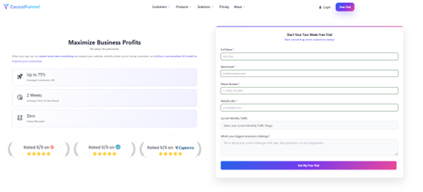
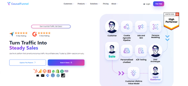
CausalFunnel empowers marketers to build, test, and refine landing pages using advanced AI and predictive user intent modeling. Instead of relying on guesswork, the platform analyzes visitor behavior in real time to deliver personalized experiences that increase engagement and conversions.
It supports no-code, rapid page creation, allowing teams to launch high-converting landing pages quickly. Built-in A/B testing continuously evaluates headlines, visuals, forms, and CTAs to identify top-performing combinations. Through behavioral analytics such as heatmaps and user journey tracking, marketers can pinpoint friction areas and optimize accordingly.
Real-time nudges help guide visitors toward desired actions, such as bookings or purchases, while cross-device optimization ensures seamless performance on both mobile and desktop. Designed for industries including e-commerce, travel, and professional services, CausalFunnel helps transform traffic into qualified leads and measurable ROI.
Now you clearly understand the landing page vs homepage difference. Each page plays a strategic role in growth. Confusing them often leads to weak performance. Using them correctly increases clarity and conversions.
A homepage builds trust and brand authority. It supports visitors across multiple funnel stages. It encourages exploration and deeper research.
A landing page drives focused action quickly. It removes distractions and strengthens intent. It aligns messages with a specific campaign.
When you match page type with traffic source, results improve. When structure aligns with user intent, conversions rise steadily. Small design changes can create a major impact over time.
Review your current pages with these insights. Remove unnecessary distractions where focus is required. Strengthen messaging where persuasion matters most. Strategic alignment always beats random experimentation.
Content marketing for startups does not generate instant results. Expect early signals within 3–6 months. Consistent publishing, distribution, and optimization produce measurable ROI around 6–12 months. Patience is essential to benefit from compounding content effects.
The budget depends on goals and resources. Focus on a lean startup content strategy that maximizes high-impact channels. Prioritize quality over quantity. Invest in promotion and small-scale paid campaigns to accelerate visibility when necessary.
Outsourcing can help if internal bandwidth is limited. Freelancers or agencies should complement, not replace, strategy execution. Ensure outsourced content aligns with buyer intent, funnel stages, and authority-building requirements to avoid wasted spend.
Track meaningful metrics: lead conversions, CTA engagement, time on page, and scroll depth. Avoid vanity metrics. Attribution models clarify which content drives pipeline influence, ensuring content marketing for startups produces tangible growth.
Start using our A/B test platform now and unlock the hidden potential of your website traffic. Your success begins with giving users the personalized experiences they want.
Start Your Free Trial
Empowering businesses to optimize their conversion funnels with AI-driven insights and automation. Turn traffic into sales with our advanced attribution platform.
Trusted by Customers


©CausalFunnel Inc. All rights reserved.