
")


Free Funnel Audit
Convert more customers today!
SEO
10 mins read

SEO
10 mins read
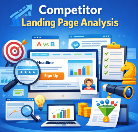
Competitor landing page analysis means studying how other brands design and write their landing pages to convert visitors.
A landing page is any page built with one goal. That goal could be sign-ups, sales, or demo bookings.
Think of this. You search for a tool, click an ad, and land on a page pushing a free trial. That page is a landing page. And yes, that is exactly what gets analyzed here.
Simple idea. Big impact.
Most people start from scratch. That sounds brave, but it wastes time.
Competitors have already tested what works and what doesn’t. They have spent money. They have failed and learned. So why ignore that?
Looking at their pages helps answer real questions:
And honestly, this is what most marketers wonder:
“Is this worth testing?”
“Will this headline work?”
“Why is my page not converting?”
Competitor analysis answers those questions faster than guesswork.
It’s like peeking at the answer sheet before writing your exam. Not copying. Just understanding the pattern.
Timing matters more than people think.
Doing analysis at the right moment can save weeks of effort.
Here are the key moments:
A common mistake is waiting too long. By then, money is already spent.
Finding the right pages is half the job. And there are smarter ways to do it.
Start simple. Search terms like:
Click ads and organic results. Those pages are gold.
Ever noticed how some pages feel “too perfect”? That’s because they are optimized landing pages.
SEO tools like Ahrefs or SEMrush help find top-performing pages.
Look for:
Those are not random pages. They are built to convert.
If ads are running, competitors are serious.
Auction Insights shows:
That’s direct competition.
Search for brands in your niche.
You’ll see:
This gives real-time insight into what’s working right now.
Tools like BuiltWith and SimilarWeb show:
This helps connect the dots between traffic and page design. Use all methods together. One method is never enough.
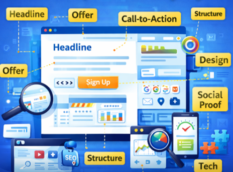
This is the most important part of the whole process. And honestly, this is where most people rush. Instead of just “looking” at a page, the goal is to break it down, question it, and score it.
The headline is the first thing people see. It decides if they stay or leave.
So pause here. Read it twice. Then ask:
For example, Slack uses simple, benefit-driven headlines like “Made for people. Built for productivity.” It feels human and clear.
Now think deeper.
Does the headline talk about features or outcomes?
Features say what the product does. Outcomes say what the user gets. Outcomes usually win.
Factor | What to check | Score (1–5) |
Clarity | Easy to understand instantly | |
Relevance | Matches target audience | |
Benefit focus | Talks about result, not just features |
If a headline needs effort to understand, it is already losing.
Now move to the offer. This is where users decide if it’s worth their time.
Look for what is being given:
But don’t stop there. The real question is:
“Why this product and not another one?”
That answer is the value proposition.
Take Dropbox. The offer is simple: store and share files. But the value is ease and accessibility from anywhere.
Factor | What to check | Score |
Clarity | Easy to understand offer | |
Appeal | Feels worth trying | |
Differentiation | Stands out from competitors |
If the offer feels like “just another tool,” conversions drop.
The CTA is where decisions happen. Everything leads here. Start by scanning the page:
Then read the wording.
Compare:
They sound similar, but they feel different.
For example, HubSpot often uses action-driven CTAs like “Get started free.” It removes doubt and sets expectation.
Factor | What to check | Score |
Visibility | Easy to find | |
Clarity | Action is clear | |
Motivation | Encourages click |
Even a small wording tweak here can lift conversions.
Now scroll slowly. Don’t rush. A good page feels like a guided story. One section leads to the next naturally.
Look at:
For example, many SaaS pages follow this flow:
If the flow feels random, users get confused.
Factor | What to check | Score |
Flow | Smooth section transition | |
Logic | Makes sense step by step | |
Readability | Easy to scan and scroll |
Confusion is the biggest conversion killer.
Design is not just about looking pretty. It builds trust. First impression matters. And it happens fast.
Look closely at:
For example, Apple uses clean layouts and lots of space. It feels premium without saying a word.
Now compare that with cluttered pages full of text. Those feel tiring.
Factor | What to check | Score |
Cleanliness | No clutter | |
Consistency | Same style across page | |
Visual impact | Strong first impression |
If a page feels messy, users lose trust quickly.
People trust other people more than brands. So this section matters a lot.
Look for:
For example, Shopify often shows real brands using their platform. That builds instant confidence.
But not all social proof works equally well.
A generic quote like “Great product!” feels weak. A detailed review with name and company feels real.
Factor | What to check | Score |
Authenticity | Feels real | |
Specificity | Includes details or results | |
Placement | Shown at the right moment |
Good social proof removes doubt.
Even landing pages can rank on search engines. So take a quick look at SEO basics.
Check:
For example, pages targeting “alternative to X” often include comparison sections.
Factor | What to check | Score |
Keyword use | Natural placement | |
Relevance | Matches search intent | |
Optimization | Title and meta are clear |
SEO brings traffic. But only if done right.
Now think about where visitors come from. Because that changes everything.
Traffic can come from:
For example, ad-driven pages are often short and direct. SEO pages are longer and more detailed.
Factor | What to check | Score |
Alignment | Matches traffic intent | |
Messaging | Fits audience awareness | |
Clarity | Speaks to right user stage |
Wrong message for the wrong audience leads to drop-offs.
Speed is not optional. It directly affects conversions. Open the page on mobile. That’s where most users are.
Check:
Even a one-second delay can reduce conversions.
Factor | What to check | Score |
Speed | Fast load time | |
Mobile UX | Smooth and responsive | |
Stability | No layout shifts |
A slow page is like a shop with a locked door.
Finally, look behind the scenes. Tools tell a lot about how the page works.
Check for:
For example, many pages use live chat to answer questions instantly. That can improve conversions.
Factor | What to check | Score |
Lead capture | Easy form or signup | |
Support | Chat or help available | |
Tracking | Likely analytics setup |
Good tools support a smooth user journey.
Most guides list things to check. That helps, but it still feels scattered.
A simple framework makes the process easier to follow and repeat. It also helps in real work moments. For example, when you’re staring at a page and thinking, “Where do I even start?”
That’s where this comes in.
The PAGE Framework stands for:
Think of it like a quick mental checklist. Four parts. Clear focus.
This is about the first impression. The message users see when they land.
Look at:
Ask simple questions:
For example, Notion clearly targets teams and individuals who want to organize work and notes in one place.
If positioning is vague, users feel lost. And when users feel lost, they leave.
Factor | What to look for | Score |
Clarity | Easy to understand instantly | |
Relevance | Speaks to a clear audience | |
Benefit | Focus on outcome, not features |
Now move beyond the headline. Look at the full page. Architecture is about how content is arranged from top to bottom.
Scroll slowly and notice:
A strong page usually follows a logical flow:
For example, Stripe uses structured sections that guide users step by step without confusion. If the structure feels messy, users get overwhelmed.
Factor | What to look for | Score |
Flow | Smooth transitions | |
Logic | Clear step-by-step journey | |
Readability | Easy to scan and scroll |
Gravity is what keeps users engaged and pushes them to click.
This includes:
Notice how some pages almost “pull” your eyes toward the button. That is not random. For example, Canva uses bright buttons and simple text like “Start designing” to guide action.
Ask yourself:
Factor | What to look for | Score |
Visibility | Easy to spot CTA | |
Clarity | Action is obvious | |
Motivation | Encourages clicking |
If gravity is weak, users drift away without acting.
This is where trust is built or lost. People rarely convert without proof. They want to see results, not just promises.
Look for:
For example, Zoom often highlights enterprise customers and usage scale to build trust.
Now think like a user:
“Do I believe this?”
If the answer is no, the page needs stronger proof.
Factor | What to look for | Score |
Authenticity | Real and believable | |
Specificity | Includes details or results | |
Placement | Shown at the right time |
This framework is simple, but it becomes powerful when used properly.
Here’s how to apply it:
After that, compare across 3–5 competitors. Patterns will start to appear. And once patterns appear, decisions become easier.
Now let’s make this actionable.
Choose direct competitors, not random ones.
Use ads, search, or tools.
Look at the headline, CTA, structure, and offer.
What repeats across pages?
What do they do really well?
What feels missing or weak?
Improve. Do not copy.
Think of this as reverse engineering success.
Here’s a simple way to organize insights.
Element | Competitor A | Competitor B | Competitor C | Your Insight |
Headline | ||||
CTA | ||||
Offer | ||||
Design | ||||
Social Proof |
This keeps things simple and structured.
Let’s walk through a realistic example using well-known tools so it feels practical, not theoretical.
Element | Competitor A (Slack) | Competitor B (Microsoft Teams) | Competitor C (Zoom) | Your Insight |
Headline | “Made for people. Built for productivity.” Clear and simple but slightly broad. | Focus on teamwork and integration with Microsoft tools. Feels enterprise-heavy. | Strong focus on video communication and reliability. More specific use case. | Clarity is strong across all. But benefit specificity is missing in A. Opportunity to combine clarity + specific outcome. |
CTA | “Try for free” visible above the fold and repeated. | “Sign up for free” but slightly less prominent. | “Sign up, it’s free” repeated often and easy to spot. | All use free-based CTAs. Strong pattern. Visibility matters more than wording here. |
Offer | Free plan with upgrade options. Easy entry. | Free + deep integration with Microsoft ecosystem. | Free basic plan, strong for meetings. | Free entry is standard. Differentiation comes from ecosystem or use-case focus. |
Design | Clean, friendly, lots of white space. Feels modern. | Slightly dense. More text-heavy. Feels corporate. | Balanced layout with product visuals. Clear sections. | Clean design improves readability. Avoid clutter seen in B. |
Social Proof | Logos of big brands and customer stories. | Enterprise trust signals and Microsoft branding. | Strong usage stats and global adoption numbers. | Mix of logos + numbers works best. Numbers add extra trust. |
Let’s look at a real example instead of a made-up one. This makes things clearer and more useful.
Take Asana. It’s a well-known project management tool. Its main landing page is built to drive sign-ups for teams.
Now, open their homepage and scroll slowly. Notice how each section flows into the next. It feels smooth, almost guided.
A few things stand out right away:
Even strong pages have gaps. That’s where opportunity lies.
Now comes the interesting part. This is where real insights turn into action.
At this point, pause for a second.
Ask yourself:
“Would this page convince me to sign up right away?”
For some users, the answer is yes. For others, there is still hesitation. And that hesitation is exactly where better landing pages are built.
Keep tools simple and useful.
Tools help. But thinking matters more.
Mistakes can ruin the whole process. Avoid these:
A page can look great and still fail. Always ask why something works.
Insights mean nothing without action. Here’s how to use them:
Sometimes the simplest page wins.
Want to rank better too? Focus on these:
Search intent is everything. Miss that, and rankings drop.
Use this before launching your page:
It is the process of studying competitor landing pages to understand what drives conversions.
3 to 5 is enough. More can create confusion.
SEO tools, ad libraries, and tech tools like BuiltWith.
A basic review takes 1–2 hours. Deep analysis can take longer.
No. Ideas can be used, but copying leads to weak results and trust issues.
Start using our A/B test platform now and unlock the hidden potential of your website traffic. Your success begins with giving users the personalized experiences they want.
Start Your Free Trial
Empowering businesses to optimize their conversion funnels with AI-driven insights and automation. Turn traffic into sales with our advanced attribution platform.
Trusted by Customers


©CausalFunnel Inc. All rights reserved.