


Free Funnel Audit
Convert more customers today!
SEO
10 mins read

SEO
10 mins read
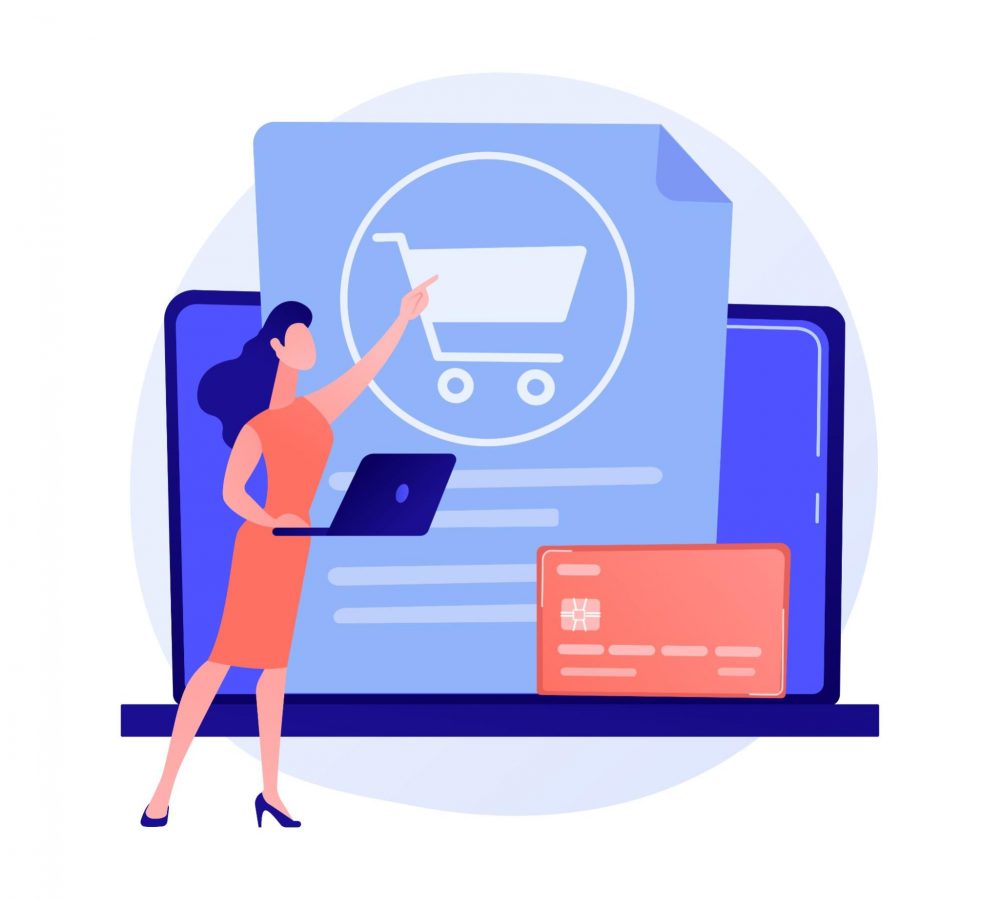
A shopper finds a product. They want to buy it. They add it to the cart. They reach the checkout. Then they leave.
That lost sale can hurt. It may also be avoidable. This is where checkout optimization helps. The goal is simple. Make it easy to buy. Cut steps that add no value. Show key facts at the right time. Give buyers a clear way to pay.
Some carts were never real sales. Many people were just browsing. Yet some buyers leave due to checkout pain. That pain can take many forms. The form may feel too long. Fees may show up late. Guest checkout may be hard to find. The page may work poorly on a phone. A buyer may not see a payment type they trust.
Want to get more value from high-intent traffic? See how CausalFunnel can fit into your conversion plan.
Keep these goals in mind:
Checkout optimization means making checkout easier to finish. It covers the path from cart to sale. The goal is not just speed. The goal is less work and less doubt. A good checkout should feel clear. Buyers should know what comes next. They should see the full cost. They should feel safe when they pay.
Ecommerce checkout optimization can cover many parts of the page. It may change the form. It may change the flow. It may add a guest checkout. It may add a digital wallet. It may show fees sooner. It can also make mobile checkout easier. That may mean less typing and better autofill.
A strong checkout experience should help a buyer:
Checkout process optimization is not the same for each store. One store may need a one-page checkout. Another may need clear steps. Do not chase fewer pages at all costs. Chase less effort. A short flow can still be hard. Clear labels, good form order, and fast pages all help.
Checkout page optimization also needs data. Look at where buyers stop. Look at which fields fail. Check if phone users leave more often. The aim is not a new look. The aim is a smooth sale.
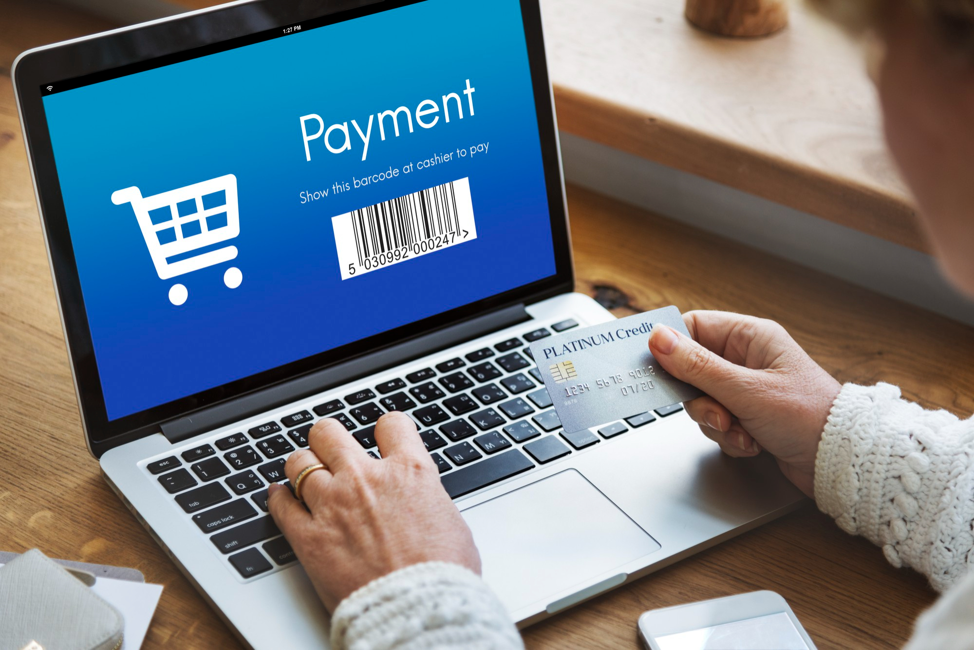
Traffic does not pay the bills. Sales do.
A buyer at checkout has shown clear intent. They found a product. They chose it. They moved close to payment. Losing them here can waste prior work. Your ad did its job. Your product page did its job. The checkout still has to finish the sale.
A better checkout UX can help. It can cut steps. It can cut errors. It can make the price clear. It can make payment feel safe. It may also help your checkout conversion rate. You can win more sales from the same traffic. You do not always need more clicks first.
Trust matters too. Buyers share key data at checkout. The page must feel safe and calm. Mobile matters too. Long forms and small tap areas can slow users down. Mobile checkout optimization aims to cut that pain. Key tasks should stay easy and fast.
A good checkout should:
There is no one cause. Some buyers change their mind. Some compare prices. Some plan to buy later. Other losses come from the checkout itself.
Here are common pain points:
| Checkout issue | Why it hurts | What to improve |
| Late fees | The total jumps | Show costs early |
| Forced sign-up | It adds work | Offer guest checkout |
| Long forms | They feel hard | Cut needless fields |
| Few pay choices | A trusted choice may be missing | Add useful payment methods |
| Weak trust cues | Buyers may feel doubt | Add clear trust signals |
| Poor mobile UX | Taps and typing take more work | Use mobile-first forms |
A late price jump can stop a sale. The item price may look fair. Then shipping is added. Tax may be added too. A fee may also show up. Now the buyer has to think again.
Unexpected costs can make shoppers leave before they complete a purchase. Show shipping fees, taxes, and other charges as early as possible. Give buyers a clear total in the cart, and if a cost is not final, provide an honest estimate or range. Keep all fees easy to find so there are no last-minute surprises.
A buyer may want the item. They may not want an account. Forced sign-up adds work. It also adds a choice. Both can slow the sale. Guest checkout removes that block. It lets the buyer pay first. The guest path must be easy to see. Do not hide it in small text. Use clear words, such as “Continue as guest.”
Long forms can make a simple sale feel hard. Each field takes time. Each field can also fail. This can feel worse on a phone.
Ask one thing first: Do we need this data to fill the order? If not, cut the field. Or ask for it after the sale. Use address autofill when it helps. Keep labels clear. Keep typed data after an error. A frictionless checkout does not mean no steps. It means each step earns its place.
A buyer may trust one way to pay more than another. Some prefer cards. Others use digital wallets. Some use bank pay or local tools. The best mix depends on the market. If a buyer does not see a known option, they may stop.
This is why payment methods are part of checkout optimization. They are not just a back-end choice. They shape the user experience too.
A good checkout can:
The goal is not to offer every method. The goal is to offer the right ones.
Payment is the point where trust matters most. A buyer is about to share private data. They may enter a card number, name, phone number, or address. The page should feel safe.
Useful checkout trust signals can include:
Keep these signals close to the point of doubt. Do not fill the page with badges. Too many signs can make the page look less real. A clean and calm payment page often builds more trust than a crowded one.
A checkout can look fine on a large screen and still fail on a phone. This is why mobile checkout optimization needs its own plan. Think about how the page feels on a small screen. Can the buyer tap each field with ease? Does the right keyboard open? Can they see an error at once? Does the page move while it loads? Small faults can add up.
A strong mobile checkout should have:
Speed also matters at the last step. A slow pay page can create doubt. Test the full flow on real phones. Do not test only on a desktop tool.

The best ecommerce checkout best practices remove doubt, delay, and extra work. The next ideas focus on parts of checkout that have not been covered yet.
A buyer should know where to look next. Keep the layout clean. Put related items in clear groups. Give the main action the most focus. The checkout flow should move in a clear order.
For example:
Do not place ads, pop-ups, or large promo blocks in the path. The buyer has one main task. Let them finish it. This can make the checkout experience feel light, even when the order needs more than one step.
Some data is needed. That does not mean the buyer must type it all. Address autofill can cut work. It can also reduce typing errors.
Use tools that can help with:
Make sure the buyer can still edit the result. Do not lock a field after it has been filled. A fast form is not only a short form. It is also a form that helps the user complete each field with less work.
A slow page can hurt the final step of a sale. Checkout page optimization should include speed. Look at the code and tools that load during checkout. Remove items that do not help the sale.
That may include:
The payment stage should feel fast and stable. Also watch for layout shifts. A button should not move just as a buyer tries to tap it. Fast pages make the flow feel more direct.
A one-page checkout can work well when the order is simple. A multi-step flow can work well when the buyer must enter more data.
Neither format is always best.
| Checkout type | Best fit | Main risk |
| One-page checkout | Simple orders | Page may feel long |
| Multi-step checkout | More complex orders | Extra steps may feel slow |
Do not pick a format just because it is popular. Test it with real users. The best choice is the one that makes the task feel clear and easy.
If the checkout has more than one page, show progress.
A simple bar can tell the buyer:
Use plain labels such as:
Delivery → Payment → Review
Avoid vague names. A good progress cue can make a long flow feel shorter. It gives the buyer a clear endpoint. This is a small checkout UX change, but it can make the path easier to follow.
A long list of payment choices is not always useful. Show the options that fit the buyer. For example, a phone user may value a wallet. A buyer in another country may want a local bank option.
Useful choices may include:
Keep the page simple. If possible, rank the options by use, market, or device. This can make checkout conversion optimization more relevant to each buyer.
Trust should be part of the design. Place key proof near the point where a buyer may pause.
For example:
This keeps trust tied to the task. Do not use long legal text in the main flow. Give the buyer just enough proof to move ahead with ease.
A bad error message creates a new problem. “Something went wrong” does not help.
A good message should say:
For example:
“Enter a valid card expiry date.”
is better than:
“Payment error.”
Keep data in the form after an error. Do not make the buyer start again. Good error recovery is a key part of checkout UX. It helps users move past small issues without losing progress.
A global store should not use one fixed checkout for every buyer. International checkout may need local changes.
These can include:
Localization can make the store feel more familiar. It can also cut doubt. A buyer should not have to guess what a price means or how a payment tool works.
Some buyers need help before they pay. Do not make them leave the page to find it.
Useful help can include:
Keep help easy to open and easy to close. The goal is to answer a concern without breaking the sale. A strong checkout experience gives buyers a way forward when they get stuck.
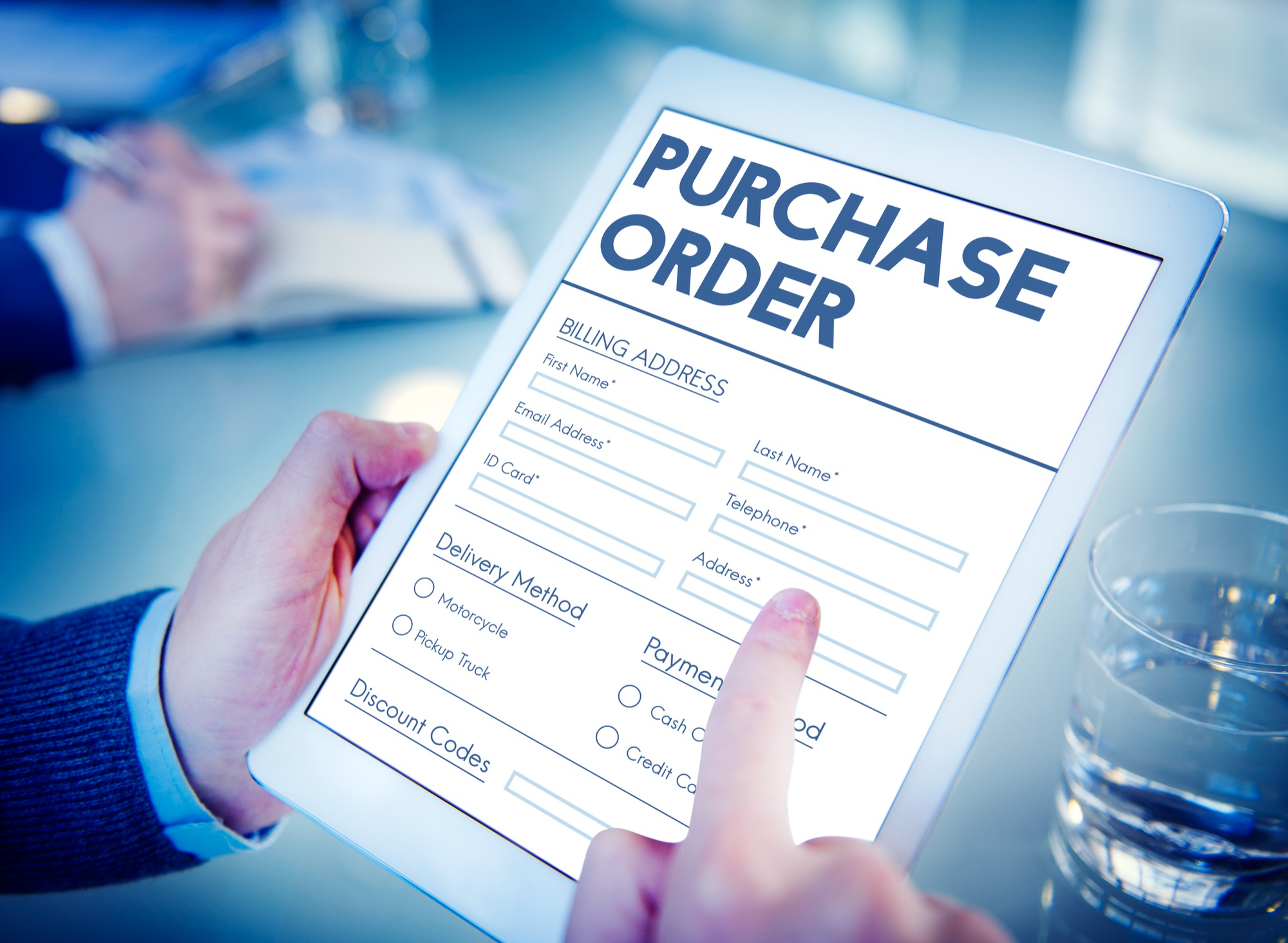
Use saved details for repeat buyers who agree. This cuts work at the last step and can make repeat sales feel fast.
Useful saved data may include:
Keep each item easy to edit. The buyer should fix old data with one tap. This is a useful form of checkout optimization. It cuts repeat work without adding new steps.
Some sales fail after the buyer taps Pay. The page may be fine. The card may be good. The charge may still fail. Track the payment approval rate. Check it by bank, card type, and market. Look for weak paths. Some pay tools can retry safe declines.
Do not treat all failed pay tries the same. This is back-end checkout optimization. Buyers may not see it. Yet more good orders may get through.
Checkout can adapt to the buyer. Yet it should stay calm. Show what is useful. Hide what adds noise. A store may show a saved choice to a repeat buyer. It may show a local deal. It may show a small add-on that fits the order.
Keep the main goal clear. The buyer came to pay. Do not let a cross-sell block the pay button. A good personalized checkout should save time or add clear value.
A good checkout should work for more users. Use plain labels. Keep text easy to read. Let users move through the form with a key. Add clear focus states.
Do not use color as the only sign of an error. Buttons need clear names. Fields need clear labels. This can help people who use assist tools. It can also make the page easier for all buyers. Good access is good checkout UX.
Some buyers leave even when the page works well. A short follow-up can bring some of them back. An email or text can link to the saved order. Keep the note clear. Show the item. Show the next step. Use a time limit only when it is real.
Do not send too many notes. The goal is to help a buyer return. It is not to add stress. This extends ecommerce checkout optimization past the first visit.
Track a small set of checkout metrics. Give each one a clear job.
Metric | What it means | Why it helps |
Checkout completion rate | Buyers who start and then buy | Shows how well checkout closes sales |
Payment approval rate | Payments that get approved | Shows pay or bank issues |
Revenue per checkout | Sales value per checkout start | Links tests to real sales |
Repeat checkout rate | Repeat buyers who finish | Shows if saved data helps |
Recovery rate | Left checkouts that later buy | Shows if follow-up works |
The checkout completion rate is a key number.
Use this formula:
Completed orders ÷ checkout starts × 100
A global benchmark can give context. Yet your own trend is often more useful. Rates can vary by store, device, and market. Use enough data to see a real trend.
Checkout A/B testing helps you test an idea before you make it the new rule. Start with one clear claim. For example:
“Saved buyer data will lift paid orders.”
Keep the old page as the control. Make one new version. Split users between the two. This is the core of an A/B test.
Then pick one main goal:
Do not judge the test from clicks alone. More taps may still lead to fewer sales. Avoid many big changes in one test. If five parts change, you may not know what caused the result. Use conversion rate optimization as a loop. Test, learn, keep the win, and drop the loss.
The best checkout is not the one with the most tricks. It helps a ready buyer finish. Strong checkout optimization is a cycle. Find a real gap. Make one sound change. Track the sale. Test the next idea. That keeps each choice tied to growth.
Do not chase trends with no proof. Do not add tools just because you can. Let buyer data guide the work. A good checkout can turn more high-intent visits into real sales. A great one keeps learning from each test.
If you want to turn buyer signals into clear growth actions, see how CausalFunnel can support your conversion plan and help you find the next growth move.
There is no one good rate for every store. Price, traffic, device, and product type can change it. Broad averages can hide key gaps. Your own trend is a better base for action. Track how many buyers start checkout and then buy. Aim to lift that rate over time.
Use this formula: Completed orders ÷ checkout starts × 100
If 400 people start and 200 buy, the rate is 50%. This rate looks only at the last part of the sales path.
Checkout completion rate is the share of checkout starts that end in a paid order. It helps a store judge the last stage of the sales path. It does not measure all site visits. Use one set of rules for the metric in each report.
Checkout rate starts when a buyer begins checkout. Site conversion rate starts much earlier. It may use all visits or sessions as its base. This is why the two rates answer two different needs. Checkout rate shows how well the final sales stage works.
Test on a steady plan and after key site or tool changes. A current Shopify testing guide calls for ongoing checks. It also calls for tests after updates, new tools, and key sales events. For A/B tests, wait for enough data before you call a winner.
Start using our A/B test platform now and unlock the hidden potential of your website traffic. Your success begins with giving users the personalized experiences they want.
Start Your Free Trial

Empowering businesses to optimize their conversion funnels with AI-driven insights and automation. Turn traffic into sales with our advanced attribution platform.
Trusted by Customers


©CausalFunnel Inc. All rights reserved.