
")


Free Funnel Audit
Convert more customers today!
SEO
10 mins read

SEO
10 mins read
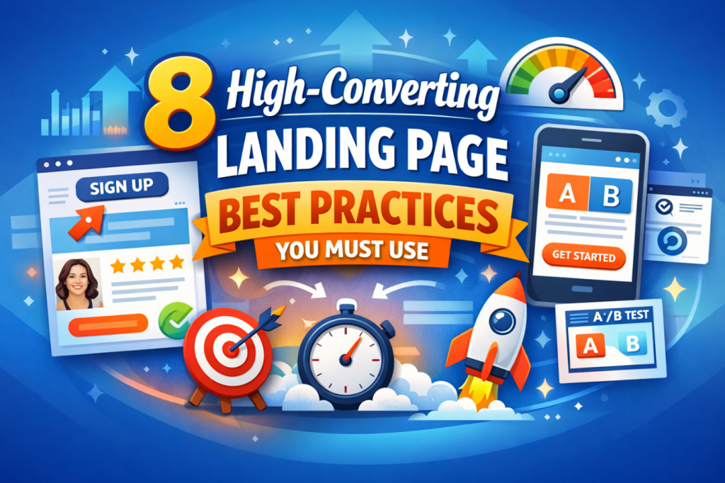
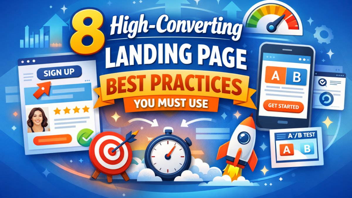
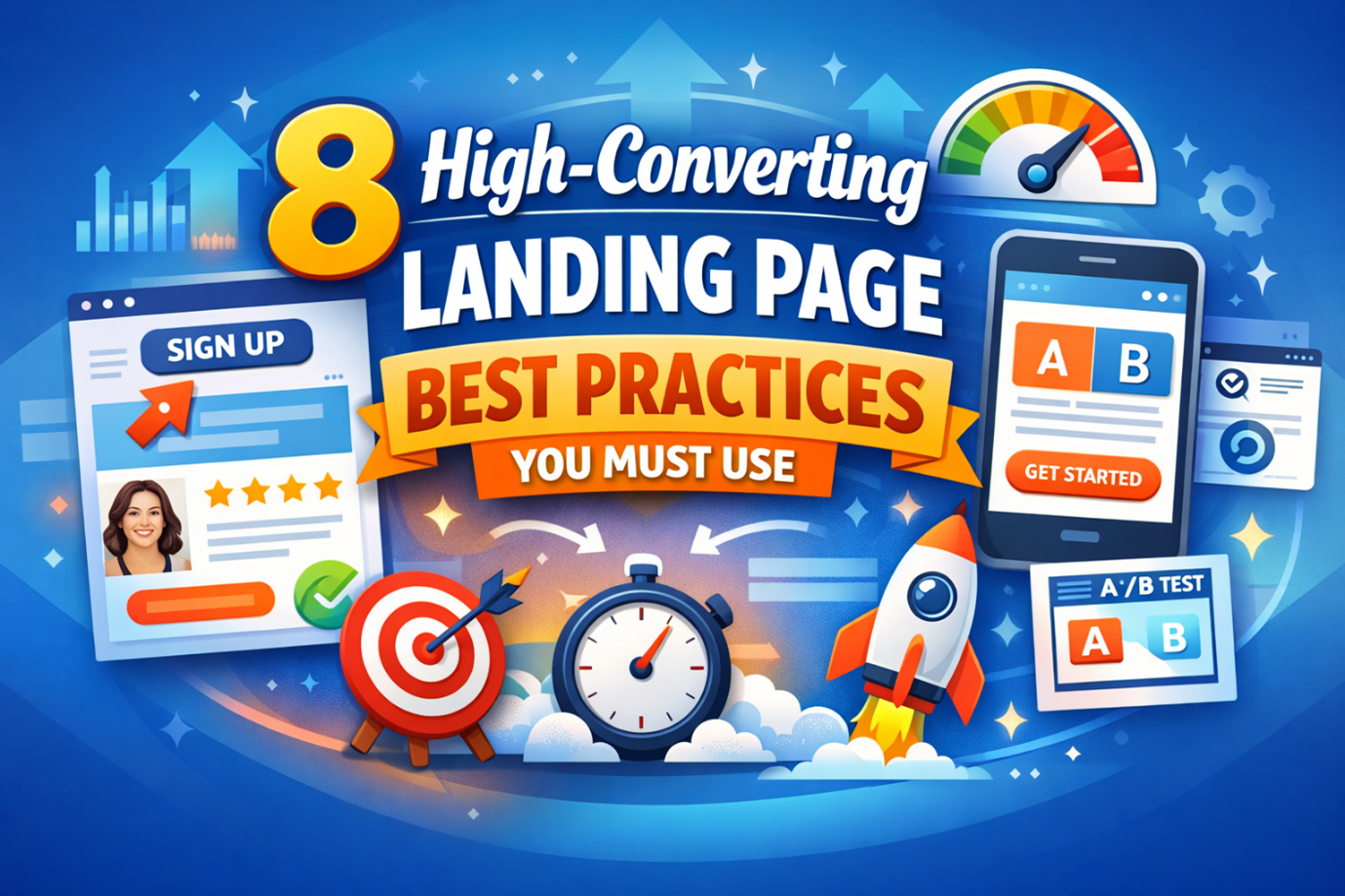
Most landing pages fail to convert visitors into real customers. You may drive traffic, but results often stay disappointing. That happens when pages lack clarity, focus, and strong direction.
High-converting landing pages follow proven, simple principles. These principles guide users toward one clear action. They remove confusion and build trust quickly.
In this guide, you will learn eight powerful practices. Each one helps improve conversions and user experience. You can apply them without any advanced design or coding skills.
Getting traffic is only half of the real challenge. The real goal is turning visitors into leads or customers. Many businesses create landing pages without proper planning. They focus on design but ignore user behavior and intent.
This leads to high bounce rates and low conversion results. Users leave because they do not find clear value. The good news is that you can fix this easily. You only need the right structure and proven methods.
These eight landing page best practices will guide you. Each one solves a specific conversion problem effectively.
These best practices are simple, clear, and highly effective. They focus on real user behavior, not just theory. Each section below explains what to do and why. You will also learn how to apply each method easily.
Let’s start with the most important foundation first.
Some of the best landing page best practices are to match what users expect to see. This is called a message match, and it is very important.
When users click an ad, they expect consistency. If the message changes, they feel confused or misled. This confusion leads to higher bounce rates quickly. Users leave because they cannot find what they expected. To fix this, keep your message consistent across platforms.
Focus on these key elements:
For example, promote your discount clearly and consistently across both pages. Ensure the same offer is presented before and after the click, without any changes or hidden conditions. This consistency builds trust, reduces confusion, and prevents users from feeling misled. When the offer remains exactly as expected, users are more likely to continue their journey and complete the desired action.
You can also use dynamic text for better personalization. This helps match keywords based on user searches. When users feel they made the right click, they stay longer. This increases trust and improves conversion chances significantly.
Users should see your main action immediately after landing. This area is called “above the fold” in design terms.
It refers to the visible screen area a user sees immediately after landing on your page, before any scrolling occurs. This section plays a critical role in forming the user’s first impression and determining whether they stay or leave. Since attention spans are short, this space must communicate value clearly and quickly. If users cannot immediately see your call to action, they may lose interest and exit the page without engaging further.
Users should never have to search or guess what the next step is, as this creates friction and reduces conversions. Instead, guide them with a clear visual hierarchy, compelling headline, and a prominently placed call to action. Your CTA should stand out through contrast, size, and positioning, making it instantly noticeable the moment the page loads. By doing this effectively, you reduce confusion, improve user flow, and increase the likelihood of users taking the desired action.
Your above-the-fold section should include:
Avoid adding too many elements in this area. Too much content creates confusion and reduces focus. Also, design this section for mobile users first. Most users will visit your page from their phones.
Ensure your CTA button is easy to tap. Use large buttons and clear spacing for better usability.
A strong first impression keeps users engaged longer. It also guides them toward your desired action faster.
Users do not read pages word by word. They scan quickly and look for key information. Visual hierarchy helps guide their attention effectively. It shows users what to focus on first. Directional cues push users toward your main CTA. These cues can be subtle but very powerful.
Use these techniques to guide user attention:
Whitespace also plays a big role in clarity. It gives your content room to breathe and stand out.
Avoid cluttered layouts that overwhelm the user quickly. Simple designs perform better in most situations.
You can also use images of people looking at your CTA. This naturally directs user attention to the right place.
A clear visual flow improves engagement and readability. It helps users move smoothly toward conversion actions.
Users want to understand your product quickly and clearly. Text alone often fails to explain everything effectively. Visuals help users see how your product actually works. They reduce confusion and build confidence faster.
Showing your product in action improves user understanding. It also helps users imagine using your product themselves.
Use these types of visuals for better impact:
Avoid using generic or low-quality stock images. They reduce trust and make your page look less authentic. Instead, use real images that show actual usage scenarios. This builds credibility and strengthens your message.
Place your visuals near your main value proposition. This helps users connect the message with real proof. Strong visuals keep users engaged for longer periods. They also increase the chances of conversion significantly.
A landing page should focus on one clear action. Too many options create confusion and reduce conversions. That’s why landing page optimization ensures your traffic doesn’t go to waste by improving key elements like headlines, design, and CTAs, so visitors clearly understand the value and are more likely to convert.
Users should know exactly what to do next. They should not feel overwhelmed by multiple choices. Removing distractions helps users stay focused on your goal. It also improves clarity and decision-making speed.
Remove these common distractions from your page:
Keep your design simple and clean at all times. Every element should support your main conversion goal. This approach reduces decision fatigue for users. It makes the experience smoother and more intuitive. You can see how landing page best practices convert better than complex designs. Clarity always wins over unnecessary complexity in design.
Users rarely trust marketing claims without proof today. They look for signals that confirm your credibility quickly. Trust signals reduce doubt and make users feel more confident. They show that real people already trust your product.
Social proof is one of the strongest persuasion factors. It helps users make faster and safer decisions.
Use these trust elements on your landing page:
Avoid using vague or fake-looking testimonials. Generic names reduce trust and feel less believable.
Instead, include photos, job titles, and specific results. This makes your testimonials feel real and relatable. You can also add numbers to strengthen your claims. For example, show how many users trust your product.
Place trust signals near your CTA for maximum impact. This reassures users before they take action. Strong trust signals reduce hesitation and increase conversions. They help users feel safe while making decisions.
Speed plays a major role in user experience and conversions. Slow pages frustrate users and increase bounce rates quickly. Most users expect pages to load within three seconds. Anything slower can lead to lost opportunities and traffic.
Mobile experience is equally important for modern users. A large portion of traffic comes from mobile devices. If your page looks broken, users will leave instantly. They will not wait or try to figure it out.
Improve speed and mobile experience using these methods:
Also, ensure your design works well on smaller screens like mobile and tablet devices. Buttons should be large and easy to tap. Forms should be short and simple to complete. Avoid asking for too much information on mobile.
Test your page on different devices regularly. This helps you find and fix usability issues quickly. Fast and smooth pages keep users engaged longer. They also improve your search engine performance naturally.
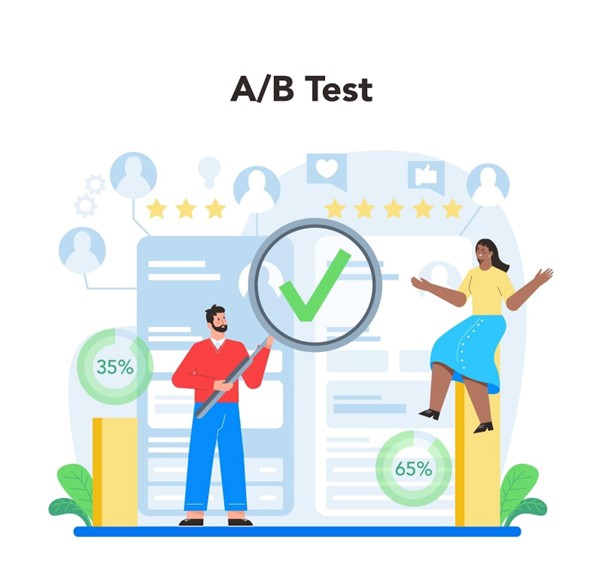
No landing page is perfect from the start. You must test different elements to find what works best.
A/B testing helps you compare two versions of a page. It shows which version performs better based on real data. This removes guesswork from your decision-making process. You rely on facts instead of opinions or assumptions.
You can test these important elements:
Start with small changes to see clear results. Avoid testing too many elements at the same time.
Use tools that track user behavior and conversions. Heatmaps and analytics provide useful insights for improvement. Track metrics like conversion rate and scroll depth. These numbers help you understand user interaction clearly.
Testing is an ongoing process, not a one-time task. Keep refining your page based on real performance data. Continuous improvement leads to better results over time. Even small changes can create significant conversion gains.
Bonus Tips to Improve Landing Page Conversions
Sometimes small changes can create big improvements quickly. These tips help refine your landing page performance further. They focus on reducing friction and improving user experience. Use them to strengthen your overall conversion strategy.
You should not rely on guesswork when optimizing pages. Every element should be tested and improved continuously. Test headlines, CTAs, and layouts at the same time. This helps you find the best-performing combinations faster. You can also test completely different page versions. This approach reveals what truly works for your audience.
Working with professionals can speed up this process. Experts bring proven strategies and testing frameworks.
For example, the team at CausalFunnel helps optimize pages effectively. using advanced A/B testing to improve conversion performance. Where you can test multiple variations at once for better results. This saves time and increases accuracy in decision-making.
These improvements remove friction from the process. They make it easier for users to complete actions. Better user experience leads to higher conversion rates. Every detail matters in landing page optimization.
Building a landing page is only the first step. Real success comes from landing page optimization over time. Many businesses expect quick results without proper testing.
This often leads to poor performance and wasted traffic. High-converting landing pages follow a clear structure. They guide users toward one action without confusion.
Let’s recap what drives better conversions:
Each element plays an important role in conversions. Together, they create a smooth and effective user experience.
Landing page optimization is not a one-time task. It requires regular updates based on user behavior data. Use A/B testing to compare different page variations. Test headlines, CTAs, visuals, and form structures.
Start with small improvements and measure their impact. Focus on fixing the biggest conversion issues first. Always observe how users interact with your page. Use real data instead of assumptions to guide decisions.
Even small changes can improve conversions significantly.Consistency is key for long-term landing page success. Keep testing, keep optimizing, and stay user-focused. That is how high-converting landing pages are built.
SEO split testing is a method to test SEO changes across groups of pages. It measures the real impact using data.
SEO testing focuses on pages, while A/B testing focuses on users. Search engines require a different testing approach.
Most tests should run for several weeks. The exact duration depends on traffic and page volume.
A control group is a set of pages that remain unchanged, which helps you compare results accurately.
Small websites can test, but results may not be reliable. Larger datasets produce better insights.
Start using our A/B test platform now and unlock the hidden potential of your website traffic. Your success begins with giving users the personalized experiences they want.
Start Your Free Trial
Empowering businesses to optimize their conversion funnels with AI-driven insights and automation. Turn traffic into sales with our advanced attribution platform.
Trusted by Customers


©CausalFunnel Inc. All rights reserved.