
")


Free Funnel Audit
Convert more customers today!
SEO
10 mins read

SEO
10 mins read
A strong Landing Page Experience can shape your entire campaign result. It affects how users feel, act, and decide within seconds. If your page feels slow or confusing, visitors leave quickly. Studies show that a one-second delay can raise bounce rate by up to 20 percent. That small delay can reduce trust and lost sales grow fast.
A powerful landing page experience blends clear messaging with smooth user experience. It guides visitors toward one goal without distraction. It also supports conversion rate optimization by removing friction at each step. Search engines notice these signals through engagement data and Core Web Vitals. Better engagement can improve Quality Score and lower advertising costs.
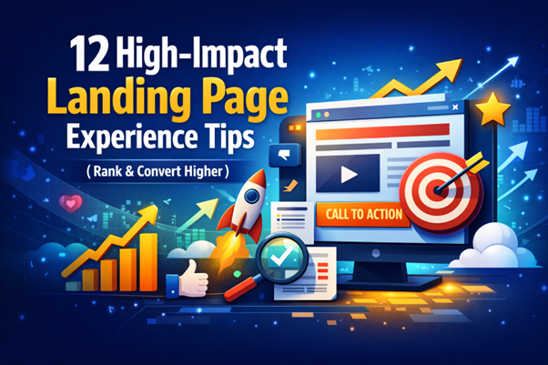
In this guide, you will learn twelve practical ways to improve structure, speed, trust, and clarity. Each tip focuses on actions that help you rank higher and convert more visitors.
A good landing page experience combines clarity, speed, and relevance to meet user expectations. Key attributes include fast loading times, mobile responsiveness, clear navigation, compelling visuals, and persuasive calls-to-action.
Content should align with user intent, providing valuable information that answers questions or solves problems. Trust signals, such as testimonials or security badges, enhance credibility, while minimal distractions help keep visitors focused on the desired action.
Here are the 12 Landing Page Experience Tips to Rank Higher:
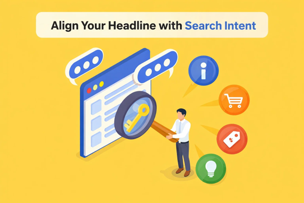
Your headline is the first promise visitors see on your page. If it does not match their expectation, they leave quickly. Strong search intent alignment reduces confusion and builds instant trust. When your ad and headline say the same thing, the message match feels natural. This improves ad relevance and lowers mental effort for users.
A clear headline strengthens your Landing Page Experience from the first second. It tells visitors they are in the right place. This reduces cognitive friction and improves early engagement signals. A focused Landing Page Experience keeps users moving toward the main goal.
Micro-example:
The ad says: “Free SEO Audit for Small Businesses.”
Weak headline: “Grow Your Online Presence Today.”
Aligned headline: “Get Your Free SEO Audit in Minutes.”
4-Point Headline Checklist:
A strong page should guide users toward one clear action. When you add too many options, people hesitate and delay decisions. This problem relates to the attention ratio concept. The attention ratio compares available links to conversion goals. A single objective landing page keeps that ratio focused and clear.
Distraction removal improves clarity and reduces mental overload. Extra navigation links often pull users away from the main conversion pathway. For example, imagine a page offering a free trial. If the page also promotes a blog, pricing page, and newsletter, users get confused. That multi-CTA setup weakens the primary goal and lowers conversions.
A focused Landing Page Experience protects the user’s attention. A clean Landing Page Experience increases completion rates and builds stronger engagement signals.
How to Keep One Clear Goal:
Visitors do not read every word on your page. They scan fast and look for clear outcomes. That is why benefits always outperform features. Features describe what something does. Benefits explain how it improves the user’s life or work. A strong value proposition highlights results, not technical details.
Clear formatting improves readability and keeps attention longer. Most users follow an F-pattern reading behavior on web pages. They read the top line fully, then scan down the left side. Your information hierarchy must guide their eyes toward key benefits. Short paragraphs and strategic bold points support a better Landing Page Experience. A structured layout also reduces friction inside the Landing Page Experience and keeps users engaged.
Feature vs. Benefit Example:
Feature: “Our software includes automated reporting tools.”
Benefit-focused rewrite: “Save hours each week with automated reports ready in one click.”
Observe how the benefit highlights time efficiency. The result delivered is more important than the tool behind it. Focus on communicating the value users gain rather than simply describing what you offer.
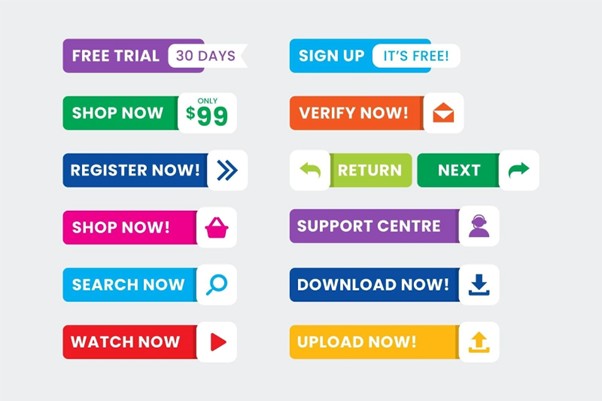
Your CTA button drives the final decision on your page. If it blends into the layout, users ignore it. Strong call-to-action optimization focuses on visibility and clarity first. High contrast colors help the button stand out instantly. This visual priority improves your Landing Page Experience and guides attention naturally.
CTA placement also plays a major role in conversions. Place one primary CTA above the fold for early action. Add another CTA after social proof or benefits. This timing supports different decision stages. Some users act fast, while others need reassurance first. A strong Landing Page Experience supports both behaviors without pressure.
Color psychology influences user response in subtle ways. Green often signals progress and safety. Orange creates energy and urgency. Blue builds trust and stability. Choose one bold color that contrasts clearly with the background.
Clear wording works better than generic labels. Strong conversion triggers often use verbs and outcomes.
High-Impact CTA Examples:
Keep the button text simple and direct. Make the action feel easy and rewarding.
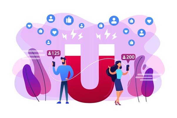
Trust drives decisions more than design alone. Visitors want proof before they share details or payment information. Social proof reduces doubt and supports faster decisions. Strong testimonials show real outcomes and honest feedback. This builds confidence inside your Landing Page Experience from the start.
Place trust elements close to your primary CTA button. Users often scan for reassurance before clicking. A short review snippet near the CTA can increase action. Trust badges and security seals also reduce risk concerns. Authority logos act as powerful credibility markers for first-time visitors.
Google also values trust under its E-E-A-T principles. Pages that show real experience and proof often perform better. A reliable Landing Page Experience includes visible signals of safety and results.
Mini-Case Example:
A software company added three short testimonials below its CTA. Each review highlighted a clear business result. They also displayed payment security badges beside the form. Within weeks, their form submissions increased by 18 percent.
Use real names, roles, and outcomes whenever possible. Specific proof feels stronger than generic praise.
Speed shapes first impressions before users read a single word. A slow page feels unreliable and frustrating. That delay weakens your Landing Page Experience within seconds. Google measures speed through Core Web Vitals signals. These metrics affect rankings and visibility.
Largest Contentful Paint should load within 2.5 seconds. Cumulative Layout Shift should stay below 0.1 for stability. When pages move suddenly, users lose trust quickly. Fast loading improves engagement and reduces friction. A strong Landing Page Experience keeps users focused on the offer, not the delay.
Research shows that even a one-second delay can raise bounce rate by around 20 percent. Higher bounce rates reduce conversions and campaign returns. Page speed optimization protects both ranking and revenue performance.
Better speed also improves your Landing Page Experience on mobile devices. Mobile users expect near-instant loading results.
Performance Benchmarks & Fixes:
Speed improvements create smoother journeys and stronger engagement signals.
Forms often decide whether users convert or leave. Long forms create hesitation and delay decisions. The field reduction principle keeps only essential information fields. Fewer fields lower effort and improve completion rates. This directly strengthens your Landing Page Experience and builds trust.
For example, imagine a form with six required fields. It asks for name, email, phone, company, budget, and job title. Many users stop halfway and abandon the page. Now reduce it to three simple fields. Ask only for name, email, and one key detail. Submissions often increase because effort feels smaller.
Smart form optimization also includes autofill support for faster entry. Progressive profiling allows you to collect extra details later. Strong error validation UX helps users fix mistakes easily. Clear messages prevent confusion and frustration. A smoother Landing Page Experience keeps users confident through every step.
Form Optimization Checklist:
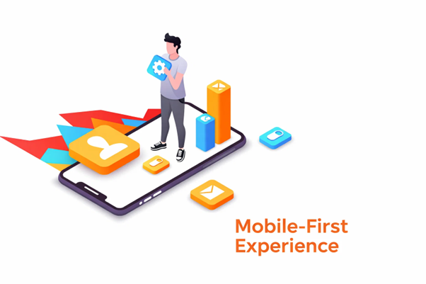
Most users now visit websites on mobile devices. Google also uses mobile-first indexing, meaning mobile performance affects rankings. A seamless mobile UX strengthens your Landing Page Experience and keeps visitors engaged. Pages must load quickly, adapt to screen size, and remain easy to navigate.
Designing for the thumb zone improves usability. Place buttons and links where thumbs naturally reach. Vertical spacing between elements prevents accidental taps and clutter. Mobile responsiveness ensures images, text, and CTAs scale correctly on all devices. A strong mobile Landing Page Experience reduces frustration and increases conversions.
Mobile Optimization Checklist:
Users rarely read every word on a page. Most follow a Z-pattern scanning behavior, moving eyes across the top, diagonally down, and then horizontally at the bottom. A strong visual hierarchy guides attention to the most important elements first. This improves the Landing Page Experience and ensures key messages are seen quickly.
Spacing between sections prevents clutter and improves readability. White space around images, text, and buttons helps users focus without feeling overwhelmed. Proper layout structure prioritizes elements like headlines, benefits, CTAs, and testimonials in a clear sequence. A well-organized Landing Page Experience reduces confusion and increases conversions.
Layout Example:
Small bits of text can make a big difference in conversions. Microcopy reassures visitors and reduces friction. Clear clarity messaging addresses doubts before they stop users from taking action. Strong Landing Page Experience uses microcopy to remove obstacles and build trust.
Examples like “No credit card required” or “Cancel anytime” reduce anxiety instantly. They signal risk reversal, making users feel safe. Microcopy leverages psychological triggers such as loss aversion and trust. Strategically placed microcopy near forms, CTAs, or checkout areas improves confidence and completion rates.
Microcopy Examples:
Internal and external links strengthen both SEO and user experience. Proper linking guides visitors through relevant content while reinforcing your Landing Page Experience. Internal links connect related pages, creating a clear site structure. This improves topical authority and helps search engines understand your content hierarchy.
Using contextual anchor text ensures that links make sense within the page. Descriptive anchors tell users what to expect, improving click-through rates.
For example, linking to a guide on “conversion rate optimization tips” from a CTA section adds value and encourages exploration. This naturally increases dwell time and reduces bounce rate, signaling engagement to search engines.
External outbound authority links also boost credibility. Referencing reputable tools, studies, or industry examples shows that your content is trustworthy.
For instance, linking to Google PageSpeed Insights or a Nielsen UX study reinforces the reliability of your advice. These references enrich the Landing Page Experience by giving users practical resources and actionable next steps.
Strategic linking also supports conversion pathways. Users who explore connected content better understand your value proposition and feel more confident completing actions. A well-linked page keeps visitors engaged longer while supporting rankings and overall user satisfaction.
Key Linking Practices:
Testing is essential to refine your Landing Page Experience. A/B testing and multivariate testing reveal what works best for your audience. Small changes in headlines, CTAs, images, or layouts can significantly affect conversions. A data-driven approach ensures every change improves performance instead of relying on guesswork.
Start by testing one element at a time.
For example, compare two headline versions: “Get Your Free SEO Audit Today” versus “Claim Your Free Website Audit in Minutes.”
Track metrics like clicks, form submissions, and engagement. This isolates which wording drives more action without confusing other variables. Multivariate testing allows you to test combinations of headlines, CTA colors, and images simultaneously for deeper insights.
Analyzing conversion data helps identify patterns. A/B tests highlight user preferences, while continuous experimentation builds incremental improvements. Each cycle informs the next change, creating a feedback loop that strengthens your Landing Page Experience. Over time, even small optimizations accumulate into significantly higher conversions and lower bounce rates.
Example Test Scenario:
A structured testing routine ensures your page evolves with audience behavior. Continuous optimization makes your Landing Page Experience more persuasive, reliable, and conversion-focused over time.
While many optimization techniques can be handled in-house, some attributes of a good Landing Page Experience may require professional expertise. Experts can help when advanced design, speed optimization, or conversion rate improvements are needed. For example, complex A/B testing setups, Core Web Vitals issues, or mobile UX refinements often benefit from specialized tools and experience.
Professionals can also craft persuasive copy, design high-impact CTAs, and implement trust signals strategically. They ensure the layout, visual hierarchy, and internal linking structure are optimized for both users and search engines. Partnering with experts saves time, reduces errors, and maximizes conversions while keeping your page aligned with best practices.
Knowing when to seek help ensures that each attribute of your Landing Page Experience performs at its highest potential, creating a page that ranks well and consistently converts visitors into leads or customers.
Boost your Landing Page Experience today. Book your demo now and see how expert insights and AI tools can improve conversions and rankings.
A poorly optimized landing page can hurt both conversions and rankings. Avoid these common mistakes to protect your Landing Page Experience and keep users engaged.
By avoiding these mistakes, you create a cleaner, faster, and more persuasive Landing Page Experience. Each improvement helps retain visitors and increases the likelihood of achieving your conversion goals.
A strong Landing Page Experience combines speed, clarity, trust, and focus. Clear headlines, benefit-driven content, and compelling CTAs guide users effortlessly toward one goal. Mobile optimization, proper visual hierarchy, and fast loading further enhance user engagement and reduce friction.
Balancing ranking factors with conversion-focused elements ensures your page performs well in search results while generating real business results. Trust signals, social proof, and strategic linking support both credibility and visibility.
AI-powered tools & Services play a vital role by analyzing user behavior, optimizing headlines and CTAs, and suggesting layout improvements based on real-time data. These tools help automate testing, identify friction points, and enhance overall Landing Page Experience efficiently.
Remember, optimization is an ongoing process. Regularly review metrics, test new variations, and refine design elements to maintain high performance. By combining AI insights with proven strategies, your Landing Page Experience will not only rank better but also convert more visitors effectively.
An effective landing page clearly communicates its value, has a strong call-to-action, uses engaging visuals, and minimizes distractions. All elements guide the visitor toward completing the desired action.
Fast-loading pages reduce bounce rates and keep visitors engaged. Slow pages frustrate users and can lower your search rankings, directly affecting conversions.
Most users access websites via mobile devices. A mobile-first design ensures your page looks great, loads quickly, and functions smoothly on all screen sizes, improving usability and engagement.
Understand what users are looking for when they search. Provide relevant content, answer their questions, and make your value proposition clear to meet their expectations and keep them engaged.
Start using our A/B test platform now and unlock the hidden potential of your website traffic. Your success begins with giving users the personalized experiences they want.
Start Your Free Trial
Empowering businesses to optimize their conversion funnels with AI-driven insights and automation. Turn traffic into sales with our advanced attribution platform.
Trusted by Customers


©CausalFunnel Inc. All rights reserved.