
")


Free Funnel Audit
Convert more customers today!
SEO
10 mins read

SEO
10 mins read
Landing page design best practices help you turn visitors into leads. A strong page guides users toward one clear action. Good design supports your overall landing page strategy. It also answers how to design a landing page correctly.
Many pages fail because they confuse visitors. They add too many offers and weak messages. However, great pages stay simple and focused. They remove anything that distracts from action.
Your goal is not just traffic, but conversion and real business growth, which starts with structure, clarity, and smart design choices.
If you want expert guidance and real growth support, visit CausalFunnel to optimize your landing pages with AI-driven experimentation.
Landing page design is more than colors and layout. It combines structure, psychology, and user experience, shapes how people see your offer, and influences how fast they take action.
When learning how to design a landing page, focus on clarity first. Every element should support a single goal. That goal might be signups, downloads, or purchases.
Good design includes these core elements:
Each element works together to increase conversion rate optimization. When one element fails, conversions drop quickly.
Landing page design best practices focus on user behavior. They guide the eye and reduce confusion. They also create flow from the headline to the CTA button.
Strong design also lowers bounce rate. Visitors stay longer when content feels clear and helpful.

Many people jump into design too quickly. That approach often leads to weak results. Landing page strategy must come before visual design.
A clear Landing page strategy answers three important questions:
Without these answers, design decisions feel random.
Every landing page needs one clear goal. Too many goals reduce focus and lower performance.
Common conversion goals include:
Choose one main action only. Design everything around that action.
Clear goals improve your conversion funnel. They also make landing page optimization easier later.
Not all visitors behave the same way. Traffic source affects user intent and expectations.
Paid ads usually bring cold audiences. Organic traffic often includes warmer visitors.
Your page must match that intent perfectly. This is called a message match.
For example:
Strong alignment lowers bounce rate fast. It also improves the click-through rate significantly.
Landing page strategy should always consider traffic intent. Ignoring intent creates confusion and weak trust.
Your value proposition explains why you matter. It tells users what they gain.
Avoid talking only about features. Focus on outcomes and benefits instead.
Weak message:
“Our tool includes advanced analytics features.”
Strong message:
“See clear growth insights in minutes.”
When learning how to design a landing page, start with value clarity. Design supports the message, not the opposite.
Now, let us break down the process clearly. This section explains how to design a landing page properly.
Follow these steps for the best results.
The hero section appears above the fold. It creates the first impression instantly.
A strong hero includes:
Your headline must grab attention quickly. It should highlight a clear result.
Example formula:
“Get [desired result] without [main problem].”
Attention-grabbing headlines improve engagement fast. They also strengthen the landing page layout structure.
A good landing page layout guides the eye naturally. It follows visual hierarchy principles.
Important layout rules include:
Simple layouts improve mobile-first design performance. They also reduce cognitive overload for users.
Landing page design best practices always favor simplicity. Complex pages often confuse visitors.
Your call to action drives conversions directly. CTA button design must stand out visually.
Follow these guidelines:
Strong call to action best practices improve results fast. Avoid vague phrases like “Submit” or “Click Here.”
Use specific action words instead. Examples include “Start Free Trial” or “Get My Guide.”
Clear CTAs support landing page optimization strongly.
Trust signals reduce hesitation and fear. Visitors need proof before taking action.
Effective social proof includes:
Place trust signals near your CTA. That placement increases the landing page conversion rate.
High-converting landing pages always include proof. People trust other users more than marketing claims.
If you want expert help adding trust elements, explore CausalFunnel. Our team builds performance-focused pages backed by analytics insights.
Element | Weak Design | Strong Design |
Headline | Vague benefit | Clear outcome promise |
Layout | Cluttered sections | Clean visual hierarchy |
CTA | Generic text | Action-driven text |
Trust | No proof | Testimonials and logos |
Goal | Multiple actions | Single-focused conversion |
This table highlights core landing page design best practices clearly. Strong pages remove friction and guide decisions smoothly.
Now we move into advanced landing page design best practices. These tactics improve performance after the basics are strong. They support better landing page optimization and stronger results.
Message match builds trust instantly. It keeps your promise consistent across touchpoints. If your ad mentions a free checklist, repeat it clearly. Do not change wording or offer details.
A strong message match improves user intent alignment and lowers bounce rate significantly.
Check these elements carefully:
Small differences create confusion quickly. Consistency builds confidence and clarity.
Landing pages should focus on one action. Extra links reduce attention and split decisions. Remove top navigation menus when possible, and avoid adding unrelated footer links.
A focused page increases click-through rate naturally. It keeps users moving toward your CTA button.
Landing page design best practices often recommend fewer exits. Less choice leads to stronger action rates.
Directional cues help users focus faster. They subtly guide the eye toward important elements.
Examples include:
These small design signals influence behavior quietly and strengthen the landing page layout flow.
Directional cues improve visual hierarchy effectively. They support how to design a landing page strategically.
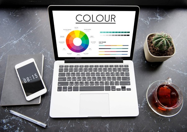
Colors influence emotions and decisions. Your CTA button color should contrast clearly. Avoid blending CTA buttons with background colors. High contrast improves visibility instantly.
Use calm colors for trust-focused offers, and bold colors for urgency-driven promotions.
Landing page optimization often starts with color testing. Even small changes can improve conversion rate optimization.
Users scan before they read fully. Your content must support fast scanning behavior.
Use:
Avoid long blocks of dense text and break ideas into digestible sections. Strong readability supports mobile-first design performance. It also increases time on page naturally.
Most users browse on mobile devices today. Therefore, your page must feel smooth on smaller screens.
Follow these mobile-first design rules:
Mobile speed affects landing page conversion rate strongly. Slow pages increase drop-offs quickly. Test your page on multiple devices, and check both speed and visual clarity.
If you need help optimizing performance, visit CausalFunnel. Our experts focus on data-driven landing page optimization.
Page load speed impacts conversions directly. Even small delays reduce results significantly.
Common causes of slow pages include:
Focus on improving Core Web Vitals scores. Fast pages improve both users and search engines.
Landing page design best practices always include speed checks. Design should never sacrifice performance.
Microcopy and urgency work together to guide user action. Microcopy removes small doubts before visitors click your CTA. It answers hidden questions, like:
Urgency motivates users to act faster. Scarcity increases perceived value, like:
Do not fake urgency, as users notice manipulation quickly. Genuine urgency improves click-through rate without harming trust. Combined, microcopy and real urgency reduce friction and increase conversions naturally. Place these near your forms and CTA buttons for maximum effect.
FAQ sections answer common concerns clearly. They reduce friction before users scroll away.
Common FAQ topics include:
Adding FAQs improves landing page optimization depth. It also supports better conversion funnel performance.
This approach strengthens how to design a landing page thoughtfully.
Optimization Area | Why It Matters | Expected Result |
Message Match | Builds trust instantly | Lower bounce rate |
Speed Improvement | Reduces user frustration | Higher conversions |
CTA Contrast | Improves visibility | More clicks |
Microcopy | Removes doubt | Better form completion |
Mobile Design | Matches user behavior | Increased engagement |
This table summarizes advanced landing page design best practices. Each factor directly influences user behavior and action.
A/B testing compares two versions of a page. It helps identify what performs better. Test one element at a time. Do not test too many changes together.
Common elements to test include:
A/B testing improves landing page conversion rate steadily. It removes guesswork from design decisions.
Landing page strategy should always include testing cycles. Continuous testing leads to long-term growth.
If you want expert testing support, explore CausalFunnel. Our team uses analytics and heatmaps for performance insights.
Also Read: Google Ads A/B Testing

Even strong pages can fail with small mistakes. These issues often reduce conversions quickly.
Multiple CTAs create confusion and hesitation. Visitors struggle to choose the right action. Stick to one main goal per page. Remove secondary actions that distract users.
Focused pages improve the landing page conversion rate faster.
Your headline shapes first impressions instantly. A vague headline lowers engagement immediately. Avoid phrases like “Welcome to Our Website.” Instead, promise a clear and specific outcome.
Strong headlines support landing page design best practices effectively.
Long forms increase friction and frustration. Users avoid filling unnecessary fields. Ask only for essential information. You can collect more details later.
Short forms improve form optimization significantly.
Many users browse on smartphones daily. Poor mobile layout drives visitors away quickly. Check font size, spacing, and button visibility. Ensure tap targets feel comfortable and accessible.
Mobile-first design strengthens your conversion funnel naturally.
Slow pages damage user trust instantly. Visitors rarely wait for heavy pages to load. Compress images and reduce extra scripts. Test performance is often using reliable tools.
Fast load speed supports landing page optimization strongly.
If visitors feel confused, they leave quickly. Your value must appear within seconds.
Answer these questions clearly:
Clarity improves bounce rate and engagement.
Studying examples helps improve practical understanding. Let us review three common landing page types:
A strong SaaS page focuses on ease and speed. It highlights benefits before technical features.
Key elements often include:
This structure supports high-converting landing pages. It removes friction from the signup process.
Landing page design best practices suggest showing product screenshots. Visual proof increases credibility and trust. Platforms like CausalFunnel demonstrate how combining behavioral data with conversion science can significantly improve trial signups and overall funnel performance.
E-commerce pages focus on urgency and value. They highlight discounts clearly and quickly.
Strong ecommerce landing page layout often includes:
Scarcity tactics improve click-through rate effectively. However, honesty builds long-term customer trust.
Lead magnet pages aim to capture email addresses. They focus on explaining the benefits of the resource.
Strong elements include:
This approach improves conversion rate optimization directly. It supports how to design a landing page with clarity.

Use this checklist before launching any page. It helps confirm alignment with landing page design best practices.
These steps support a strong Landing page strategy foundation.
Design clarity improves user experience greatly.
Content should guide users naturally toward action.
Technical strength supports long-term landing page optimization.
Continuous testing improves the landing page conversion rate steadily.
If you want help running advanced testing and analytics, explore CausalFunnel. Our specialists use heatmaps and behavioral insights to drive measurable growth.
Also Read: How to Optimize Landing Pages for SEO to Increase Revenue with CausalFunnel
Landing page design best practices focus on clarity and action. Strong pages combine strategy, psychology, and simple design.
Landing page strategy must guide every decision. Design should always support a single clear goal. Learning how to design a landing page takes practice and testing. Small improvements often create large growth results.
Avoid distractions and unnecessary complexity. Focus on value, trust, and smooth user flow.
When strategy and design work together, conversions rise steadily. That is the true goal of every landing page.
The most important landing page design best practices focus on clarity and conversion. A strong page has one clear goal and one main call to action.
Key elements include:
Good design removes distractions and confusion. It guides users smoothly toward one action. When structure and strategy work together, conversions improve steadily.
A strong landing page strategy starts with audience research. You must know who you are targeting clearly.
Before designing, answer these questions:
Define one conversion goal only, as multiple goals reduce focus and performance. Align your message with traffic intent. Paid visitors and organic visitors often behave differently. Lastly, a clear strategy makes it easier to design effectively.
To learn how to design a landing page, start with structure. Create a strong hero section above the fold.
Follow this simple process:
A good landing page layout improves visual flow. Mobile-first design also improves user experience. Test your page regularly using A/B testing. Small changes can improve the conversion rate significantly.
Many landing pages fail due to simple mistakes. These mistakes increase friction and confusion.
Common issues include:
Each problem affects landing page optimization negatively. Removing distractions often increases performance quickly. Strong landing page design best practices focus on simplicity.
Landing page optimization should continue even after publishing your page. Do not treat launch as the final step.
Start with these actions:
Landing page strategy should include continuous testing cycles. Data helps you improve results without guessing. Consistent testing and refinement drive long-term growth.
Start using our A/B test platform now and unlock the hidden potential of your website traffic. Your success begins with giving users the personalized experiences they want.
Start Your Free Trial
Empowering businesses to optimize their conversion funnels with AI-driven insights and automation. Turn traffic into sales with our advanced attribution platform.
Trusted by Customers


©CausalFunnel Inc. All rights reserved.