



Free Funnel Audit
Convert more customers today!
SEO
10 mins read

SEO
10 mins read
Have you ever come across a website or a product that felt confused, frustrated, or stuck while using them. We all must’ve been there at least once.
When you come across these kinds of websites and products, it makes simple tasks feel hard and time-consuming. Users may also leave without completing their goal which eventually leads to higher drop-offs, poor engagement, and lost trust.
More than 90% of users decide whether to stay on a website or not based on their impression of their website. Also, more than 35% of users stop engaging with a website if the interface or the website design is unattractive.
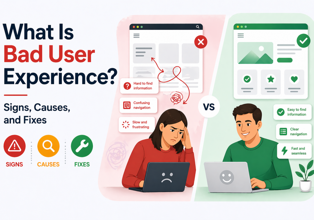
In this guide, you will learn the key signs, common causes, and practical fixes to improve user experience.
Users have a bad online experience when they cannot do what they came for on a website or app. This is because the design, content, or flow does not match what users expect, further creating confusion and slowing them down.
Websites with a good experience, allow users to move smoothly and find what they need quickly. Websites with bad user experience leaves visitors feeling lost, annoyed, or overwhelmed.
Think about a website where you cannot find the menu easily. It can also be an app that takes too long to load each screen. Even small issues can make users leave, and over time, these problems reduce engagement and hurt business growth.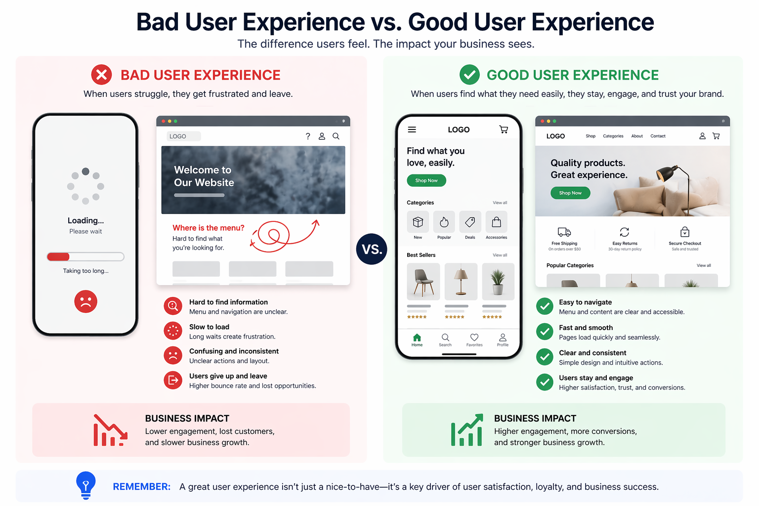
Here’s a simple way to see it:
Have you ever searched for pricing but could not find it? That is a common UX failure that breaks trust fast.
Bad user experience isn’t just about the overall experience users face, but it’s about how the users feel from start to finish. Bad UX can show up in small, frustrating ways.
These are not very evident in the beginning if you don’t know what you’re looking for. But as you keep navigating, it builds quickly, further spoiling your entire online experience.
Also, if you know what you want from a website or an app, these are easy to spot. It shows up in small moments where users feel confused or delayed. While these issues may seem minor, they quickly add up and push users away.
Some common bad user experience examples include:
Let’s take an example of the time you’re filling a long form. Just when you’re entered all the details, the form suddenly rests and clicking a button does nothing. This interrupts the user journey and creates frustration. Over time, users lose patience and stop returning.
Another good example to understand this is to imagine reading a blog full of popups. Every few seconds, something blocks your screen. You lose focus and exit frustrated.
These small issues create a poor experience over time.
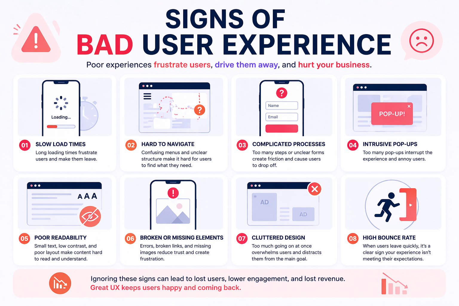
Bad user experience does not always feel obvious at first glance. But if you look at how the users are behaving when engaging on your website and the key metrics, the signs become clear.
These signals show where users struggle, drop off, or lose interest. When you are tracking these patterns, it helps you find and fix problems early.
Conversion rate shows how many users take action. This includes signups, purchases, or clicks. If traffic is high but conversions are low, something is wrong. Users may not trust the page or understand the offer.
For example, users may start filling a signup form but leave halfway. This often means the process feels long or complicated. A poor flow directly affects business results.
Bounce rate measures how many users leave after viewing one page. A high rate often signals poor first impressions where users are not able to find what they expected quickly.
This often happens when content feels irrelevant or the page loading speed is slow. Users click, wait, and then leave quickly. That is a clear sign of bad user experience.
Engagement shows how users interact with your content or features. Low clicks, short session time, and no interaction are warning signs.
Users may scroll quickly without reading anything meaningful. This often means the content or layout does not hold attention. A lack of clarity can reduce engagement fast.
Users often tell you what is wrong through feedback. You just need to listen carefully. Complaints about difficulty, confusion, or frustration are clear red flags.
Reviews often highlight repeated problems that many users face. Ignoring this feedback can make issues worse over time. Listening helps improve the experience faster.
Comments like “hard to use” are direct signals. These insights help you fix real problems.
Retention shows how many users return after their first visit. If users do not come back, the experience did not meet expectations.
They may have found the product hard to use or not useful enough. A poor first impression can reduce long-term loyalty.
Abandonment happens when users leave before completing a process. This is common in checkout flows or long forms.
Users may feel overwhelmed by too many steps or unclear instructions. Even small friction points can cause users to quit midway.
Exit rate shows where users leave your site. If important pages have high exit rates, there is likely a problem.
For example, users may leave on a pricing page due to unclear details, or they may exit a product page due to lack of trust signals.
When users struggle, they often reach out for help. A rise in support requests shows that users cannot solve problems on their own.
Common issues include login trouble or unclear navigation. This increases workload and signals deeper usability problems.
Misclicks happen when users click the wrong element by mistake. Rage clicks occur when users click repeatedly out of frustration.
These behaviors show that users cannot interact smoothly with the interface. Poor button placement or unclear design often causes this issue.
Users may scroll more than needed when they cannot find what they need. This often means content is poorly structured or hidden.
If users keep searching without success, they feel confused and tired. This leads to drop-offs and lower satisfaction.
Bad user experience usually does not happen by accident. It often comes from poor design choices or lack of planning. When teams ignore user needs, small issues grow into bigger problems. But if you’re able to identify the root cause, it can help you fix the experience faster.
Here are the most common reasons behind a bad user experience:
A confusing navigation is when users cannot find what they need quickly and easily. Menus may be unclear or poorly organized, and too many options can overwhelm users and slow decisions. Try to keep it simple as that works better for most users.
Pages that take too long create instant frustration for users. Even a few seconds delay can increase drop-offs. Users expect fast and smooth performance every time and slow speed often comes from heavy images or poor optimization.
Many users access websites on their phones today. If the design does not adjust well, users struggle to interact. Text may look too small or buttons too close together. This makes tasks harder and reduces usability.
Not all users interact with content in the same way. Some users need clear contrast or simple navigation. Ignoring accessibility limits who can use your product, further creating a frustrating experience for many users.
Too many elements on one screen can confuse users. When everything looks important, nothing stands out clearly, and users struggle to focus on the next step. A clean design helps guide user actions better.
Design decisions should be based on real user needs. Without research, teams rely on assumptions that may be wrong. This leads to features that users do not find helpful. Therefore, it is important that you understand your users and give them an experience they want.
Frequent popups break the user flow and create irritation. Users may feel forced to take actions they do not want which reduces trust and increases exits quickly. A smooth experience should feel natural and uninterrupted.
Understanding real situations makes it easier to spot problems. These examples show how small issues can create big frustration. Each case highlights what went wrong and what users expected instead.
Imagine you’re visiting a website where the menu has unclear labels. You click multiple options but still cannot find the right page. This wastes time and increases frustration quickly.
Similarly, users expect simple and clear navigation that guides them easily. When labels do not match user intent, they feel lost. This is one of the most common bad user experience examples seen today.
A user clicks a link and waits several seconds for the page. The delay feels longer than expected and breaks the flow. Many users leave before the page even loads fully.
Users expect fast performance and smooth transitions. Slow speed creates impatience and reduces trust in the product. Over time, this leads to higher bounce rates and lost users.
A website looks fine on desktop but fails on mobile screens. Text overlaps, and buttons are hard to tap correctly. This is when users struggle to complete simple actions on their phone.
Users expect a consistent experience across all devices. When mobile design is ignored, usability drops sharply. This can impact a large portion of your audience.
A user lands on a page and sees multiple popups quickly. One asks for email, another shows a discount, and another blocks content which feels overwhelming and annoying.
Users expect a smooth browsing experience without interruptions. If there are too many popups, it creates pressure and breaks focus, which often leads to quick exits and lower engagement.
These bad user experience examples show how small issues create big problems.
Bad user experience does not just frustrate users. It directly affects your business results and long-term growth. When users struggle, they leave faster and rarely come back. This creates a gap between effort and actual outcomes.
Here is what usually happens:
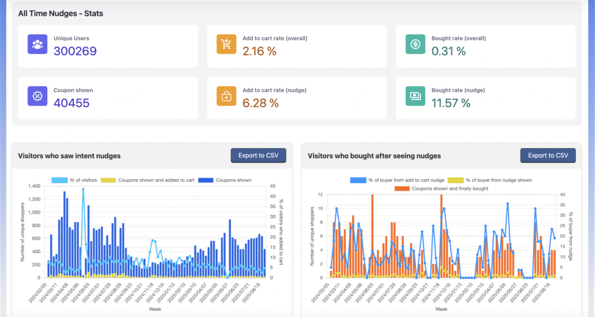
Tools like CausalFunnel help track these issues by showing where users drop off in real time. Their landing page optimizer makes sure they are optimized in a way that users like to interact with which increases retention and revenue in the long term.
Fixing bad user experience starts with understanding real user behavior. You need to identify where users struggle and remove friction step by step. Small improvements can create a big impact over time.
Here are simple ways to improve:
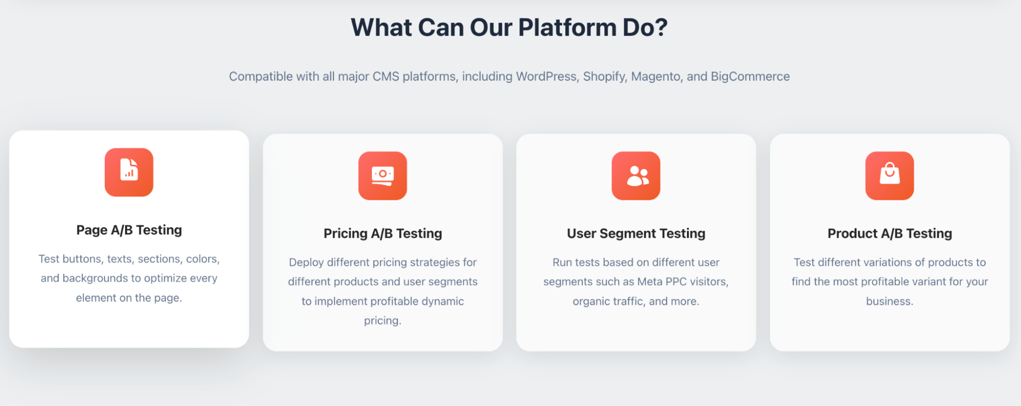
Many teams use CausalFunnel to improve conversions faster by running tests and diagnosing the issue where the website lacks. They build strategies around their reading and make sure the business performs well.
Bad UX | Good UX |
Confusing navigation | Clear navigation |
Slow loading | Fast performance |
Cluttered design | Clean layout |
Hard to read text | Easy readability |
Too many popups | Minimal interruptions |
Poor mobile layout | Mobile-friendly design |
Good UX is not about fancy design, but about making things simple and clear. If your website is not able to offer good user experience to your visitors, it can quietly damage your product and business over time.
Many users may not even complain about the bad experience, but they will leave without hesitation. By understanding the signs, you can detect problems early. Identifying the causes helps you fix issues at the root.
You should also remember that improving user experience is not a one-time task. It requires continuous testing, learning, and improvement. When you focus on users, better results follow naturally which can lead the users to have a simple and smooth experience further building trust, engagement, and long-term growth.
Bad user experience is when users struggle to complete tasks easily on a website or while looking at a product because the process feels confusing or slow.
Some common examples of a bad user experience are slow websites, confusing menus, and too many popups are common examples.
`It usually comes from poor design, slow speed, and lack of user testing.
Look at metrics like bounce rate, conversions, and user feedback.
Start using our A/B test platform now and unlock the hidden potential of your website traffic. Your success begins with giving users the personalized experiences they want.
Start Your Free Trial

Empowering businesses to optimize their conversion funnels with AI-driven insights and automation. Turn traffic into sales with our advanced attribution platform.
Trusted by Customers


©CausalFunnel Inc. All rights reserved.