
")


Free Funnel Audit
Convert more customers today!
SEO
10 mins read

SEO
10 mins read
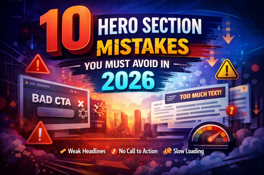
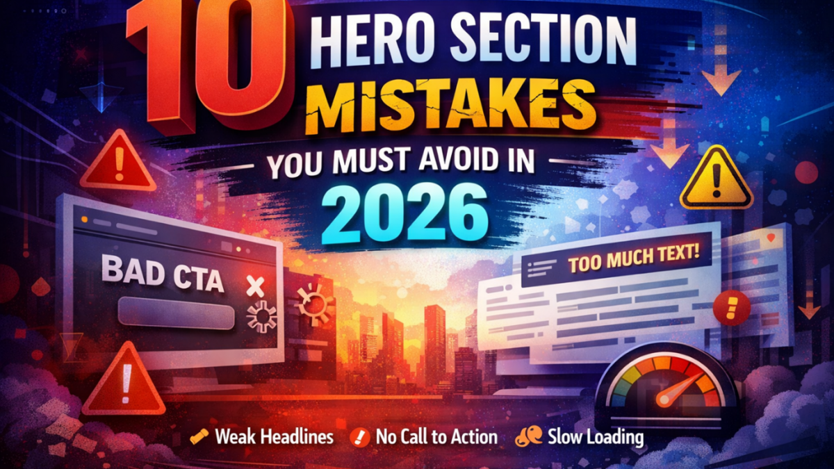
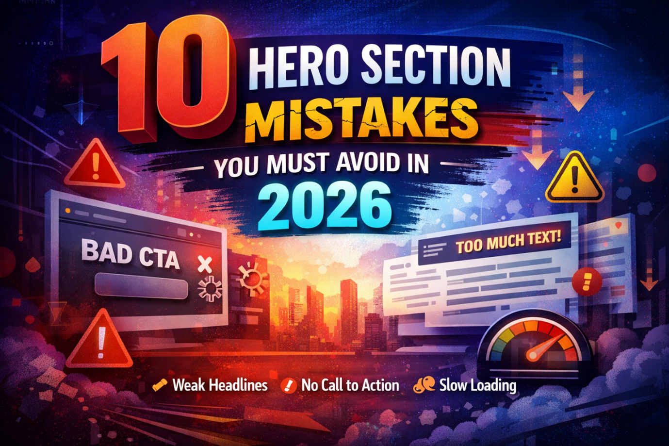
Your hero section is the first thing users see on your website. It decides if they stay or leave within seconds. Most visitors scan your page very quickly after landing. If your message is unclear, they will leave right away.
A strong hero section builds trust and grabs attention fast. It also guides users toward the next action clearly.
Many websites fail because their hero section lacks clarity. Some focus too much on design and ignore user intent. Others overload the space with too much information at once. This creates confusion and lowers engagement across the page.
The goal of your hero section is simple and very important. Make users understand your offer in under five seconds.
A well-designed hero section improves user experience and conversions. It also supports better results from conversion rate optimization efforts. In this guide, you will learn ten common mistakes. These mistakes often reduce performance and hurt your website growth.
Fixing them can improve both engagement and conversions quickly.
A hero section is the top section of a webpage. It appears right after the page loads on screen. It’s your first chance to make an impression and introduce your brand, product, or service quickly. It also tells users what action to take next.
A typical hero section includes these core elements:
This section works as your first impression online. It helps users decide if your page is worth exploring further. A strong hero section design keeps users engaged longer. A weak one can increase bounce rates quickly.
Many websites struggle because of simple design mistakes. These mistakes reduce clarity and confuse users immediately. A poor hero section often leads to lower engagement rates. It also affects conversions and overall user experience. The good part is these mistakes are easy to fix. You just need to understand what works and what fails.
Let us now break down the most common mistakes clearly.
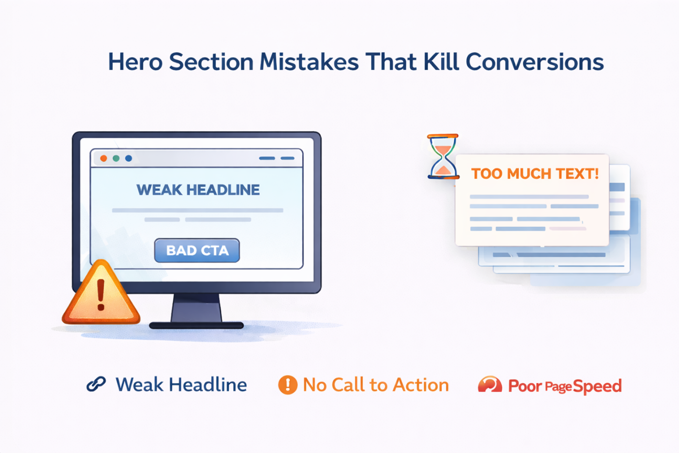
Your headline is the most important part of your hero section. It tells users what your website is about instantly. A vague headline creates confusion and weak first impressions. Users may leave if they do not understand your message quickly.
Many websites use generic phrases that say very little. Examples include “Welcome to our website” or “We deliver quality.” These lines do not explain value or solve any user problem.
A strong headline answers one key question quickly. “What will I get from this website?”
Your hero section must guide users toward a clear action. Without a CTA, users do not know what to do next. Some websites hide their CTA or make it hard to notice. Others use weak wording that fails to create urgency. This often leads to missed opportunities and lower conversions, especially on pages designed to drive a specific outcome.
Good CTA examples include:
A well-optimized CTA is a core part of effective landing page optimization. It helps guide users smoothly toward conversion by reducing confusion and reinforcing intent. Your CTA should clearly reflect your main goal and support the overall purpose of your landing page hero section, creating a focused and seamless user journey.
Users do not read long blocks of text immediately. They scan the screen and look for key information quickly. Too much text creates overload and reduces clarity. It also makes your design look cluttered and confusing.
Your hero section should communicate one clear message only.
Follow the five-second clarity rule always. Users should understand your message within five seconds.
This improves your above the fold design significantly.
Visuals play a key role in your hero section design. They support your message and create emotional connection. Many websites use random stock images without purpose. These visuals do not match the brand or message clearly.
This creates confusion and weakens your overall impact.
A strong visual should support your headline naturally. It should not distract users from the main message.
Heavy images and videos can slow down your page speed. Slow pages create frustration and increase bounce rates. Users expect fast loading websites in today’s digital world. Even a small delay can impact user experience negatively.
This issue is common in many website hero section designs.
You can also use lazy loading for better performance. Always test your page speed regularly for improvements.
Most users now browse websites on mobile devices daily. Your hero section must work well on smaller screens. Many designs look great on desktop but fail on mobile screens. Text becomes hard to read and buttons become difficult to tap.
This creates a poor experience and frustrates users quickly.
Also check how your layout stacks on mobile screens. Your headline, visual, and CTA should stay clearly visible. Mobile optimization is no longer optional in modern design. It is a core part of effective hero section design today.
Visual hierarchy helps users understand what to focus on first. Without it, your hero section feels messy and confusing. Many websites place too many elements at equal importance levels. This makes it hard for users to find the main message. A strong layout guides users from headline to CTA smoothly.
You should also limit the number of competing elements. Focus on one clear message and one main action.
This improves clarity and makes your design more effective.
Your hero section must match what users expect to see. If it does not, they will leave your page quickly. Many websites focus only on branding or design trends. They forget to address the actual needs of their audience.
This creates a gap between user intent and what information your content provides.
For example, a service page should highlight clear benefits. A product page should show value and key features quickly. Avoid making your hero section too vague or abstract. Clarity always performs better than creativity alone.
Mistake #9 – No Trust Signals (Social Proof Missing)
Users need trust before they take any action online. If your hero section lacks trust signals, users may hesitate. Many websites forget to include proof of credibility upfront. This reduces confidence and increases doubt in users’ minds.
Trust signals help users feel safe and confident quickly.
Keep these elements subtle and not overwhelming. They should support your message, not distract from it.
Even small trust signals can make a big difference.
Many websites create a hero section once and forget it. This approach limits growth and performance improvements. User behavior changes over time and trends also evolve. Your hero section should adapt based on real data insights. Testing helps you understand what works best for users.
Even small changes can improve results significantly. Always review and update your hero section regularly.
This is a key part of conversion rate optimization strategy.
Use this checklist to improve your hero section quickly.
These points cover the most important fixes you need.
If you answer “no” to any question, take action soon. Fixing these issues can improve your results quickly.
Many businesses try to fix their hero section using guesswork alone. This approach often leads to slow progress and missed opportunities. Working with professionals or advanced tools can speed up results. They use real data instead of assumptions to guide decisions.
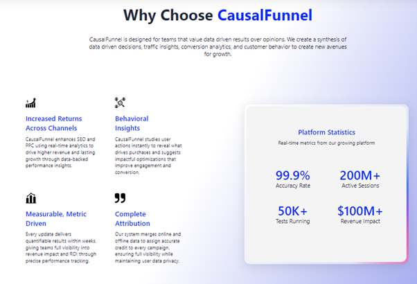
One example is CausalFunnel, which focuses on conversion optimization. It helps improve your hero section using data-driven insights.
Test what actually works instead of guessing:
Personalize content for different visitors:
Understand how users interact with your hero section:
Improve conversions with data-backed decisions:
Automate ongoing improvements:
Your hero section is too important to rely on guesswork. Small changes can create large improvements in conversions. Using the right tools or expert support helps you move faster. It also ensures your decisions are based on real user behavior. This approach leads to smarter design and better business results.
Looking at real examples helps you understand what works better. You can learn faster by studying strong hero section designs. Below are simple examples with clear breakdowns.
This type of website focuses on solving a clear problem. The hero section explains the service in simple words.
What works well here:
This approach builds trust and clarity very quickly. Users understand the offer without any confusion.
Product websites focus on features and user benefits clearly. The hero section highlights the product’s main value fast.
What works well here:
This type of layout supports faster decision-making. Users can quickly see what they will get.
SaaS websites need to explain value very quickly. Their hero section focuses on clarity and simplicity.
What works well here:
This builds confidence and reduces user hesitation. It also improves sign-up rates significantly.
Your hero section plays a key role in user experience. It shapes the first impression of your website. Even small mistakes can reduce your conversion results. Fixing them can improve engagement and user trust quickly.
Focus on clarity, simplicity, and strong messaging always. Make sure your design supports your main goal clearly. Review your hero section regularly and keep improving it. Test different ideas and track what works best.
A well-optimized hero section can drive better results. It can turn visitors into leads, and leads into customers.
A bad hero section lacks clarity and direction. Users cannot understand the message quickly. It often includes too much text or weak visuals. It may also miss a clear call-to-action button. These issues reduce engagement and increase bounce rates.
Start by simplifying your message and layout. Focus on one clear goal and one main action. Make sure your headline explains value clearly. Also improve your CTA visibility and design. Small changes can create noticeable improvements fast.
Not every page needs a hero section at the top. It works best on homepages and landing pages. These pages need strong first impressions for users. Other pages may focus more on detailed content instead. Use hero sections where clarity and impact matter most.
A hero section should stay short and focused. It should not take too much space on screen. Users should understand your message within seconds. Avoid adding too many elements or long text blocks. Keep it clean, simple, and easy to scan quickly.
Start using our A/B test platform now and unlock the hidden potential of your website traffic. Your success begins with giving users the personalized experiences they want.
Start Your Free Trial
Empowering businesses to optimize their conversion funnels with AI-driven insights and automation. Turn traffic into sales with our advanced attribution platform.
Trusted by Customers


©CausalFunnel Inc. All rights reserved.