Landing pages have become the linchpin of modern digital marketing. Whether running PPC ads, promoting webinars, or marketing SaaS products, your landing page is key to success. It’s where you turn interested visitors into leads and customers.
The problem is that not all landing pages are created equal, many look beautiful but struggle to convert. Research by WordStream shows that the median landing‑page conversion rate is around 2.35 %, while marketers in the top 25th percentile achieve conversion rates of 5.31 % or higher.
This guide goes into more details into what makes a landing page convert, examines real‑world examples of high‑performing pages and provides a comprehensive framework to craft your own high converting landing pages.
Definition: A landing page is a standalone page created specifically for a marketing or advertising campaign. Unlike a homepage which encourages exploration a landing page is designed with a single objective or call‑to‑action (CTA), whether that’s capturing an email address, registering for a webinar or making a purchase.
This guide is structured to give you both strategic insights and best landing page examples. It begins with an exploration of the elements common to high‑converting pages. Then it offers best practices and deep profiles of 15 successful landing pages across industries.
Later sections discuss types of landing pages, SEO optimisation, performance measurement, common mistakes and a practical checklist. By the end, you’ll understand not just what to do but why certain strategies work.
Understanding high converting landing pages
The Economics of Conversion
Landing pages exist at the intersection of traffic and value. You can spend heavily on traffic acquisition through Google Ads, Facebook Ads, influencer campaigns or email marketing but unless your landing page converts visitors into leads or customers, you’re wasting money.
A difference of a few percentage points in conversion rate can dramatically affect return on investment (ROI). Consider two companies each paying $1 per click for 1 000 visitors. Company A has a conversion rate of 2 % (about average) and generates 20 leads at $50 per lead.
Company B has a 10 % conversion rate (achievable with a well‑designed page), producing 100 leads at $10 per lead. The cost per acquisition is five times lower for Company B.
What Sets High‑Converting Pages Apart
While there’s no universal formula, analysis of hundreds of high‑performing pages reveals several common traits:
- Clear and compelling value proposition. Successful pages convey what the visitor will receive and why it matters. For example, HubSpot’s Social Media Trends Report page immediately states, “Social Media Trends Report + Expert Panel,” and even includes the year “2025” to signal the report’s freshness. This clarity reassures visitors that they’ll get timely insights.
- Benefit‑driven copy. High‑converting pages focus on benefits rather than features. The HubSpot Financial Planning Templates landing page uses copy like “organize, analyze, and plan your personal and business finances with ease” instead of merely listing file formats. Benefits answer the customer’s question: “What’s in it for me?”
- Simplified layouts. Clean design helps visitors process information quickly and reduces friction. Airbnb’s landing page uses large photos and category tags to let visitors explore vacation rentals easily. White space and clear hierarchy guide the eye to the CTA.
- Strong social proof. Testimonials, reviews, customer counts, media logos or endorsements build trust. Rover’s landing page includes testimonials and emphasises its “Rover Guarantee,” helping pet owners feel safe. Showcasing big brands or well‑known clients can also add credibility.
- Focused call‑to‑action. High‑converting pages feature a single, action‑oriented CTA. Mortgage provider ooba places a form at the top of the page with a descriptive button explaining what happens next. Avoid generic buttons like “Submit”; use phrases like “Get my free quote” or “Start my trial.”
- Visitor Incentives: Offering personalized offers to convert anonymous visitors can be a powerful persuasive tactic. This creates a sense of urgency and value, encouraging immediate action.
- Ad Campaign Alignment: Tools like an Ads Optimizer help manage intelligent ad campaigns and maximize Return on Ad Spend (ROAS). This ensures the message in the ad is perfectly aligned with the landing page, creating a consistent experience for the user
- Message match and relevance. The copy and visuals must reflect the visitor’s intent. onX’s page aligns its content with search terms such as “topographic hunting maps”. If users click an ad for hunting maps and land on a generic mapping page, they will bounce.
- Intelligent Support system: An AI Shopping Buddy or intelligent chatbot can provide instant customer support and answer questions in real-time. This removes uncertainty and guides users toward a purchase or sign-up, reducing friction in the sales process.
- Ongoing testing and optimisation. High‑performing pages rarely get it perfect on the first try. FilterEasy continued A/B testing even after identifying a successful page. Testing headlines, images, CTAs, form lengths and page layouts provides data to iteratively improve conversion rates.
Essential Elements of a high converting landing page
The best landing page examples are the combination of copy, design and psychology. This section dives deeper into the core elements and provides actionable guidelines.
1. Value Proposition & Headline
The headline is the first thing visitors read, so it must communicate what the offer is and why it matters. Good headlines are specific, benefit‑oriented and often incorporate keywords from the corresponding ads. Ooba’s mortgage page, for instance, uses a headline and supporting copy that tell visitors they can pre‑qualify for a home loan quickly. When crafting your headline:
- Focus on the benefit rather than the feature. For example, “Get pre‑qualified for a mortgage in minutes” is more compelling than “Online mortgage application.”
- Use numbers or data to add credibility. Including a year (“2025 Social Media Trends Report”) or a statistic can enhance perceived value.
- Tie to intent. If the visitor searched for “software to manage social media,” the headline should incorporate “social media management” or a similar phrase.
2. Sub‑headline & Supporting Copy
The sub‑headline elaborates on the headline, providing additional context. In edX’s landing page, the sub‑headline condenses the course’s key benefits into bullet points, making it easy for visitors to scan. Supporting copy should:
- Answer why visitors should care. Explain how the offer solves their problem or improves their life.
- Use plain language. Avoid jargon and corporate speak; speak to your audience as if you’re having a conversation. HubSpot strategist Cyan Zhong notes that she focuses on conversational language above the fold because many users don’t scroll.
- Highlight pain points and solutions. The Listings Lab page calls out real‑estate agents’ pain points, cold calling, poor leads and long hours and positions the downloadable guide as the remedy.
3. Visual Hierarchy & Design
Visual hierarchy guides visitors through the page. By varying the size, color and position of elements, you can direct attention to the most important information. Consider these design principles:
- Above‑the‑fold clarity. Visitors should see the value proposition and CTA without scrolling. Curology’s page uses fewer than 50 characters in its above‑the‑fold copy, immediately conveying what the skincare service does.
- Whitespace. Don’t cram every inch of the page with text or images. Minimal design, like Row House’s landing page, lets the CTA stand out.
- Contrast for CTAs. Use colour contrast to draw the eye to buttons. Mailchimp uses bold yellow buttons against a light background, making them impossible to miss.
- Consistent branding. Stick to your brand’s colour palette and typography. However, some pages deviate intentionally (e.g., Spotify uses a new colour scheme on its landing page to differentiate a specific offer), which can draw attention when done carefully.
- Responsive design. Test layouts on multiple devices. Twillory, for example, built separate experiences for mobile and desktop users.
4. Calls‑to‑Action
A strong CTA is more than a button; it’s a promise of what happens next. Best practices include:
- Use action verbs. “Get,” “Download,” “Start” and “Reserve” inspire action. Ooba’s CTA tells visitors they’ll discover what they qualify for when they click.
- Explain the outcome. Descriptive CTAs, like “Get My Free Guide,” tell users exactly what they receive. Avoid generic “Submit” or “Send.”
- Repeat CTAs on long pages. For long, scrollable pages, place CTAs strategically at the top, middle and bottom to ensure they’re always visible. Mailchimp repeats its CTA down the page.
- Make CTAs stand out. Use contrasting colours and plenty of surrounding white space.
5. Forms & Lead Capture
Forms are the gatekeepers between interest and conversion. The number and type of fields you ask visitors to fill out can significantly affect conversion rates. A few considerations:
- Shorter is often better. EdX’s page features a simple form with a few fields, contributing to a 52.68 % conversion rate. However, more complex services (like mortgages) may require additional information; in that case, be transparent about why you need it.
- Use progressive profiling. Ask for basic information first (name and email) and gather more details later in the funnel.
- Offer social logins. Codecademy allows visitors to sign up with LinkedIn, Facebook or Google, shortening the conversion path.
- Provide context. Tell users how long the form takes to complete or why certain information is needed.
6. Social Proof & Trust Signals
Trust is essential for conversion, especially for high‑value or sensitive offers. Use these tactics:
- Testimonials and reviews. Showcase quotes from happy customers. The Listings Lab uses testimonials to demonstrate success.
- User counts or subscribers. Justin Welsh’s newsletter landing page highlights a readership of 215 000+ people and features endorsements from notable entrepreneurs.
- Media mentions and logos. ClaimCompass includes logos of media outlets and mentions EU regulations to enhance credibility.
- Trust badges and certifications. For e‑commerce or payment pages, add security badges to reassure users.
7. Urgency & Scarcity
When used ethically, urgency and scarcity increase conversions by motivating visitors to act quickly. Techniques include:
- Countdown timers. The College Board’s SAT registration page uses a timer to display the deadline.
- Limited spots or stock indicators. For webinars or limited‑capacity events, mention the number of seats available.
- Expiring bonuses. Offer a bonus that expires soon (e.g., free consultation for those who sign up by Friday).
8. Testing & Optimisation
No landing page is ever “finished.” Continuous experimentation is key. Consider the following:
- A/B testing. Compare two versions of a page by changing one element (headline, image, CTA colour) to determine which performs better.
- Multivariate testing. When you have large traffic volumes, test combinations of multiple elements simultaneously.
- Heatmaps & session recordings. Tools like Hotjar or Microsoft Clarity provide visual data on how users scroll, click and interact with your page.
- Analytics integration. Ensure your pages are connected to analytics platforms (e.g., Google Analytics, HubSpot) to track conversions, bounce rates and time on page. Use these insights to refine your content and design.
9. Post‑Conversion Experience
The landing page experience doesn’t end with the form submission or purchase. A thoughtful follow‑up can improve customer satisfaction and lifetime value:
- Thank you pages. Redirect users to a thank‑you page with next steps such as a downloadable link, scheduling options or additional resources.
- Onboarding sequences. For SaaS or digital products, send follow‑up emails guiding new users through your product.
- Upsells or cross‑sells. Offer related products or services. For example, after someone downloads a lead magnet, you might invite them to a webinar or free consultation.
Comprehensive Best Practices
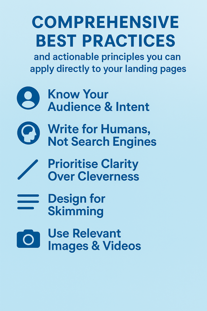
While the previous section breaks down specific elements, this section synthesises them into actionable principles you can apply directly to your landing pages.
- Know Your Audience & Intent. Before writing a copy or designing your page, research your audience. What problems are they trying to solve? Where are they in the buyer’s journey? Align your offer with their intent educational resources for those in the awareness stage, demos or trials for those ready to make decisions. Ben Young of HubSpot emphasises mapping landing pages to the funnel to match user intent.
- Write for Humans, Not Search Engines. SEO is important (more on that later), but your primary goal is to convince a person to take action. Use conversational language and short sentences. Cyan Zhong, who writes landing‑page copy for HubSpot, notes that she strives to be direct and conversational because many visitors don’t scroll beyond the fold.
- Prioritise Clarity Over Cleverness. A clever headline that confuses the visitor will hurt conversions. For example, ClaimCompass clearly states its offer and process for flight compensation rather than using witty puns. Don’t make users guess what you’re offering.
- Design for Skimming. Most visitors will skim rather than read every word. Use headings, bullet points, icons and spacing to highlight key information. OnHubSpot’s Social Media Trends Report page, section navigation helps busy readers jump to the part they care about.
- Use Relevant Images & Videos. Avoid generic stock photos. Show the actual product, a screenshot of the dashboard or a preview of the resource. AI Tools Guide uses a slideshow preview to let visitors see the guide’s contents. Video can also increase conversions by demonstrating value. Promo’s video header provides a quick demonstration of its video‑maker tool.
- Minimise Form Friction. Only ask for information you truly need. For newsletter signups, name and email suffice. For more complex offers (e.g., mortgage pre‑qualification), clearly explain why you need additional data. Where possible, offer sign‑in with existing accounts (Google, LinkedIn) to shorten the process.
- Leverage Social Proof Strategically. Place testimonials, ratings or endorsements near the CTA or hero section. Justin Welsh features endorsements from prominent entrepreneurs at the top of his newsletter signup page. If your product has been featured in notable publications, display the logos. For B2B products, mention the number of companies using your service or share case studies.
- Remove Navigation & Distractions. Good landing page examples are led by the removal and minimization of navigation bars. ExpressVPN does this to focus the visitor on its offer. If you must include navigation (e.g., for compliance reasons), keep it minimal and link to necessary policies.
- User Design & Colour Psychology. Colours evoke emotions, blue conveys trust, red creates urgency, green signals growth or environmental friendliness. Ensure sufficient contrast for accessibility. Use directional cues (arrows, images of people looking toward the CTA) to guide the eye.
- Employ Ethical Urgency & Scarcity. Inducing panic with false scarcity can damage your brand. Use urgency ethically, like a legitimate sale ending soon or limited seats for a live workshop. The College Board’s countdown timer is authentic because SAT registration truly has a deadline. If you have limited stock, let users know but never lie about inventory.
- Optimize for Page Speed & Accessibility. Fast load times improve user experience and SEO. Compress images, minify scripts and use content delivery networks (CDNs). Ensure your page meets Web Content Accessibility Guidelines (WCAG) by using alt text for images, high contrast ratios and keyboard navigability.
- Test Early and Often. Start with a hypothesis (“A shorter headline will increase conversions”) and design A/B tests around it. Test one element at a time to isolate its effect. Don’t assume; data may surprise you. FilterEasy’s marketing team tested multiple variations and found that their champion page consistently outperformed challengers.
- Plan a Robust Follow‑Up. Think beyond the immediate conversion. Provide high‑quality thank‑you pages, nurturing emails and onboarding experiences to maximise the value of each conversion.
Detailed Example Profiles: 15 High‑Converting Pages
The following profiles offer a deeper look at fifteen successful landing pages across different industries. Each profile highlights the key elements that contribute to high conversions and provides actionable takeaways.
1. Promo: Leverage Video to Sell a Visual Product (46.94 % Conversion Rate)
Promo’s landing page targets businesses and social‑media managers who need quick, professional video ads. As soon as the page loads, a dynamic hero video showcases the product’s capabilities. A clear headline (“Make Hollywood‑quality videos in minutes”) conveys the value proposition. Underneath, concise copy explains that users can choose from templates, customize them and publish within minutes. Why it converts:
- Demonstrative content: Video shows, rather than tells, how the product works, reducing uncertainty and building trust. Unbounce notes that video can increase conversions by up to 80 %.
- Social proof: Testimonials and star ratings appear just below the hero section, showing that real users have succeeded with the product.
- Strong CTA: The button uses active language (“Get Started Free”) and stands out against a contrasting background. Visitors know they can try the tool without commitment.
- Minimal distractions: Navigation is limited, focusing visitors on the sign‑up journey.
2. edX: Simplify Your Pitch & Make Benefits Crystal Clear (52.68 % Conversion Rate)
EdX’s landing page promotes an online course. A supporting video shows a snippet of the course interface.
- Concise copy: Rather than listing every feature, the page focuses on how the course helps students master Python quickly.
- Crystal‑clear subhead: The subhead reinforces the goal (“Build real‑world projects and launch your coding career”).
- Proof points: A section lower on the page features alumni testimonials and statistics (e.g., “90 % of our graduates find jobs within three months”), building credibility.
- Straightforward CTA: The button reads “Start Learning Now,” clearly indicating the next step.
3. Simply Business: Address Complexity with Straightforward Copy (62.26 % Conversion Rate)
Insurance is notorious for complex policies and confusing terms. Simply Business tackles this by using plain language to explain how its service works. The page opens with a headline like “Get tailored business insurance in minutes,” followed by a short paragraph that addresses common concerns that cover types, pricing transparency and support.
- Bulleted instructions: A simple three‑step graphic explains how to get a quote (answer a few questions, compare covers, buy a policy).
- Pain‑point emphasis: Copy reassures visitors that there’s no jargon or hidden fees.
- Trust signals: Reviews from existing customers and partnerships with reputable insurers establish credibility.
- Clear CTA: Buttons like “Get my free quote” appear above and below the fold, making it easy to act.
4. Later: Maintain Message Consistency & Simplify Forms (57.92 % Conversion Rate)
Later, a social‑media scheduling tool, uses “conversion scent” to maintain consistent messaging across ads, emails and the landing page. Visitors who click through from an ad see the same headline and imagery they saw earlier, reinforcing relevance.
- Matching headlines: If an ad promised a 14‑day free trial, the landing page headline echoes that promise.
- Concise form: The sign‑up form asks only for name and email, minimising friction.
- Value‑oriented copy: The page emphasises how scheduling posts in advance frees up time for creativity.
- Supporting visuals: Screenshots show the drag‑and‑drop calendar interface.
5. The Listings Lab: Focus on Agent Pain Points & Provide Visual Proof
Targeting real‑estate agents, The Listings Lab knows its audience struggles with cold calling and poor leads. Its page addresses these pain points in the headline (“Stop cold calling; attract clients with ease”) and copy. The hero section includes a mock‑up of the downloadable guide, and bullet points summarise what agents will learn (e.g., “Generate qualified leads without door knocking”).
- Empathy: By acknowledging agents’ frustrations, the copy builds rapport.
- Visual proof: A mock‑up of the guide signals that it’s tangible and professional.
- Testimonial slider: Real agents share how the guide transformed their business, providing social proof.
- CTA: “Download your free guide” clearly tells visitors what to expect.
6. Twillory: Design Mobile‑First & Offer Incentives (46.85 % Conversion Rate)
Clothing retailer Twillory discovered that 83 % of its traffic came from mobile devices. To capitalize on this, it built separate mobile and desktop experiences using Unbounce’s builder. The mobile page features large photos, easy‑to‑tap buttons and a sticky bar offering a 15 % discount for signing up.
- Mobile‑optimised layout: Large fonts and responsive images ensure readability on small screens.
- Incentive pop‑up: A spin‑to‑win wheel pops up after a few seconds, offering a discount code. Gamification encourages signups.
- Lifestyle imagery: Photos show people wearing the shirts in real situations, helping visitors imagine themselves in the products.
- CTA: “Shop Now” leads directly to a product catalogue, while “Sign up & save” captures leads.
7. TyresOnTheDrive: Make the Headline Do the Selling
This tyre‑replacement service gets straight to the point with a headline like “Expert Tyre Fitting at Your Home or Work”. Sub‑copy explains that customers can schedule a convenient appointment and choose from top brands. Social proof comes from logos of well‑known tyre companies and trust badges from review sites.
- Clear promise: Visitors know exactly what service they’re getting and where it will happen.
- Social proof: Ratings and testimonials reassure customers of quality.
- Benefit over discount: Rather than emphasising low prices, the copy highlights convenience and expertise.
- CTA: “Book Now” invites immediate action and links to a scheduling tool.
8. ooba: Clarify the Process & Use Descriptive CTAs (35.57 % Conversion Rate)
As a mortgage provider, ooba asks for more information than a typical lead magnet, but the page explains why and what happens next. A form at the top requests details like home price and income. The copy reassures visitors that they’ll receive a pre‑approval assessment.
- Descriptive button: The CTA reads “Find out what you qualify for,” telling visitors the result of submitting the form.
- Contextual cues: Icons and small explanations below each form field reduce uncertainty.
- Trust elements: Partner bank logos and testimonials build credibility.
- Above‑the‑fold form: Placing the form high ensures it’s seen immediately.
9. ClaimCompass: Educate & Convert in Multiple Steps (30.02 % Conversion Rate)
ClaimCompass helps travellers claim compensation for flight delays. Many visitors may not understand EU flight compensation rules, so the page offers a simple explanation and a link to detailed guidelines. The first CTA (“Check your flight”) takes users to a form where they can enter flight details. For visitors who need more reassurance, additional sections explain the legal basis and feature testimonials.
- Educational content: Instead of pushing for an immediate sign‑up, the page teaches visitors about their rights.
- Multiple CTAs: Users ready to convert can click right away; those who need more information can scroll.
- Authority: Logos of media outlets and EU regulation icons signal legitimacy.
- Follow‑up form: The second CTA invites visitors to submit a claim, guiding them further down the funnel.
10. Extreme Lounging: Keep It Simple & Give Away Something Valuable
Extreme Lounging, a furniture retailer known for its beanbag chairs, uses a contest to build its email list. The landing page features an eye‑catching photo of the limited‑edition chair up for grabs, a headline (“Win a Limited Edition Chair!”) and a simple email form.
- Simplicity: No long copy or multiple sections just a clear offer and a form.
- Immediate value: Visitors get a chance to win a desirable product in exchange for their email.
- Monthly contests: The company runs new contests each month, keeping the campaign fresh and encouraging repeat visits.
- CTA: “Enter the Giveaway” uses language consistent with the headline.
11. onX: Align Content with Search Intent & Optimise CTAs (61.15 % Conversion Rate)
onX sells an outdoor navigation app for hunters and hikers. Users often find the landing page via PPC ads targeting terms like “topographic hunting maps.” The page features screenshots of the app showing topographic maps and hunting boundaries. Ryan Watson, onX’s User Acquisition Manager, credits message match and A/B testing for the high conversion rate.
- Search intent alignment: The headline and images mirror the search terms (“Find the best spots to hunt”). Visitors immediately know they’re in the right place.
- A/B‑tested CTAs: Different button copies (“Start free trial,” “Explore maps now”) were tested to identify the highest performer.
- Feature preview: Short videos demonstrate how to use the app in the field.
- Credibility: Logos from hunting magazines and endorsements from professional hunters provide social proof.
12. Investing Shortcuts: Tap into FOMO & Social Proof (51.32 % Conversion Rate)
Created by Strikepoint Media, this landing page offers a guide on cryptocurrency investing. The headline references Bitcoin’s meteoric rise and urges readers to learn the “shortcuts” while there’s still time. Beneath the headline, the copy provides context about the opportunity and mentions that the guide includes insights from experts.
- Urgency: The narrative around skyrocketing Bitcoin prices creates a sense of urgency to act before the market changes.
- Benefit‑oriented: The focus isn’t on technical jargon but on opportunities to profit.
- Social proof: Logos of financial publications and a testimonial from a well‑known investor lend credibility.
- CTA: “Get the Guide Now” invites immediate download.
13. MyTutor: Time Your Offer to When It Matters Most (55.29 % Conversion Rate)
MyTutor’s exam‑results‑day landing page targets students who didn’t achieve their desired grades. The page acknowledges the emotional moment (“Didn’t get the grades you hoped for?”) and offers personalised tutoring to get back on track.
- Empathy: The copy reassures students and parents that support is available.
- Timing: Launching on exam results day means the offer is immediately relevant.
- Clear solution: The CTA (“Find a Tutor”) directs users to a tutor‑matching system.
- Social proof: Success stories from former students build trust.
14. College Board: Use Deadlines & Encouragement (77.38 % Conversion Rate)
This non‑profit encourages students to register for the SAT. The landing page uses a countdown timer showing how many days remain to register and emphasises the importance of acting quickly. The copy reassures students they are ready by reminding them they’ve already taken the PSAT.
- Urgency and scarcity: A visible countdown and repeated reminders (“Seats are filling up fast”) create pressure to act.
- Encouraging tone: Phrases like “You’re already prepared!” provide positive reinforcement.
- Multiple CTAs: “Register Now” buttons appear at multiple points, ensuring visitors don’t need to scroll to act.
- Informational sections: Details on test dates, locations and preparation tips help answer questions without leaving the page.
15. FilterEasy: Trust Your Champion & Keep Testing (34.52 % Conversion Rate)
FilterEasy, a home air‑filter subscription service, built a landing page that significantly outperformed all challengers. Growth Marketing Director Rianna Riddle admits they’re still testing to determine precisely what makes the page so effective. The page features a clean layout, clear benefits (“Never forget to change your filters again”), pricing options and a strong testimonial section.
- Straightforward structure: The value proposition, benefits and pricing options are presented logically and simply.
- Social proof: Reviews and ratings reinforce the product’s effectiveness.
- Continuous testing: Even after finding a high‑performing variant, the team continues to run A/B tests to ensure it stays optimal.
- CTA: “Get Started” leads to a subscription order page.
Types of Landing Pages & When to Use Them
Different business goals require different kinds of landing pages. Understanding which type to deploy helps align your strategy and conversion goals.
- Lead Magnet Pages. These pages offer a free resource (ebook, checklist, webinar, tool) in exchange for contact information. Use them to build your email list or nurture leads. Examples: HubSpot’s Social Media Trends Report, Promo’s free trial.
- Product or Sales Pages. Designed to sell a product or service directly. Use these for SaaS sign‑ups, e‑commerce purchases or consultations. Examples: onX’s navigation app page, Twillory’s clothing page.
- Event or Webinar Pages. Focused on getting visitors to register for an event. Use urgency (dates) and emphasise value from attending. Example: College Board’s SAT registration page, Calendly’s webinar landing page features a video introduction.
- Course or Membership Pages. Sell online courses or memberships. These often include video sales letters, testimonials from students and details about instructors. HubSpot’s article highlights pages like the Radical Design Course and Notion Mastery.
- Newsletter Sign‑Up Pages. Encourage visitors to subscribe by emphasizing benefits, frequency and sample content. Example: Justin Welsh’s newsletter page emphasises his authority and features endorsements.
- Free Trial or Demo Pages. Offer a no‑risk trial to get visitors into your product. Example: ExpressVPN’s page uses a no‑navigation layout and simple CTA to start the free trial.
Choosing the Right Type
Consider your funnel stage and objective. If your goal is brand awareness and lead collection, lead magnet pages work well. For bottom‑of‑funnel prospects who are ready to decide, demo or free‑trial pages are appropriate. Align the page with user intent to maximise conversions.
SEO & Content Optimization for Landing Pages
Search engine optimisation (SEO) and content optimization ensure your landing pages are discoverable and relevant. Here’s how to tailor your page for organic and paid search without sacrificing conversion.
Keyword Research & Placement
- Identify relevant keywords. Use tools like Google Keyword Planner, Ahrefs or SEMrush (if available) to discover keywords with sufficient search volume and commercial intent. For example, “high converting landing pages,” “landing page examples,” “best landing page design” and “landing pages that convert.”
- Incorporate keywords naturally. Include your primary keyword in the title tag, headline (H1), meta description, URL slug and a few times throughout the copy. Avoid keyword stuffing Google rewards readability.
- Use semantic variants. Search engines understand related terms. Include phrases like “conversion rate optimization,” “CTA buttons,” “lead generation pages,” “social proof” and “page design best practices.”
- Mobile‑first indexing. Google uses the mobile version of your site for ranking. Ensure your page is responsive and loads quickly on mobile devices.
- Page speed. Compress images, minify CSS/JS and use lazy loading to improve speed. Slow pages increase bounce rates and hurt rankings.
- HTTPS security. Use an SSL certificate. Secure pages boost user trust and SEO.
- Schema markup. Implement structured data (e.g., FAQ schema) to help search engines understand your content and display rich snippets.
Content Optimization
- Write compelling meta titles and descriptions. These influence click‑through rates from search results. Include your main keyword and a call‑to‑action like “free guide” or “start your trial.”
- Use header tags wisely. H1 for your primary headline; H2 for subheadings. This structure helps both readers and search engines understand your content hierarchy.
- Optimize images. Add descriptive file names and alt text with keywords. Compress images to reduce file size.
- Internal linking. Link from relevant blog posts or resource pages to your landing pages to signal importance to search engines.
Balancing SEO & Conversion
While SEO can drive more traffic, it shouldn’t compromise user experience. Ensure that optimizing for keywords doesn’t lead to awkward phrasing or overstuffed copy. Focus on search intent: people searching for “best landing page examples” likely want inspiration, so a gallery of examples with analysis is appropriate. Those searching for “free landing page builder” are likely looking for product trials.
Measuring Success & Continuous Improvement
high converting landing pages are built through data‑driven iteration. Here’s how to measure and optimize performance.
Key Metrics to Track
- Conversion rate: The percentage of visitors who complete your desired action (sign up, download, purchase). Track this across devices and traffic sources.
- Cost per conversion: Especially important for paid campaigns. Divide your ad spend by the number of conversions to evaluate ROI.
- Bounce rate: The percentage of visitors who leave without taking any action. High bounce rates may indicate misaligned messaging or slow loading.
- Time on page & scroll depth: Long engagement can suggest that visitors are consuming your content, but extremely long times may indicate confusion. Use heatmaps to see where users drop off.
- Multi‑step funnel metrics: For multi‑step forms or checkouts, track completion rates at each step.
A/B & Multivariate Testing
To improve your landing page, test one variable at a time:
- Headlines: Try different value propositions. For instance, you might compare “Get the Ultimate Landing Page Checklist” with “Boost Your Conversions by 20 % with Our Checklist.”
- Images vs. video: Test a static image against a short product demo video to see which retains visitors longer and leads to more signups.
- Button copy: Compare variations like “Get Started Free,” “Start My Trial” and “Join Today.”
- Form length: Test asking for only an email versus asking for name, company and phone number. Observe how additional fields affect conversion.
For more complex pages, multivariate testing allows you to test combinations of headlines, images and CTAs simultaneously. However, you need significant traffic volume to achieve statistically significant results.
Qualitative Feedback
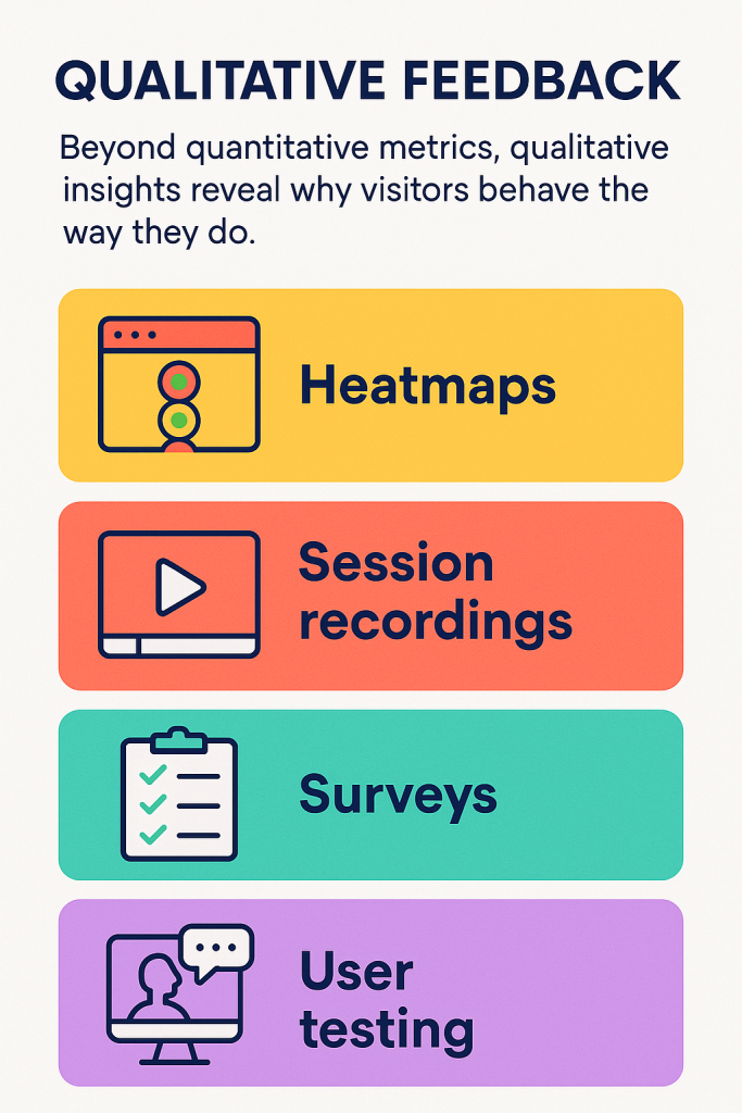
Beyond quantitative metrics, qualitative insights reveal why visitors behave the way they do:
- Heatmaps: Visualise where users click, hover and scroll. You may discover that visitors ignore a key section because it looks like an ad.
- Session recordings: Watch real users navigate your page. Identify bottlenecks or confusing elements.
- Surveys: After conversion (or exit), ask visitors what convinced them or what prevented them from converting.
- User testing: Recruit members of your target audience to test your page and describe their experience. Observing real reactions can unveil issues you hadn’t considered.
Continuous Improvement Cycle
- Set a baseline. Launch your page and track initial metrics.
- Identify opportunities. Use data and feedback to pinpoint underperforming elements.
- Formulate hypotheses. Decide what changes might lead to improvement.
- Implement tests. Launch A/B or multivariate tests.
- Analyze results. Determine if changes made a statistically significant difference.
- Iterate. Adopt successful variants and continue testing new ideas.
Common Mistakes & How to Avoid Them
Even well‑intentioned marketers fall into common traps when building landing pages. Here’s what to watch out for:
- Cluttered design: Trying to cram too much information or too many CTAs on one page confuses visitors. Stick to a single objective per page.
- Weak or generic CTAs: Buttons that say “Submit” or “Send” are vague. Use descriptive, benefit‑oriented copy, such as “Get My Free Quote.” Ooba’s descriptive button explains what the visitor will receive.
- Unrealistic claims or clickbait. Claims that sound too good to be true can damage trust. Provide evidence or testimonials to back up bold statements. Notion Mastery’s page, for instance, features a testimonial from Notion’s founder to justify its claim.
- No message match: Sending PPC traffic about “free marketing templates” to a generic homepage leads to high bounce rates. Ensure that your landing page reflects the promise of the ad or link.
- Lack of mobile optimisation: Failing to design for mobile results in poor user experience and lost conversions. Use responsive design or separate mobile layouts.
- Requesting too much information too soon: Asking for phone numbers or budget before building trust can deter leads. Short forms convert better, unless the context requires more data.
- Ignoring legal compliance: If you collect personal data, ensure compliance with GDPR, CCPA and other regulations. Include privacy policies and cookie consent where necessary.
- No post‑conversion strategy: Failing to follow up leaves leads cold. Always send a thank‑you email, deliver the promised asset and nurture the relationship.
Best Landing Page Checklist
Use this checklist as a reference when creating or auditing your landing page:
- Clear, benefit‑oriented headline matching ad/keyword intent.
- Concise sub‑headline that supports the headline and elaborates on benefits.
- Hero image or video that illustrates the offer.
- Social proof near the top testimonials, ratings, client logos.
- Single, prominent CTA with descriptive text and contrasting colour.
- Minimal form requesting only essential information; optional social login.
- Design optimized for mobile devices.
- Navigation either removed or minimized.
- Persuasive copy that addresses pain points and emphasises benefits.
- Ethical urgency or scarcity elements, if appropriate (countdown, limited spots).
- Trust badges or security icons for payment or sensitive information.
- Fast load times and optimized images.
- SEO‑friendly meta title, description, headings and image alt text.
- Thank you page with next steps after conversion.
- Analytics and tracking integrated (conversion goals, events).
Conclusion
High converting landing pages blend art and science. They start with a deep understanding of the audience’s needs and intent, expressed through clear headlines, benefit‑oriented copy and compelling visual design.
They minimise friction through simple forms, mobile‑optimised layouts and focused CTAs. They build trust with social proof, transparency and ethical use of urgency. They adapt to visitors’ context, whether the goal is to capture a lead magnet download, sell a product or register attendees for an event.
The 15 real-life examples here range across industries from SaaS tools such as Promo and onX to educational services such as edX and MyTutor to consumer brands such as Twillory and Extreme Lounging.
As you design your own landing pages, utilize the principles and examples presented here as a foundation. Then test aggressively, learn from your results and keep refining. With the proper methodology, your landing pages can post conversion rates that not only outperform industry norms but form the foundation of your marketing success.


")