
")


Free Funnel Audit
Convert more customers today!
SEO
10 mins read

SEO
10 mins read

Just imagine, you enter a website and you see the navigation menus scattered all around. You need to find something on the website but navigating the information is difficult because you don’t know where to find it. This results in potential leads leaving your website as soon as they enter and your website’s rankings dropping too soon.
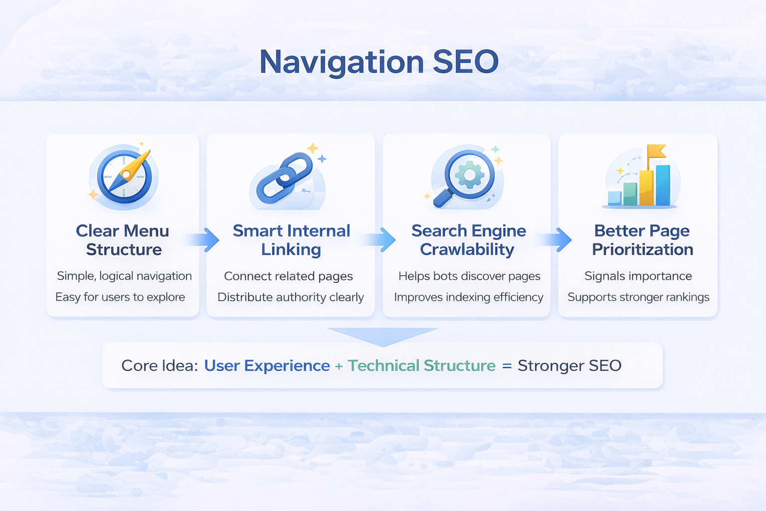
Clear, well-organized website navigation helps search engines understand your site and helps people stay longer, click more, and trust you faster.
If your menu is messy, rankings drop. On the other hand, if your structure is clear, rankings usually improve. That is why navigation SEO is not a design detail, but a ranking factor disguised as usability.
In this guide, we will walk through structure, labeling, mobile behavior, click depth, and real seo navigation best practices you can actually apply today.
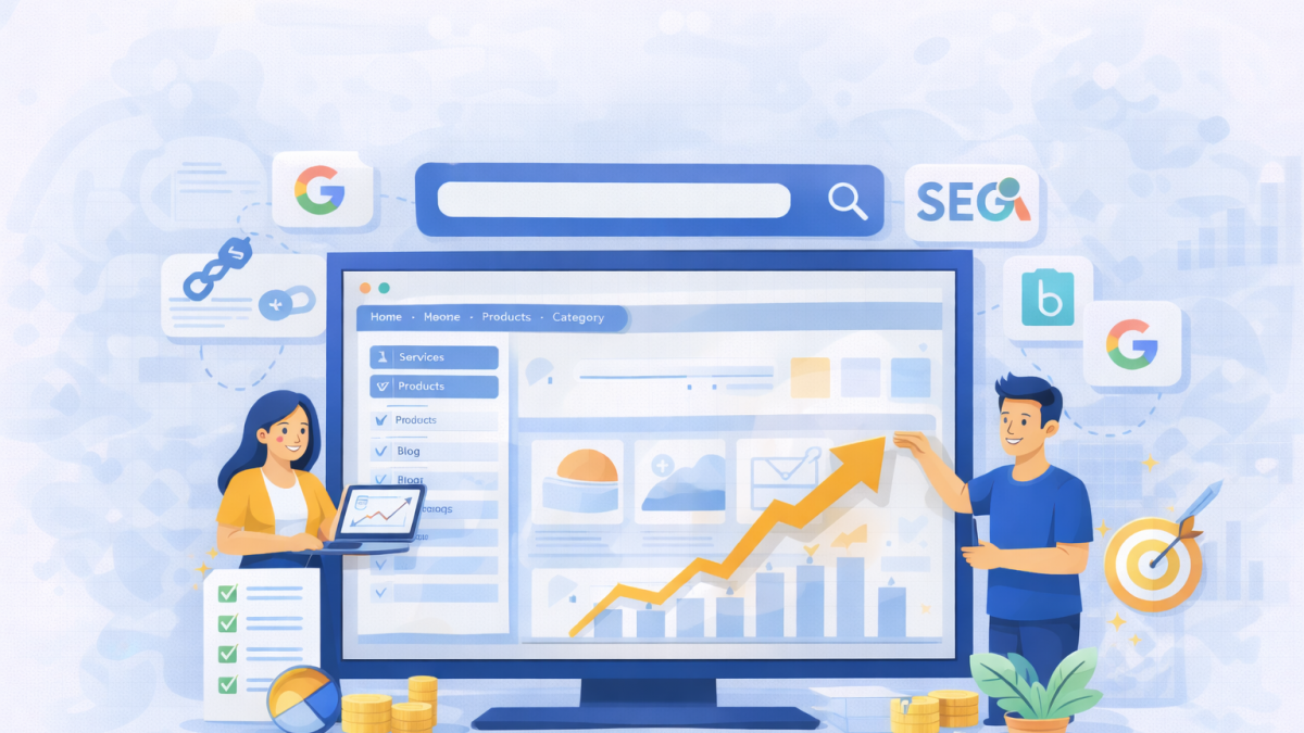
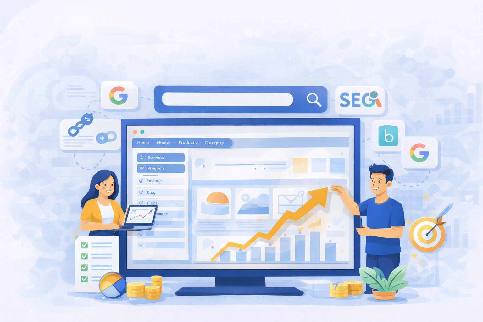
Most people think navigation is just menus at the top of a page. From a visitor’s view, that is correct. But, from a search engine’s view, it is the map of your entire website.
Navigation SEO means designing menus and internal links so search engines can easily crawl, understand, and prioritize your pages. It combines user experience with technical structure.
A normal website navigation answers:
“Where can a visitor go?”
Navigation SEO answers:
“What pages matter most and how are they connected?”
Search engines read hierarchy through links. If a page sits close to the homepage and is linked often, it gains importance. If it hides five clicks deep, it looks less valuable.
So menus are not just for humans. They signal authority flow, topical grouping, and relevance. That is why two sites with identical content can rank differently. A website that is better structured always wins.
Google does not rank pages only by content quality. It ranks pages that it can understand quickly and confidently. Your structure affects how bots crawl and how users behave. When a visitor lands on your site, they subconsciously judge trust in seconds. If they feel lost, they leave. That bounce becomes a signal.
Navigation in a website impacts:
Good navigation SEO improves both machine understanding and human comfort.
When your website navigation is easy to understand, not only will it be easy to navigate, but it will also offer many other benefits you’ll notice. Here are some that you can expect:
These SEO navigation best practices improve rankings because they align user clarity with search engine logic. Google rewards predictable structure.
Your website is just like a supermarket. Milk is always at the back, fruits at the front, and snacks in aisles. You never get confused. Websites work the same way.
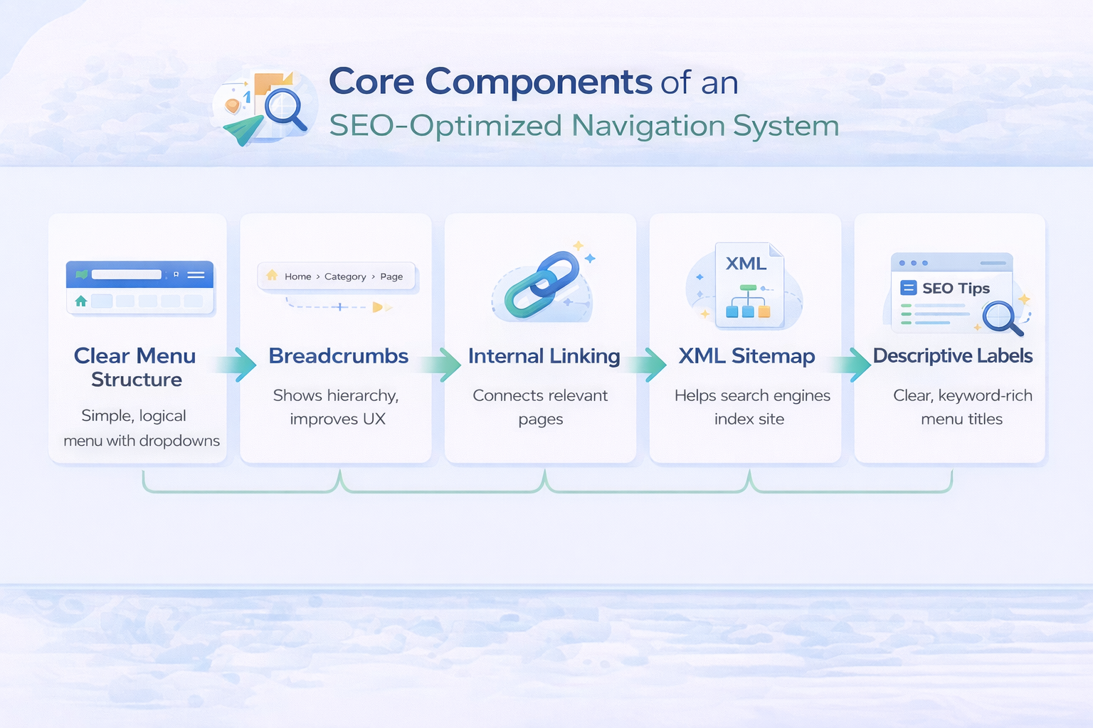
Good navigation is not a single menu but a group of elements working together to guide movement across the site. Each part, like the header, breadcrumbs, internal links, and footer, plays a different role in showing importance and relationships between pages.
When these pieces align, both users and search engines understand the structure quickly without confusion.
Your top menu defines your site’s identity. You should always limit categories and keep labels clear. Avoid creative branding words that only your team understands.
For example, “Growth Hub” sounds fancy but means nothing to Google or users. “Digital Marketing Services” works instantly.
A clean top menu strengthens navigation SEO because it signals core topics directly from every page.
Mega menus help large sites but hurt small ones. If you only have 15 pages, a mega menu is overkill.
It is always beneficial to keep the dropdown depth shallow. Two levels are the perfect number. But three is risky, as more than three hides pages from both users and crawlers.
Also, if there are too many nested links, it can dilute authority and create confusion.
Breadcrumbs quietly show visitors where they are and how they arrived there. Instead of relying on the back button, users can jump to broader categories instantly while still understanding the page’s context.
Example:
Home > Services > SEO > Technical SEO
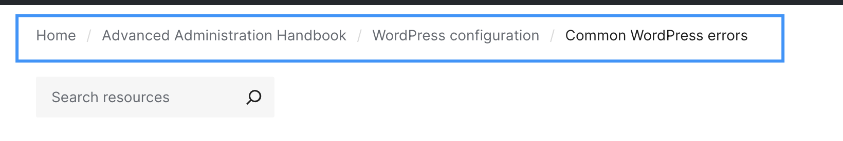
This path also tells search engines how topics relate, reinforcing hierarchy and relevance without extra effort. Over time, consistent breadcrumbs strengthen internal linking patterns and make deeper pages easier to discover.
The footer acts as a secondary guide once someone finishes exploring the main content. It is the right place for supportive pages like policies, company details, resources, and contact information. It’s not a duplicate of the header.
A well-structured footer spreads authority to important supporting pages while keeping the primary experience uncluttered. It also reassures visitors that essential information is always accessible, even at the end of a page.
Navigation does not live only in menus. The links inside your paragraphs carry stronger contextual meaning because they connect ideas, not just sections.
When an article naturally points to a related service or guide, it signals importance and topical connection to search engines. These links help users continue their journey instead of restarting it from the menu, which improves flow and engagement.
Click depth means how many clicks a page is from the homepage. Important pages should be within two clicks always.
Why? Because homepage authority flows outward. Every click reduces strength slightly.
Pages closer to the starting point inherit more attention and authority, while distant pages appear less important.
Bad structure example:
Homepage > Blog > Category > Subcategory > Article > Product
Good structure example:
Homepage > Category > Article
Logical URLs reinforce this hierarchy. Here’s how it looks:
Search engines prefer predictable structure. It lowers crawl effort and increases trust.
If you need a map to reach a page, Google will likely ignore it.
Most navigation problems start with a simple mistake: the menu reflects the company’s org chart, not the visitor’s intent.
Teams often ask, “What do we want to show?”
You should ask, “What does the visitor need first?”
Good navigation begins with priorities. Your menu is prime real estate. Every slot you fill pushes another page out of view. So choosing pages is less about adding and more about removing.
Before touching the menu, pause and think like a new visitor. Imagine you land on a site for the first time. You are not interested in internal departments, awards, or brand slogans. You want answers fast.
Instead of guessing, look at data. Your analytics already tells you what people consider important.
Many sites discover that their “About” page is visited more than half of their blog posts. That is a sign that trusted content should be easier to reach.
Card sorting sounds fancy, but it is simple. Write each page name on paper cards. Ask 4 to 6 real people to group them naturally. Do not guide them.
You will notice patterns. People group by problem, not by company department. This is one of the most reliable ways to shape navigation around real thinking behavior.
This step alone often improves navigation SEO because it aligns structure with search intent.
Traffic alone should not earn a spot in your main menu. Some pages attract visitors but pull attention away from decisions. Navigation space is limited, so every link should move a visitor closer to confidence or action.
Pages that support trust, clarity, or revenue deserve visibility. Informational or supportive content still has value, but it works better inside articles, resource hubs, or the footer rather than competing for attention in primary navigation.
Use these filters before adding anything to the menu:
As menus expand, understanding slows down. More options force users to pause and compare instead of moving forward naturally. A smaller, intentional set of links guides decisions faster than a long list ever can. Clear navigation comes from choosing what matters most, not from showing everything.
Imagine a marketing website with 80 articles and 12 services. Listing everything kills usability.
Instead:
Top menu shows:
Inside “Services”, users explore deeper. Inside “Resources”, they browse content. You did not remove pages. You organized access. These SEO navigation best practices focus attention instead of scattering it.
Menus are read in seconds, not studied. Visitors scan for familiar words that confirm they are in the right place. If labels sound creative but unclear, users hesitate, and hesitation often leads to exit.
Good navigation uses everyday language people already recognize from search and conversation. You are not trying to impress; you are trying to be instantly understood. Clear wording removes decision effort and lets users move forward without thinking.
Example:
Bad: Solutions
Good: CRM Software
Bad: Learn
Good: Marketing Blog
Bad: Insights
Good: Case Studies
This is not about stuffing keywords into every label. It is about matching expectations. When menu wording mirrors real queries, both visitors and search engines understand the page’s purpose faster, which quietly improves navigation SEO performance.
A strong menu removes thinking effort. That sounds simple, but it is surprisingly rare. Most sites add links whenever a team launches a new feature, service, or campaign. After a year, the menu becomes a junk drawer.
Good navigation SEO is about discipline. You are not listing everything you have. You are guiding people to what matters first.
Let’s walk through each practice with the reasoning behind it and what to actually do.
People build a mental map within seconds. If your menu shifts between pages, that map breaks. The visitor pauses and thinks, “Wait… where did that go?”
Search engines notice this, too. Inconsistent menus can change internal linking patterns and dilute authority flow.
What to do:
Consistency builds familiarity, and familiarity builds trust.
More options feel helpful to owners but overwhelming to users. Too many choices create decision fatigue. When users are unsure, they leave instead of exploring. Seven items on a main menu are a practical ceiling for human memory scanning.
Why does it help rankings?
When users quickly find a path, they click deeper instead of bouncing. That behavioral signal supports navigation SEO performance.
Trimming your menu by grouping is a great idea. Instead of:
Use:
You can still expose details inside pages.
Dropdowns can organize information, but too many layers turn organization into a maze. What appears structured to the designer often feels confusing to the visitor.
When users must keep opening sub-menus just to reach a page, navigation slows down and confidence drops before they even read your content.
Each extra level hides pages from crawlers and users. Hidden pages feel unimportant to search engines.
A better approach is to:
This strengthens navigation SEO because authority flows through structured hubs instead of scattered links.
This sounds obvious, yet many redesigns remove it accidentally. Users instinctively click the logo when lost. When it fails, frustration spikes immediately.
Practical benefit:
Small UX fixes often produce big SEO gains.
Today, your mobile menu is your real menu. Search engines judge the phone experience before the desktop one, so a navigation that looks polished on a laptop but awkward on a small screen weakens both usability and rankings.
If visitors need to zoom, scroll sideways, or hunt for options, they assume the site is harder than it should be and they leave.
Common problems:
To check this, open your site one-handed. If your thumb struggles, your visitors struggle too.
Mobile usability is now part of navigation SEO performance, not just design quality.
Many menus are still designed with desktop behavior in mind, where moving a cursor reveals options. On mobile devices, that behavior doesn’t exist.
People interact by tapping, not hovering. When a menu depends on hover logic, it often flickers open and closed or refuses to respond clearly, making the site feel unreliable within seconds.
Fix:
A menu should feel obvious even for someone half-distracted in a noisy cafe.
Sticky headers help long pages. But oversized ones block content and annoy users. A good sticky header is thin, calm, and helpful.
Use sticky when:
Avoid when:
Navigation should assist, not dominate.
Crowded menus create anxiety. Clean spacing improves comprehension speed. Users do not read menus word by word. They pattern-match shapes and groupings.
Improve clarity:
Clarity improves engagement, and engagement feeds ranking signals tied to navigation SEO effectiveness.
Internal search is a safety net, not a replacement for structure. But on large sites, it prevents exits. If users search often, they reveal missing navigation paths.
Use search data:
Navigation should answer common intent before users have to type.
Menus are not permanent. Businesses evolve, content grows, and user expectations change. What worked last year may now confuse visitors.
Simple testing cycle:
Then adjust slowly. Not drastic redesigns. These SEO navigation best practices work best when treated as ongoing maintenance, not a one-time project.

Most visitors will access your site on a phone first, not a laptop. They may be standing in a queue, walking on a busy street, or holding a coffee in one hand. That context changes everything.
Desktop users explore, but mobile users decide quickly.
Mobile navigation SEO is about reducing effort to near zero. If someone has to zoom, aim carefully, or think twice, they leave. And when they leave fast, rankings usually slide over time because engagement signals drop.
Let’s walk through what actually makes a mobile menu feel easy instead of frustrating.
Finger taps are messy. Unlike a mouse pointer, thumbs are large and imprecise. Tiny links create mis-taps. Mis-taps create irritation.
What works best:
If a user taps the wrong link twice in a row, they often quit the site entirely.
The hamburger icon is familiar now, but hiding it too well causes hesitation. Users should see it instantly without scanning.
Good placement:
When menus are hard to find, visitors assume the site is confusing before even opening it.
Mobile devices cannot hover. Yet many menus still depend on hover logic carried from desktop design.
Typical failure pattern:
User taps once → menu flickers → closes → frustration
Correct behavior:
Simple and predictable behavior improves navigation SEO because users continue deeper instead of abandoning.
Deep mobile menus feel like maze tunnels. Each tap adds cognitive load. If you need more than two taps to reach a key page, restructure.
Better alternative:
This also helps search engines understand topic relationships better.
On the desktop, text links work fine, but on mobile, clickable zones matter more than text. It’s always good to make the entire row clickable, not just the words.
Mobile interaction is fast, casual, and imprecise. People are walking, holding a bag, or using one hand. They don’t carefully aim at a word; they tap the space where they expect the link to be. If only the text is clickable, half their taps miss.
A missed tap feels like the site is broken, even if technically it works.
That tiny frustration matters. Users rarely retry more than once. Instead, they hit back, and that quick exit quietly damages engagement signals.
Small tap zones are one of the biggest silent killers of engagement metrics.
Good mobile navigation feels like a simple app, not a miniature desktop site. Mobile websites should be fast to open, smooth to close, without any lag or jumping layout.
You want:
Speed strongly influences user patience. Even a one-second delay inside a menu feels long on mobile.
Most users hold phones with one hand. That means the bottom half of the screen is easiest to reach. If important actions live only at the top, interaction drops.
Practical idea:
Add a bottom sticky bar for key pages like pricing or contact. Many e-commerce apps use this because it works.
Search engines track behavior patterns. If mobile users:
It signals an example of bad navigation. But when users navigate smoothly, they explore multiple pages. That increases dwell time and strengthens navigation SEO performance naturally.
Think about your own habits. If a mobile site feels slow or confusing, you rarely give it a second chance. Your visitors behave the same way.
So the real goal here is simple: “Can someone reach your main page with one thumb in under five seconds?”

You don’t need advanced tools or a full redesign to evaluate navigation. A simple review can reveal most structural problems within minutes. The goal is to see the site the way both a first-time visitor and a search engine would.
The best way to do this is by checking whether important pages are easy to reach, clearly grouped, and logically connected. Here’s a quick audit process you can implement:
Many businesses hire agencies like CausalFunnel for this stage because their CRO analysis, SEO services, PPC management, and content strategy often reveal structural issues affecting conversions. Navigation problems rarely live alone. They impact marketing performance across channels.
Navigation issues are rarely dramatic. Most sites function, but small structural decisions quietly weaken performance over time. Pages become harder to find, users hesitate, and search engines struggle to understand priorities.
Avoiding these common mistakes keeps your structure clear and prevents rankings from slipping without an obvious cause.
Here are the common navigation SEO mistakes you should avoid at any cost:
Most sites do not have bad content. They have a bad structure. Fixing navigation often improves performance faster than rewriting 50 blog posts.
Building a Navigation System That Supports Rankings
A strong structure quietly does a lot of heavy lifting. When visitors understand your site in seconds, they explore more pages, trust the brand faster, and convert with less hesitation. Search engines notice the same clarity through crawling patterns and engagement signals. That is why navigation SEO connects usability and ranking performance so closely.
Treat your navigation like infrastructure, not decoration. Small structural decisions shape how authority flows, how content is discovered, and how comfortable a visitor feels while browsing. Apply these SEO navigation best practices gradually, measure behavior, and refine over time. The goal is not a clever menu. The goal is a site where people never feel lost.
So, if a first-time visitor lands on your homepage right now, could they find your most important page in five seconds without thinking?
Yes. Navigation influences crawlability, internal linking strength, and user behavior. When search engines can reach pages easily, and users interact longer, rankings typically improve.
Most sites perform best with 5 to 7 main items. More than that increases decision fatigue and reduces engagement, which weakens navigation seo effectiveness.
Key pages should be reachable within one or two clicks from the homepage. Pages buried deeper often receive less authority and visibility.
No, but deep multi-level dropdowns can be harmful. Keep them shallow and organized. Use category pages instead of stacking too many nested links.
Only if they support decision-making, like guides or case studies. Most articles belong under a resource hub instead of the primary menu.
Search engines evaluate mobile experience first. If users struggle to navigate on a phone, they leave quickly, and engagement signals decline.
At least every 3 to 6 months. Content grows, business priorities shift, and user expectations change. Navigation should evolve with them.
Often yes. Many sites see gains simply by making key pages easier to find. Clear paths reduce hesitation and speed up decisions.
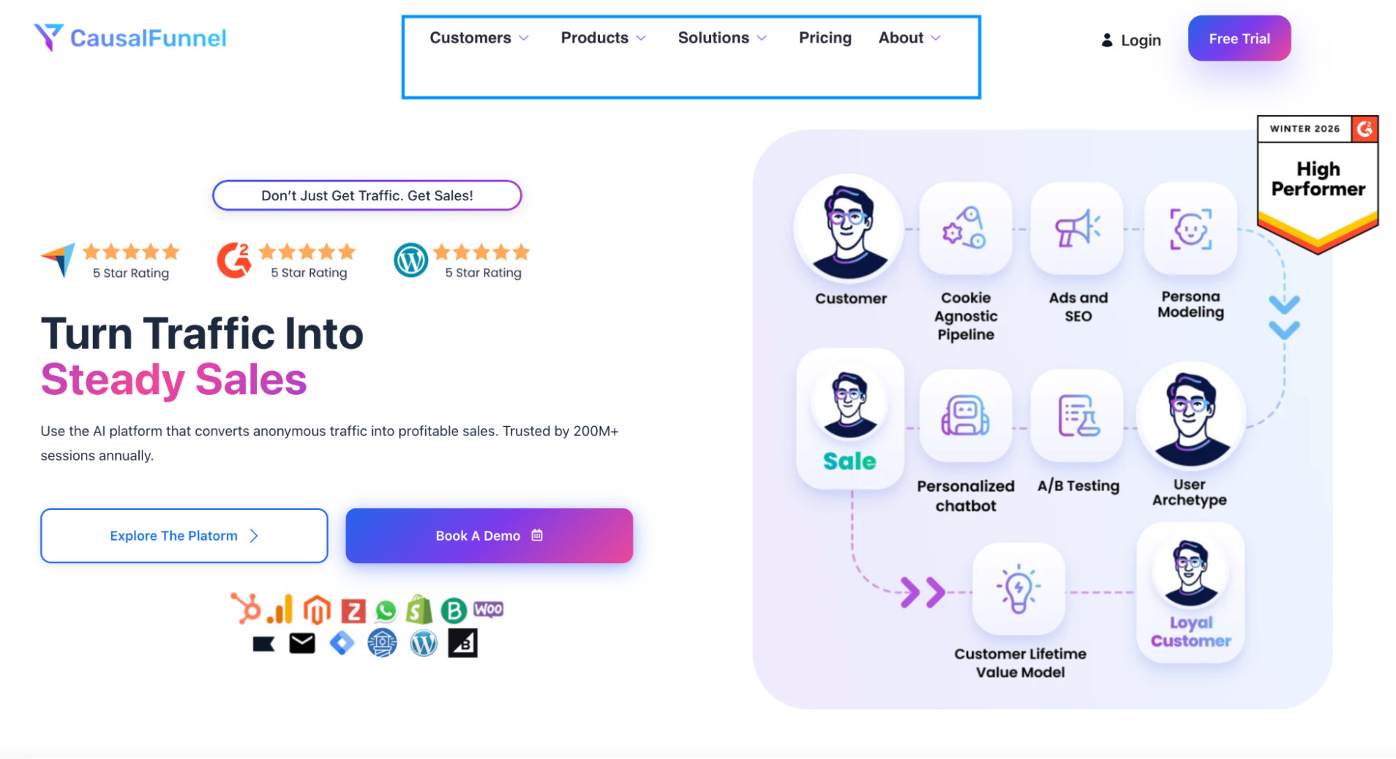
Start using our A/B test platform now and unlock the hidden potential of your website traffic. Your success begins with giving users the personalized experiences they want.
Start Your Free Trial
Empowering businesses to optimize their conversion funnels with AI-driven insights and automation. Turn traffic into sales with our advanced attribution platform.
Trusted by Customers


©CausalFunnel Inc. All rights reserved.