
")


Free Funnel Audit
Convert more customers today!
SEO
10 mins read

SEO
10 mins read
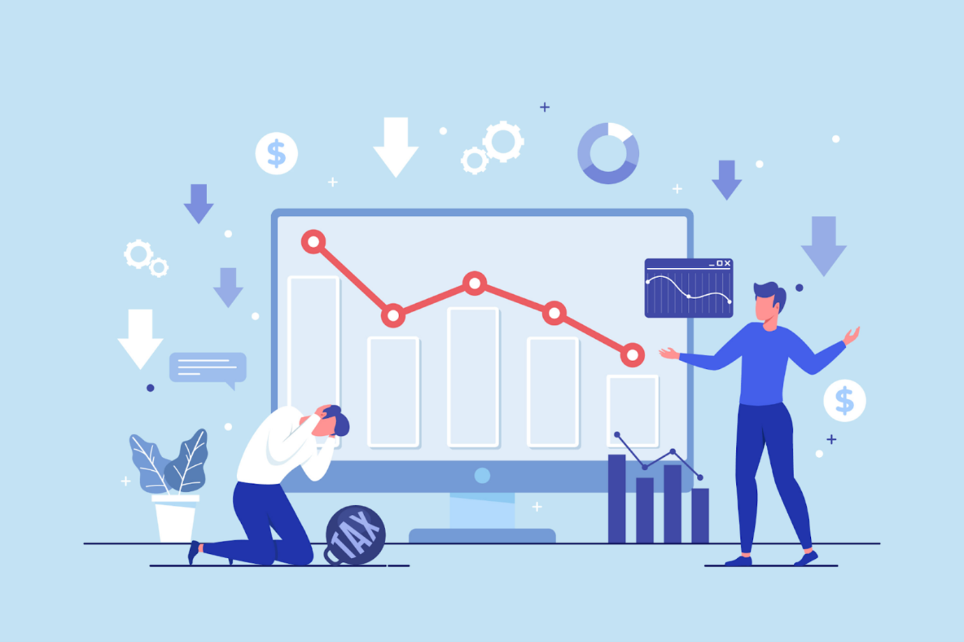
You’re able to attract a decent number of visitors, but they’re not turning into leads. Does this situation sound familiar?
If you’re a business owner, you might have come across times when your website is getting good traffic, but they’re not converting into sales. This gap often comes from weak messaging, poor design choices, or missing trust signals.
If you are wondering how to improve conversion rate, the answer is rarely one big change.
Most gains come from fixing small friction points across your pages and funnels. These include unclear offers, confusing layouts, slow load times, and weak calls to action.
The good news is that you do not need a full redesign to see results. You can increase conversion rate by making focused improvements that guide users better.
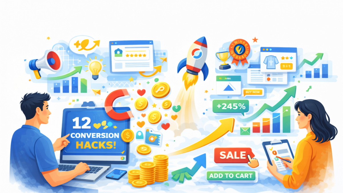
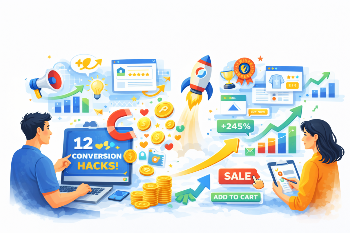
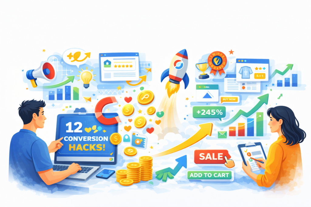
In this guide, you will find 12 proven conversion hacks. Each strategy is practical, easy to understand, and built on real CRO principles. You can use them for landing pages, websites, or marketing funnels.
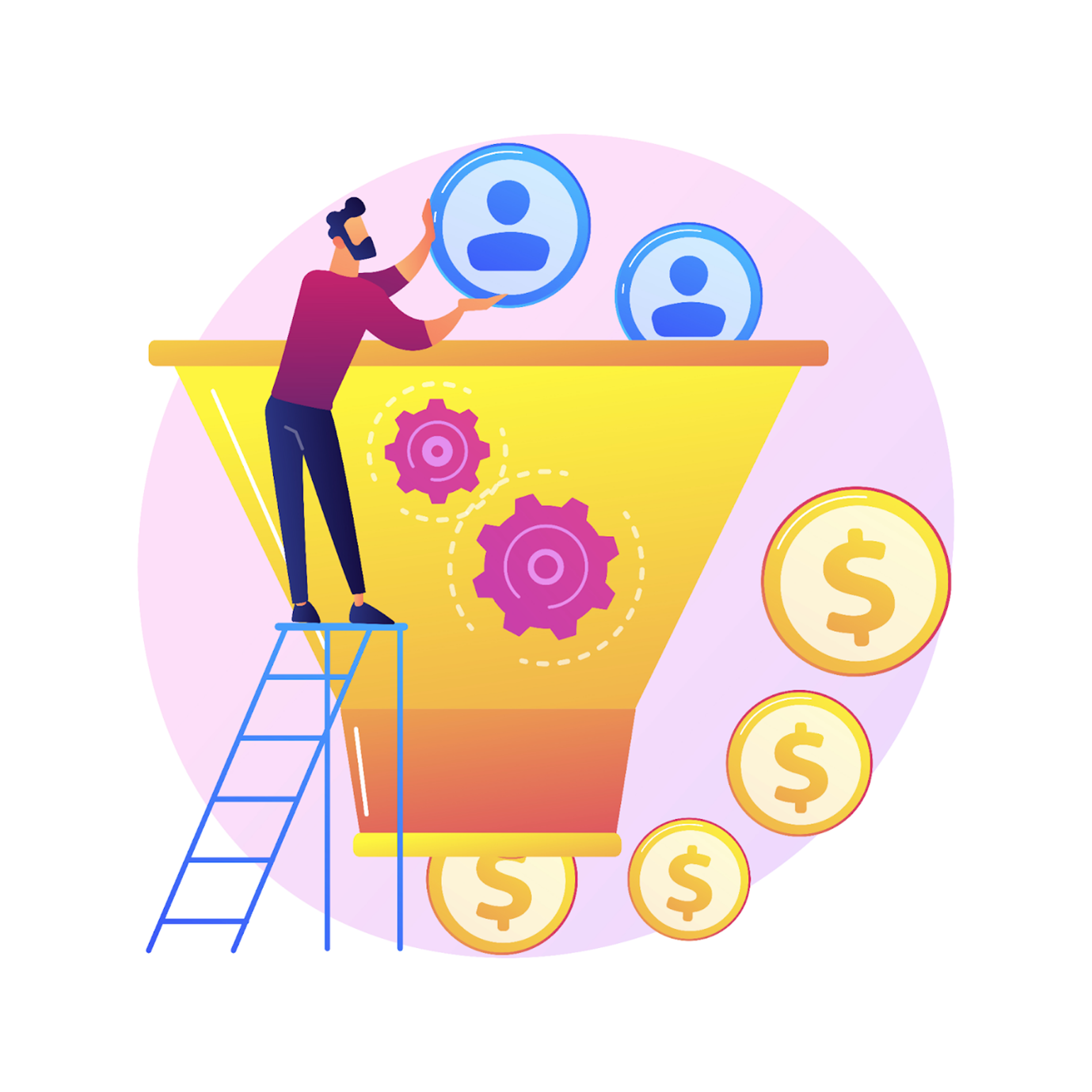
If you’re thinking what exactly is conversion rate, then here’s what. Conversion rate is the percentage of visitors who take a desired action on your website. This action could be a purchase, sign-up, form fill, or demo request.
In simple terms, it shows how well your website turns visitors into results. If you want to understand how to improve conversion rate, you must first track it clearly.
A basic formula looks like this:
To improve your website’s conversion rate, small improvements can make a big difference in revenue. You do not need more traffic if your current traffic converts better.
For example, if 1,000 visitors convert at 2%, you get 20 conversions. If you increase it to 4%, you get 40 conversions from the same traffic.
This means:
That is why conversion rate optimization matters for every business.
Conversion rate can easily be improved when you focus on the conversion rate using the formula above, auditing what you’re doing wrong on your website, and then making changes accordingly.
These 12 hacks are based on real user behavior and proven CRO practices. You can pick the ones that match your funnel and start testing them step by step.
If you’re giving an offer, first-time visitors should understand it within the first few seconds. If they feel confused, they will leave without exploring further.
You can place a strong value proposition by clearly explaining what you offer and who it is for. This ultimately shows why your solution is better than other options.
To make it clear for your visitors, avoid vague headlines that sound too generic or overly clever. Always focus on clarity, relevance, and direct benefits for the user.
Your above-the-fold section should include:
When your message is clear, users feel more confident to take action.
For example, a SaaS tool used the headline “All-in-One Marketing Platform.” Visitors did not quite understand what made it different.
They changed it to “Generate 3X More Leads Without Increasing Ad Spend,” and also added a short subheading and a clear CTA. Visitors understood the benefit instantly, and conversions improved.
Your call to action tells users what to do next. If it is unclear, users hesitate or leave the page.
Generic CTAs such as “Submit” or “Click Here” do not effectively guide users. They do not explain what the user will get after clicking.
Use specific and benefit-driven language instead. Make it clear what happens next and why it matters.
Examples of better CTAs include:
Also, focus on placement and visibility. Your CTA should stand out and appear where users expect it. A clear CTA removes confusion and drives more action.
When you check websites like CausalFunnel to convert your traffic into sales, you’ll see a clear CTA that details what you’ll get when you click on that button.
Users click on your page because of a specific promise, and if your page does not match that promise, they lose trust quickly.
This is called message mismatch, and it increases bounce rate, reducing your chances of increasing conversion rate.
Your landing page should repeat and expand the same message. The headline should reflect what users saw in the ad or email.
For example, let’s say “50% Off Today” for the service you’re providing. Your landing page should clearly show the same offer. This creates a smooth experience and builds confidence.
Users feel they are in the right place.
Consistency across channels improves both engagement and conversions.
Too many elements on a page can confuse users. In the end, they may not know where to focus or what action to take.
A high-converting page should have one clear goal, and everything on the page should support that goal.
Common distractions include:
When you simplify your page, users find it easier to act. Clarity always performs better than complexity.
People trust other people more than marketing messages. That is why social proof plays a strong role in conversions.
Visitors often hesitate because they are unsure about your offer, but here is when trust signals come into play. Trust signals help reduce that uncertainty.
You can use different types of proof to build confidence:
Place these elements near key decision points. This includes CTAs, forms, pricing sections, or checkout pages. When you have strong and specific proof, it makes your offer feel more reliable.
Many users leave because they have unanswered questions about price, trust, or product fit.
If you want to know how to improve the conversion rate, you must address these concerns early in your content.
Think about what might stop someone from taking action. Then answer those concerns clearly on your page.
Common objections include:
You can address these using:
Let’s take a coaching service, for example. A coaching service noticed users leaving before booking calls. This was because many were unsure about pricing and results.
So, they added an FAQ section addressing common concerns and also included a money-back guarantee. As a result, users felt more confident, and booking rates increased.
When users feel informed, they are more likely to convert.
Slow pages frustrate users and increase bounce rates, and many users leave if a page takes too long to load. Many studies have even shown that more than 50% of users leave a page if it takes more than 3 seconds to load a page.
Faster pages create a better experience and help you increase conversion rate. This is the reason why speed matters more on mobile, where users expect quick results.
You can improve page speed by:
You can focus on pages that drive conversions. This includes landing pages, product pages, and checkout flows.
In no time, you’ll see that speed improvements often lead to quick performance gains.
Many users visit your website on mobile devices. However, mobile conversions often stay lower due to friction.
Mobile users have intent but face usability issues. Therefore, you need to design for their behavior and limitations.
Focus on improving mobile experience with:
When mobile experience improves, conversions increase naturally.
Forms are a common point where users drop off. Every extra field adds a hurdle and reduces completion rates.
Ask only for information that is truly necessary and remove fields that do not support your main goal.
You can improve forms by:
Long forms can still work in some cases. However, they should always provide strong value in return. Simple forms make it easier for users to complete actions.
A/B testing helps you compare two versions of a page or element. It shows which version performs better based on real data.
If you want to learn how to improve your conversion rate, testing should be part of your process. Do not rely on opinions or assumptions; let user behavior guide your decisions.
You can also reach out to CausalFunnel, which is known for doing A/B Testing for your website and showing a clear picture of what’s working for your website.
You can test elements like:
Test one variable at a time for clear results. This helps you understand what drives improvement.
If your traffic is low, start with obvious fixes first and only then move to structured testing as data grows.
Urgency encourages users to take action sooner, reducing hesitation and speeding up decisions. However, fake urgency can damage trust, and users can easily detect misleading tactics.
Therefore, always use genuine urgency that reflects real constraints. This helps you increase conversion rate without harming credibility.
Examples of ethical urgency include:
Always be honest and transparent in your messaging. Trust should never be sacrificed for short-term gains.
Conversion optimization does not end after a form submission. You can still create value after the initial action.
Thank-you pages offer a great opportunity for engagement. They can guide users toward the next step in your funnel.
You can use them for:
You can also use follow-up emails or remarketing campaigns. These help bring users back and improve long-term conversions.
It is easy to feel overwhelmed with too many CRO strategies. You do not need to apply everything at once.
If you want to know how to improve conversion rate, start with high-impact and low-effort changes first.
Focus on areas that directly affect user decisions:
Fix obvious issues before running complex experiments because small changes can deliver strong results quickly. A clear priority plan helps you stay focused and effective.
Let’s be honest, most conversion problems are not complicated at all. They usually come from small mistakes like unclear offers, long forms, and vague headlines. These don’t look like a big issue and go unnoticed for a long time.
These issues create problems, confuse users, and reduce trust. Fixing them can quickly improve your chances of increasing the conversion rate.
Some of the most common mistakes we’ve seen are:
Fixing these issues can help you increase your conversion rate faster.
Improving conversions is not about one big change; it is about making small, smart improvements across your website.
If you want to learn how to improve conversion rate, focus on clarity, trust, usability, and continuous testing.
Start with one or two high-impact fixes first. Then measure results and refine your approach step by step. You do not need more traffic to grow your business. You just need to increase the conversion rate from the traffic you already have.
A good conversion rate depends on your industry and traffic source. For many websites, 2% to 5% is considered a decent range. However, high-performing funnels can achieve even higher rates with strong optimization
The fastest way to improve conversions is by fixing key friction points. You need to make sure to focus on clear messaging, strong CTAs, trust signals, and simple forms. These are the changes that often deliver quick and noticeable improvements.
You should always focus on improving conversions before scaling traffic. More traffic without optimization can waste your marketing budget. Fix your funnel first, then increase traffic for better results.
Some small design changes can help, but they are not always enough. The biggest impact usually comes from messaging, trust, and usability. Always make sure to focus on user intent and clarity before visual tweaks.
Start using our A/B test platform now and unlock the hidden potential of your website traffic. Your success begins with giving users the personalized experiences they want.
Start Your Free Trial
Empowering businesses to optimize their conversion funnels with AI-driven insights and automation. Turn traffic into sales with our advanced attribution platform.
Trusted by Customers


©CausalFunnel Inc. All rights reserved.