



Free Funnel Audit
Convert more customers today!
SEO
10 mins read

SEO
10 mins read
A great SaaS landing page design turns curious visitors into free trials and eventually paying customers.
The average buyer lands on a page and makes a choice within seconds. That moment decides whether a business gains a lead or loses one forever.
Many teams spend months building a product, but only a few hours creating the page that’s supposed to sell it.
That is like polishing a race car and forgetting the tires. The best SaaS companies know every headline, button, and image shapes a buying decision.
This guide breaks down what works, why it works, and how successful brands use simple design choices to increase conversions.
A SaaS landing page is a standalone web page built to drive one action. That action could be:
A homepage has many elements. From your services to your firm’s story and more, It tells many things. But a landing page is purely focused on a specific service. It focuses on one goal instead of showing everything a company offers.
A homepage introduces the brand. A landing page sells one offer.
Homepage | SaaS Landing Page |
Multiple links | One main CTA |
Many goals | One conversion goal |
General audience | Specific audience |
Brand overview | Campaign focused |
A dedicated page works best for:
A visitor should never feel lost after landing on your page. Every section should answer a question, build trust, or encourage action.
Your headline is the first thing visitors notice. It should explain what the product does and why it matters in just a few words. If someone has to read it twice, it is probably too complicated.
Many SaaS companies make the mistake of using clever taglines that sound creative but say very little. A direct message almost always performs better.
For example:
Not effective: The Future of Intelligent Collaboration
Effective: Manage Projects, Tasks, and Teams from One Dashboard
The second headline tells visitors exactly what they will get. That clarity keeps people on the page. It encourages them to keep reading.
Once the headline grabs attention, the value proposition should explain why someone should choose your product over others.
Focus on the result the user wants. That is majorly only what matters to them. If you can signal through your page that it gives them what they want, they will undoubtedly engage with you more. Buyers do not care about things like AI-driven workflows or smart automation if it doesn’t give them what they want.
A strong value proposition should answer three simple questions:
For example, “Create reports in minutes instead of spending hours in spreadsheets” speaks directly to a user’s daily problem. That makes the message much more persuasive over saying “Advanced reporting software.”
Every SaaS landing page needs a clear next step. If visitors are interested but cannot quickly figure out what to do, conversions suffer.
The primary call-to-action should stand out visually. It should use simple action words. Generic buttons like “Submit” or “Learn More” create less excitement than specific alternatives.
Some effective CTA examples include:
Consistency also matters. Using the same primary CTA throughout the page keeps visitors focused. It removes the need of making them choose between multiple actions.
People trust what they can see. Product visuals help visitors understand the software before they commit to a demo or free trial.
Static screenshots work well for showing dashboards or workflows. Short videos can explain more complex products in less than a minute.
Imagine choosing between two project management tools. One only describes its features with text. The other shows a real dashboard and how team collaboration works. Most users will feel more confident choosing the second option.
Real product visuals reduce uncertainty. It makes the software feel more tangible.
Trust is one of the biggest barriers in SaaS marketing. Visitors want proof that the product delivers on its promises.
Customer testimonials provide that proof through real experiences. They show potential buyers that other businesses have already solved similar problems with the software.
The strongest testimonials include:
A visitor may love your product but still hesitate before signing up. Trust badges help remove that doubt.
These visual signals reassure users that their data and payments are safe. It tells them that other businesses already trust the platform.
Common trust elements include:
A simple statement like “Trusted by 25,000 businesses” can instantly strengthen credibility.
Many SaaS landing pages do not focus much on explaining the importance of the software’s features. Features describe the product. Benefits describe the outcome.
For example:
Feature: Automated invoice generation
Benefit: Spend less time on paperwork and more time serving customers.
Benefits help visitors imagine how their daily work will improve. That emotional connection makes the page much more persuasive than a list of technical capabilities.
A good landing page combines both. It introduces the feature first. Then, it immediately explains its value.
Most visitors do not read every word on a page. They scan headings, images, and bullet points before deciding whether to stay.
A cluttered layout filled with long paragraphs can feel overwhelming. Even an excellent copy loses its impact if readers cannot find important information quickly.
An easy-to-scan design includes:
Business software is no longer researched only from office desktops. Decision-makers compare products while traveling or waiting for meetings to start.
A mobile-friendly landing page keeps that experience smooth and frustration-free. Important mobile design practices include:
A slow landing page quietly loses conversions every single day. Visitors expect pages to load almost instantly. If any part of the page takes time to load, many users leave quickly.
Fast loading speed also supports search engine rankings. It improves the overall user experience.
Simple ways to improve speed include:
Each example below highlights a different design strategy that businesses can adapt for their own landing pages.
Slack keeps its message simple from the very first screen. Visitors instantly understand that the platform helps teams communicate and collaborate better. The page avoids technical language. It focuses on everyday work problems that most businesses already face.
The clean layout and clear value proposition reduce confusion. It encourages users to explore further.
Slack uses friendly illustrations and approachable visuals instead of complex graphics. This makes business software feel less intimidating.
A SaaS company selling technical products can use simple icons to make advanced features easier to understand.
Keep the hero section focused on one message and one action. Visitors should know what the product does and what to do next within a few seconds.
Notion follows a minimalist design approach that removes unnecessary distractions. Every section feels organized and easy to scan. It allows users to focus on the product instead of decorative elements.
The page creates a calm experience that reflects the product itself.
Instead of relying on long descriptions, Notion uses product previews to demonstrate its features. Visitors can see real dashboards and documents before signing up.
Showing the interface builds trust faster than explaining it with paragraphs of text.
Whenever possible, show the product in action. Visual proof answers questions before visitors even ask them.
Canva captures attention with bright visuals and creative designs. At the same time, it maintains a clean structure. The page appeals to beginners and professionals without overwhelming either audience.
Each section naturally leads visitors toward the next step.
The primary call-to-action remains clear throughout the page. Users never have to search for where to click, even after scrolling through multiple sections.
Consistent button placement reduces friction during the decision-making process.
A strong CTA should remain visible and consistent from top to bottom. Repetition builds familiarity and increases confidence.
Figma places collaboration at the center of its landing page. Product visuals highlight teams working together instead of focusing only on software features.
This approach helps visitors imagine how the product fits into their daily workflow.
Small animations demonstrate interactions without slowing the experience. They guide attention instead of distracting users.
Simple motion can explain features that static images cannot.
Every animation should support the message. If movement does not improve understanding, it is better left out.
HubSpot builds credibility almost immediately through customer logos and impressive user numbers. These trust signals reassure visitors before they reach the product details.
People naturally feel more confident when they see that thousands of businesses already use the platform.
Highlight recognizable customer logos or measurable achievements near the top of the page. Early social proof reduces hesitation. It strengthens brand authority.
Even small SaaS companies can showcase review ratings or case study results.
Trust is a major conversion driver. The sooner visitors feel confident, the more likely they are to take action.
Airtable uses a strong visual hierarchy to guide readers through the page. Headlines, images, and buttons naturally draw attention in the right order.
Visitors never feel overwhelmed because each section focuses on one idea.
Simple layouts reduce mental effort and improve readability. Clean spacing makes important information easier to find and understand.
Sometimes removing elements improves a landing page more than adding new ones.
Design should make reading effortless. Every section should smoothly lead visitors toward the next step.
Loom lets the product speak for itself through video. Instead of asking users to imagine the experience, it shows real product interactions. This creates instant clarity for first-time visitors.
Include short product videos that demonstrate real use cases over promotional animations. Seeing actual workflows helps users understand the value much faster. Videos can simplify even complex SaaS products.
People trust what they can see. A quick demonstration converts better than a long explanation.
ClickUp uses bold headlines and benefit-focused messaging to capture attention. The page speaks directly to productivity challenges faced by businesses today.
Visitors quickly understand how the platform solves real problems.
Present outcomes before features. Explain how users save time or improve collaboration before discussing technical capabilities.
Benefits create emotional connections that feature lists rarely achieve.
Lead with results instead of functionality. People invest in solutions, not software specifications.
Miro combines clean design with large collaborative visuals. These explain the platform without heavy text. Visitors immediately understand that the product supports brainstorming and teamwork.
Visual storytelling reduces learning time.
Use large screenshots or illustrations to simplify complex concepts. It can communicate an entire workflow more effectively than multiple paragraphs. Strong visuals also improve page engagement.
Pictures reduce explanation and help visitors process information faster.
Dropbox embraces simplicity. Generous white space keeps the page organized and allows important elements to stand out naturally.
The design feels calm, making navigation effortless.
Limit navigation options and remove unnecessary links. Fewer choices help visitors stay focused on the primary conversion goal. This reduces decision fatigue and improves user flow.
Less choice often creates more action. Simplicity keeps visitors moving toward the CTA.
Monday.com uses color with purpose. Different colors organize information and guide attention instead of simply decorating the page.
This makes complex workflows easier to understand.
Use product previews to tell a visual story. Show how users move from one task to another instead of displaying isolated screenshots.
Visual progression helps visitors imagine using the product.
Good design guides the eye naturally and makes information easier to absorb.
Zapier explains automation using clear, everyday language. The copy avoids unnecessary technical jargon and focuses on practical business outcomes. This makes the product accessible to a wider audience.
Write as if explaining the product to a colleague over coffee. Simple language builds trust and reduces confusion.
Visitors should never need a dictionary to understand your value proposition.
Clear copy converts better than complicated marketing language.
Ahrefs builds authority through data and measurable results. Statistics and real numbers make its claims more believable than generic marketing statements.
Use customer success metrics, performance statistics, or research findings throughout the page. Numbers add credibility and support every claim.
For example, saying “Trusted by over 100,000 marketers” feels much stronger than saying “Popular SEO software.”
Specific evidence beats vague promises every time.
Calendly keeps visitors focused on one action from beginning to end. Every section supports the same goal without adding unnecessary distractions. This creates a smooth conversion journey.
Reduce competing links, extra menus, and unrelated offers. A focused page keeps visitors moving toward the signup button instead of exploring endless navigation options.
Every extra link competes with your primary CTA. Remove anything that does not support the conversion goal.
Asana combines strong imagery with balanced layouts to make project management feel organized and achievable. Every visual reinforces the product message instead of competing for attention.
Use generous spacing between sections and maintain consistent visual patterns across the page. White space improves readability and allows important content to stand out.
Clean layouts also create a more professional impression.
The best SaaS landing page design often feels invisible because nothing distracts users from the message or the action you want them to take.
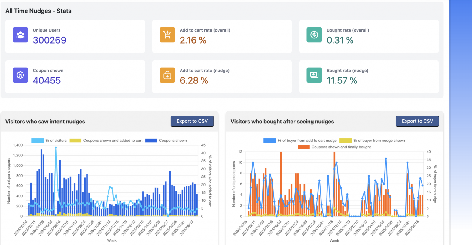
CausalFunnel’s Landing Page Optimizer uses AI and real visitor data to help businesses improve landing page performance without relying on trial and error. Instead of testing one element at a time, it analyzes multiple conversion factors. Then, it creates optimized page variations automatically.
Many landing pages lose visitors because of small issues that are difficult to spot. A weak headline, an ignored CTA, or a form placed too low on the page can reduce conversions.
CausalFunnel analyzes visitor behavior through heatmaps, scroll patterns, and interaction data to identify exactly where users stop engaging. It then highlights the areas that need improvement instead of leaving teams to guess.
Traditional A/B testing requires creating multiple versions manually and waiting for enough traffic to produce results.
CausalFunnel speeds up this process by generating several optimized landing page variations using AI. Headlines, layouts, forms, hero sections, and trust signals can all be tested at the same time to discover the highest-converting combination.
Visitors are more likely to convert when the landing page matches the words they searched for.
CausalFunnel scores landing pages against search queries and suggests headline and content improvements that better align with user intent. Better message matching can improve visitor experience while supporting stronger paid advertising performance and Quality Scores.
A layout that performs well on a desktop may not work as effectively on a mobile device.
The platform tests landing page performance across different screen sizes and traffic sources, helping SaaS businesses deliver a consistent experience for every visitor. This is especially valuable since many buyers research software products on their phones before scheduling a demo or starting a free trial.
Optimization is easier when every interaction is visible.
CausalFunnel connects with Google Analytics and logs clicks, scroll depth, form interactions, and visitor behavior in one dashboard. These insights help marketing teams understand what drives conversions and where potential customers drop off.
Not every visitor has the same intent. A first-time visitor may need more education, while a returning visitor may be ready to start a trial.
CausalFunnel automatically groups visitors based on behavior and delivers personalized incentives or messages to each segment. This data-driven personalization helps create more relevant experiences and encourages more users to convert.
High-converting SaaS landing pages are built through continuous testing, measurement, and improvement. CausalFunnel simplifies that process by combining AI-powered analysis, automated variant testing, real-time analytics, and behavioral insights in one platform.
SaaS teams can identify conversion barriers, test smarter solutions, and make decisions backed by real user data rather than assumptions.
The strongest SaaS landing pages rarely rely on flashy tricks. They earn trust through clarity, proof, and thoughtful design. Looking at the pages visited every day, one pattern stands out. The simplest experiences often leave the biggest impression. So the next time a landing page feels crowded, ask one question. What can disappear without hurting the message?
A SaaS landing page is a web page built for one clear goal, such as starting a free trial or booking a demo. Unlike a homepage, it removes extra links and distractions. It gives visitors the right information and guides them toward taking one specific action.
A good SaaS landing page design is simple, clear, and easy to use. It has a strong headline, helpful product images, real customer reviews, and one clear call-to-action. Every section should build trust and help visitors understand why the software is worth trying.
A high-converting SaaS landing page should include a clear headline, a value statement, product screenshots, customer testimonials, and a strong CTA button. It should also highlight key benefits, answer common questions, and include trust signals that make visitors feel confident about signing up.
There is no perfect length for a SaaS landing page. A simple product may need only a few sections, while a complex tool may need more details. The page should be long enough to answer important questions without adding unnecessary content that slows decisions.
A homepage introduces the entire business and links to different sections of a website. A SaaS landing page focuses on one offer and one goal. It removes distractions and encourages visitors to complete a single action, such as signing up or requesting a demo.
The best CTA is short, direct, and easy to understand. Phrases like "Start Free Trial," "Book a Demo," or "Get Started" tell visitors exactly what happens next. A clear action button creates less confusion and helps improve conversion rates.
Better conversions come from clear messaging, simple layouts, and strong trust signals. Use real customer reviews, product visuals, and short forms to reduce friction. Keeping one main CTA and removing extra distractions also helps visitors make decisions faster and with more confidence.
Many people compare software products on their phones before switching to a desktop. A mobile-friendly landing page loads quickly, uses readable text, and has buttons that are easy to tap. A smooth mobile experience keeps visitors engaged and increases the chances of getting more signups.
Start using our A/B test platform now and unlock the hidden potential of your website traffic. Your success begins with giving users the personalized experiences they want.
Start Your Free Trial

Empowering businesses to optimize their conversion funnels with AI-driven insights and automation. Turn traffic into sales with our advanced attribution platform.
Trusted by Customers


©CausalFunnel Inc. All rights reserved.