



Free Funnel Audit
Convert more customers today!
SEO
10 mins read

SEO
10 mins read
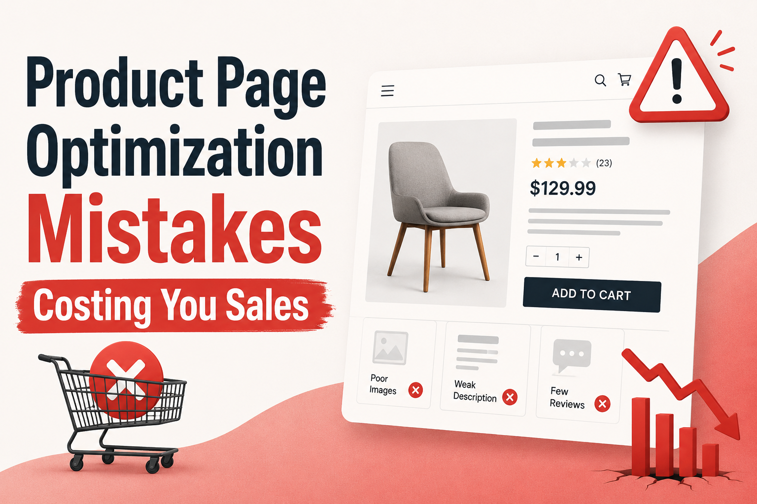
A weak product page can quietly kill sales, even when traffic is strong. Most product page optimization problems are not very big. They are small issues that stack up. These can be one weak CTA, one missing trust signal or one slow-loading image. Alone, each looks harmless, but together, they push shoppers away.
This guide covers 11 common mistakes that cost sales and shows how to fix them before more customers leave.
Product page optimization is the process of improving a product page so more visitors become customers. It combines user experience, conversion rate optimization, SEO, content, design, and trust-building elements.
Think of a product page as a digital salesperson. It needs to answer questions, remove doubts, build trust, and make buying simple. If any part of that process breaks down, conversions will have to suffer which is not at all good for any business.
Good product page optimization helps shoppers understand what they are buying, why it matters, and why they should buy from you instead of a competitor. It also helps search engines understand the page, which can improve visibility and organic traffic.
Through proper page optimization, the goal is not just to get more clicks, but to get more sales.
Many ecommerce businesses focus heavily on getting traffic. They invest in SEO, paid ads, social media campaigns, and email marketing. Yet traffic alone does not generate revenue.
Imagine spending thousands of dollars on advertising each month. Visitors arrive on your site, they view products, and then they leave without buying. Here, the issue is not traffic, but conversion.
A well-optimized product page can:
Even small improvements can have a large impact. If a page converts at 2% and improves to 3%, that represents a 50% increase in sales from the same traffic source.
That is why product page optimization often delivers one of the highest returns in ecommerce.
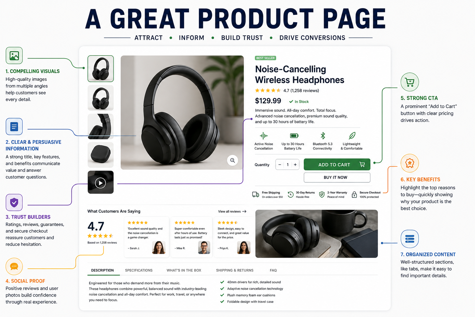
A great product page removes uncertainty at every step.
When customers land on the page, they should quickly understand the product, its benefits, its price, and why it is worth buying. They should not need to search for important information.
The strongest product pages share several traits. They work together to build confidence and guide shoppers toward a purchase.
A great product page usually includes:
Notice that none of these elements are unknown to you. Most are simple, yet they directly affect buying decisions.
Many ecommerce stores already have some of these pieces in place. The problem is that one weak area can reduce the effectiveness of everything else. A great description cannot overcome poor images. Strong reviews cannot save a confusing checkout process.
Therefore, every element must work together, and that is what separates average product pages from high-converting ones.
Many people assume product page optimization is about making pages look better. This is where they get it wrong.
The real goal is removing any hurdles. Every improvement should make it easier for shoppers to move from interest to action. Improvements should be done by using better images to reduce uncertainty. Also, you should focus on making pages load faster to reduce frustration and stronger CTAs reduce hesitation.
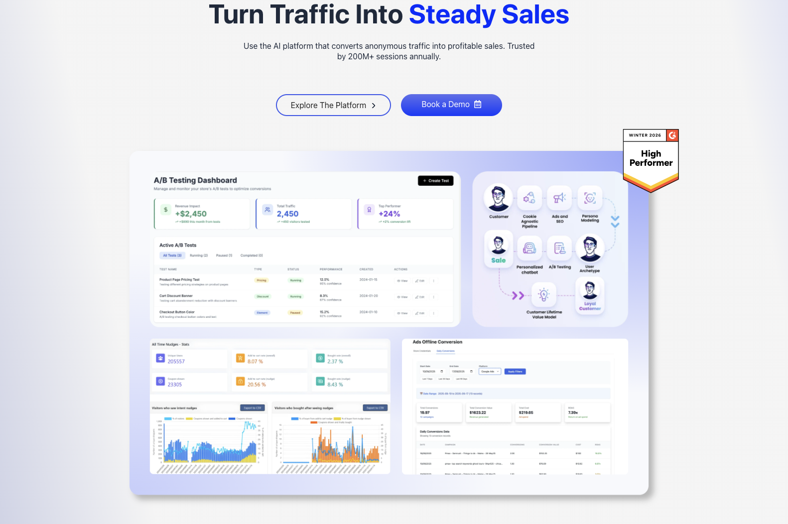
Companies such as CausalFunnel help businesses identify those friction points through AI-powered SEO, conversion rate optimization, A/B testing, and behavioral analysis. Instead of guessing what customers want, businesses can use data to understand what prevents conversions and what encourages them.
Because at the end of the day, the best product page is not the prettiest one. It is the one that converts visitors into customers.
Many mistakes are not very big and do not require any coding. Most of the time the mistake is right in front of you, you’re just not able to see it because it’s very minor. But this minor mistake can negatively affect your traffic, sales and conversions.
Have a look at the mistakes and you’ll be surprised at how small these mistakes are.
Most stores do not lose sales because the button is ugly. They lose sales because the button does not answer the shopper’s last concern.
Think about the moment before someone clicks. They are not wondering if the button should be green or blue. They are asking questions. Can I return this? Will it arrive on time? What if it does not fit? Those doubts matter more than button colors.
A plain “Add to Cart” button often misses that moment. But a button paired with reassurance can perform much better. Text such as “Add to Cart • Free Returns” or “Buy Now • Ships Today” removes any confusion.
Many brands spend hours debating design details. Yet they never look at the message around the button. That is often where the leak starts. The button is not the problem but the uncertainty is.
Look at your page right now. Is the main CTA helping a customer decide? Or is it simply waiting for them to decide alone? Your answers will tell you whether your product page is working the way it should.
More photos do not always create more sales but if you answer the right questions in the right way, it will definitely improve your sales.
A shopper buying a sofa wants to see size, texture, and room placement. On the other hand, someone buying a phone case wants proof it fits perfectly. Yet many stores use the same image strategy for every product. Doing that creates doubt.
Blurred images, awkward crops, missing zoom features, and poor lighting still appear on thousands of ecommerce sites. Those problems force shoppers to guess, and people rarely buy when they have to guess.
The best product page optimization examples focus on reducing uncertainty. Every image answers a specific question. Every angle serves a purpose. Nothing is there just to fill space.
Before adding more images, ask what questions buyers still have.
Good images sell confidence and confidence drives purchases.
Many product descriptions read like instruction manuals.
You must understand that features matter. But shoppers rarely buy features alone. They buy outcomes. A customer does not buy memory foam because it is memory foam. They buy better sleep and less back pain.
The same mistake appears across almost every industry. Product pages list specifications, dimensions, materials, and technical details. Yet they never explain why those details improve someone’s life. The result feels cold and forgettable.
A strong description connects features to benefits. It bridges the gap between what the product has and what the customer wants. That connection matters because emotion often drives the decision before logic justifies it.
Try reading your product description aloud. Does it sound like a salesperson helping a customer? Or a warehouse inventory sheet?
Many stores collect hundreds of reviews and then bury them halfway down the page. By the time shoppers reach them, some have already left.
A visible star rating near the product title works harder than most businesses realize. It creates trust before buyers begin comparing details.
Additionally, placement matters just as much as quantity. Ten visible reviews can outperform one hundred hidden ones. People want reassurance when making a decision, not five minutes later.
Think about how shoppers behave. They scan, jump around, and rarely read every word. If the proof is hard to find, many customers never see it.
Strong reviews should appear where hesitation appears and that is right near the decision point. Strong reviews should not be buried at the bottom.
Price is not just a number. It sends signals and tells shoppers what to expect. It shapes trust, and influences value. Every pricing choice changes perception.
A common mistake is hiding extra costs until checkout. Someone sees a product for $79. Then shipping adds another $15. Many shoppers abandon the purchase at that point. The problem is not always the extra cost itself. It is that unexpected charges increase cart abandonment and reduce conversion rates. Even small changes in price during checkout can lead to lost sales and lower revenue.
Installment payments can create similar problems. Showing “4 payments of $24.75” may make a product feel affordable. Or it may remind shoppers that the total cost is higher than planned. That is why placement matters.
The strongest product page optimization strategies reduce uncertainty around pricing. Customers should know exactly what they will pay and why.
When shoppers feel confused, they hesitate. When they hesitate, conversions drop.
Watch for these common pricing mistakes:
Clear pricing builds trust further building sales.
Have you ever tried buying from your own store using one hand?
That simple test reveals if there’s any problem. In 2026, mobile still accounts for the majority of product-page traffic for most US ecommerce stores. Yet many product pages are still designed with desktop users in mind.
A page can look responsive and still create problems. “The Add to Cart” button may sit too low or the product images may feel awkward to swipe. Also, size selectors may require multiple taps. These small frustrations add up quickly.
Most shoppers are not sitting at a desk. They are browsing during lunch breaks, while commuting, or while watching TV.
The easiest test is brutally simple. Open your product page on your phone. Use only your thumb. Can you add the item to your cart easily? If not, customers struggle too.
Small usability issues often create large conversion losses. Quietly.
Run these quick checks:
Mobile shopping should feel effortless.
Core Web Vitals remain a ranking factor even today, and slow product pages are still losing sales before a shopper reads a word.
Many businesses focus on copy, images, and offers. Yet none of those matter if visitors leave before the page loads. Speed affects both user experience and search visibility. That makes it a double problem.
The frustrating part is that many store owners assume page speed is purely technical. But it is not. You do not need to understand servers or code. You only need to know what to ask for.
Large image files remain one of the biggest causes of slow product pages. Third-party scripts create another common issue. Popups, tracking tools, chat widgets, and review apps all compete for attention and resources.
A slow page feels broken due to which people leave quickly. Therefore, when speaking with a developer, request these three fixes first:
Those three requests often solve a large share of performance problems.
“Selling Fast!” appears everywhere now. That is exactly the problem.
Urgency works when it feels real. It fails when it feels like just another attracting criteria. Customers have become good at spotting fake scarcity. The moment they notice every product carries the same warning, trust starts fading.
Real urgency comes from actual conditions. Low inventory, seasonal products, expiring promotions or limited production runs. Those signals feel believable because they are tied to reality.
A message such as “Only 3 left in Medium” feels useful. A vague “Hurry! Selling Fast!” often feels generic. One helps shoppers make a decision. The other becomes background noise.
Before adding urgency, ask a simple question. Would a customer believe this statement if they saw it twice? If the answer is no, it probably needs work.
More options do not always help. That is where many online businesses get it wrong.
Many ecommerce stores place huge product grids beneath the main offer. The intention is good but the outcome often is not. Instead of reinforcing the purchase, those recommendations create new decisions.
Someone ready to buy a hiking backpack does not need twelve more backpacks. That creates comparison mode and suddenly the original choice feels uncertain again.
A better approach focuses on complementary products. Show one or two useful additions. These can be a rain cover, a water bottle or simply a packing cube.
The goal is not to restart the shopping journey. The goal is to support it.
Every shopper arrives with doubts. Will this fit? Is it safe for sensitive skin? How long does shipping take? What happens if it breaks? Those questions rarely disappear on their own.
Many brands answer them in the wrong place. Information sits inside a separate FAQ page or hidden support section. That forces customers to hunt for answers.
People do not like hunting.
The strongest product pages answer concerns exactly where hesitation appears. A short shipping note near the CTA can outperform a detailed shipping page. A simple sizing explanation near the size selector can reduce abandonment dramatically.
The answer should live close to the doubt.
Most product pages do not struggle in search because of advanced SEO issues. They struggle because basic tasks never get finished.
A surprising number of product pages still use generic titles, missing image descriptions, and weak meta descriptions. Those elements look small, but they are not. Search engines use them to understand relevance and context.
The good news is that marketers can fix most of these issues without touching code. No developer required.
Before chasing complex SEO tactics, review these basics:
Strong fundamentals often outperform complicated tactics. That is where many wins begin.
One of the biggest mistakes is assuming a change will work. But mind it, assumptions are expensive.
A new CTA may improve sales or reduce them. A different image layout may help or hurt. The only way to know is through testing.
This is where companies like CausalFunnel provide value. Their services combine AI-powered SEO, conversion optimization, behavioral analysis, and A/B testing. Instead of relying on opinions, businesses can identify what actually drives more revenue.
Open your product page, grab your phone, and then work through this checklist.
Most issues become obvious within minutes. No expensive software required, and no technical expertise needed. Just honest observation.
Answer each question with yes or no.
Every “no” represents a potential leak. When this happens, fix the biggest leaks first.
Strong product page optimization is rarely about dramatic redesigns. Most gains come from removing friction. A clearer CTA, better images, faster loading times, and more visible trust signals.
That is why many businesses see stronger results when SEO and conversion optimization work together. CausalFunnel offers services that combine AI-driven SEO, GEO, AEO, CRO, and A/B testing. The goal is simple, which is to bring qualified traffic and convert more of it.
A customer rarely leaves because of one giant problem. More often, eleven small mistakes quietly push them away. Which one is hiding on your product page today?
Product page optimization is the process of improving product pages to increase conversions, engagement, and search visibility. The goal is to help more visitors become customers so your business flourishes.
One of the many things customers look at are images. This is because images reduce uncertainty among the buyers. They help shoppers understand size, quality, fit, and usage before purchasing.
Mobile optimization is very important for the users to navigate the website easily on their cellphones. Most ecommerce traffic now comes from mobile devices. A poor mobile experience can significantly reduce sales.
Yes. Customer reviews build trust. Visible reviews help shoppers feel more confident before buying. If the reviews are not visible to the customers, businesses could lose potential customers which could impact the conversion rate.
Business should start with fixing the simplest problem. They can start with the CTA and mobile experience. Those two areas often create the largest conversion gains in the shortest time.
Start using our A/B test platform now and unlock the hidden potential of your website traffic. Your success begins with giving users the personalized experiences they want.
Start Your Free Trial

Empowering businesses to optimize their conversion funnels with AI-driven insights and automation. Turn traffic into sales with our advanced attribution platform.
Trusted by Customers


©CausalFunnel Inc. All rights reserved.